
Table of Contents
It’s 1949. The war is over and a new world order is taking shape, bringing with it new hopes and fears. Against this backdrop, a British writer publishes a bleak novel that will become his most famous, and an instant classic to boot.
The book describes a world where individual freedom is crushed and the truth constantly re-written by power. It’s a world where a totalitarian state controls every aspect of life through permanent mass surveillance, propaganda and revision of the past. That author is George Orwell and the book is 1984, the quintessential dystopian novel.
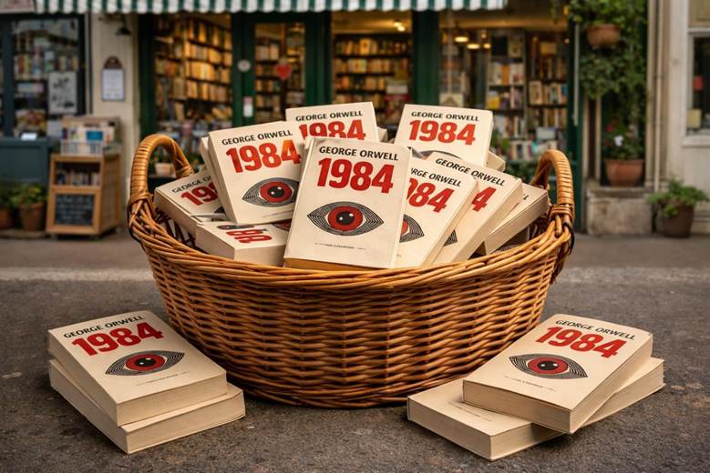
With more than 30 million copies sold, the novel was already a bestseller by the 1970s, and required reading for students across the free world. But 1984 is a curious classic in that every so often, it climbs the book charts again.
Political leader showing an authoritarian streak? New technology enabling mass surveillance? You can bet on a spike in sales of 1984!
Scroll X or Bluesky today and sooner or later you’ll come across a post about news or politics that quotes from the novel. That’s the hold that 1984 has on our collective imagination.
So we thought it was as good a time as ever to look at this seminal work through the most eye-catching and head-scratching covers to have graced the novel in its 75 years.
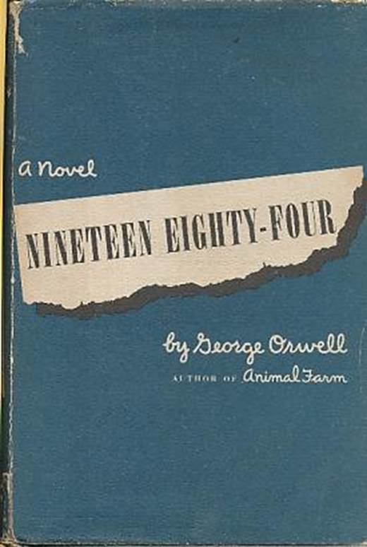
The cover for the first edition of 1984

We begin with the very first cover for 1984. It’s always fascinating to see the first cover a book presents to the world, the jacket it wore before anyone knew if it would be a soon-forgotten flop or a literary bestseller.
1984 (also released as Nineteen Eighty-Four) was published on 8 June 1949 by Secker & Warburg. It would be the ninth and final book written by Eric Arthur Blair, better known by his pen name George Orwell. A year later he would be dead from tuberculosis. Designed by Michael Kennard, the novel’s cover is a simple text-only affair: the title in numbers and letters, along with the author’s name and the subtitle “a novel”, all set against a green background.
There’s a different design for the first US edition. It shows the title as if it were printed on a strip torn from a newspaper. This is likely an allusion to the job of main character Winston Smith, who is tasked with purging books and newspapers of facts that don’t toe the Party line.
The first American cover for 1984 also tells readers that it’s by the author of Animal Farm, Orwell’s previous novel – and the work that made his name. A few more years would pass before more imaginative covers wrapped Orwell’s masterpiece, like this one for Signet’s 1954 paperback edition with its slightly camp sci-fi illustration.

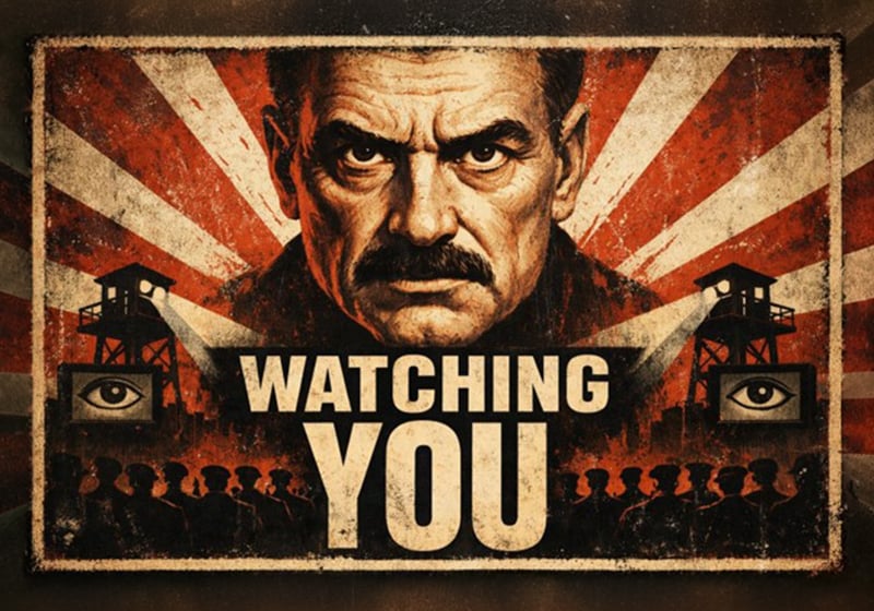
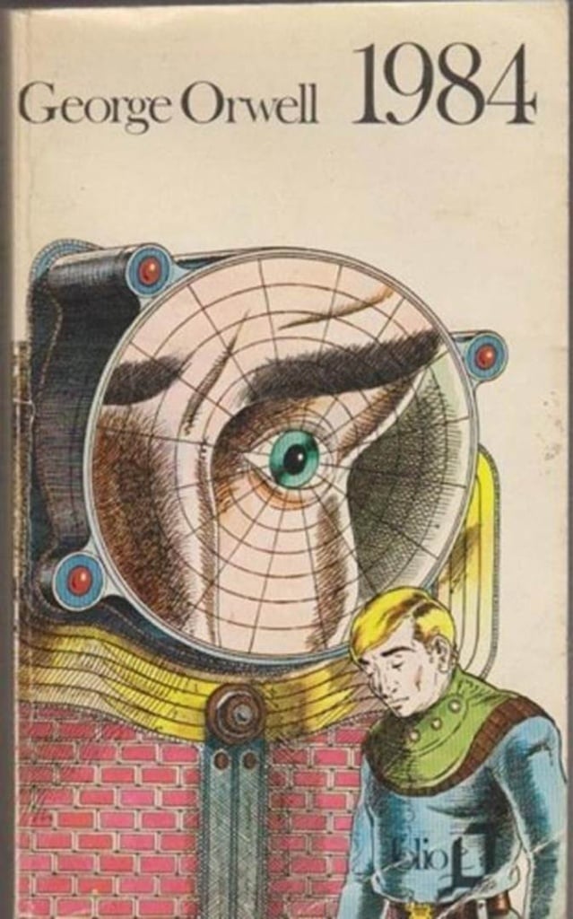
Big Brother’s all-seeing eye
One of the most vivid and unsettling ideas from 1984 is Big Brother. That’s right, before giving his name to the noughties reality TV series, Big Brother was born and lived in the pages of Orwell’s novel as the dictator of the fictitious state of Oceania and the personification of all-pervasive totalitarian power.
Unsurprisingly, Big Brother’s creepy all-seeing eye – a powerful symbol of propaganda and mass surveillance – frequently features on covers for 1984.
Here’s a fun fact: the eye and “Big Brother is watching you” slogan appear on the commemorative £2 coin produced by the Royal Mint to mark the 75th anniversary of Orwell’s death.
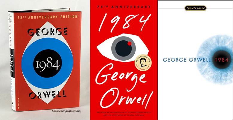
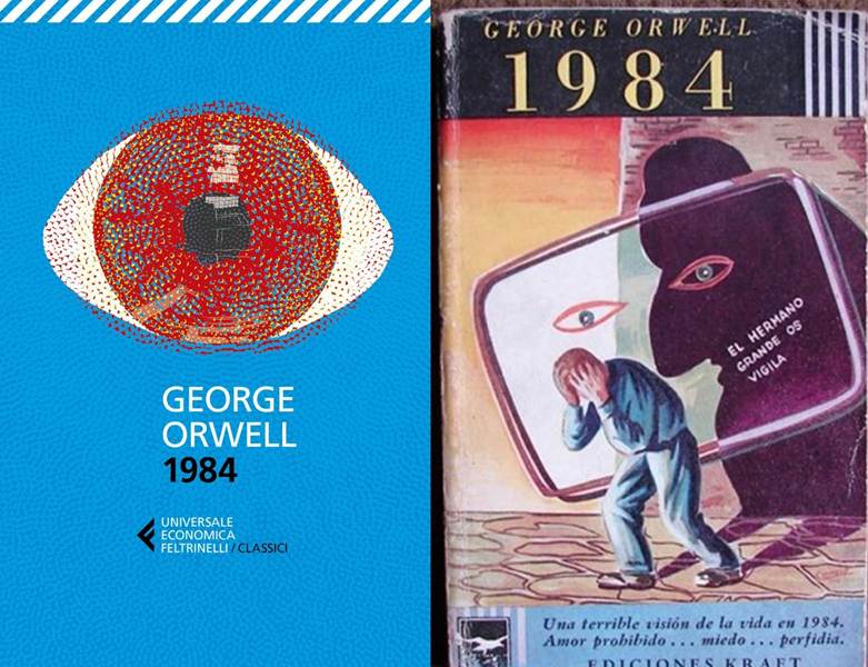
And here are some more sinister eyes peering out from a selection of new editions released in 2024 to celebrate the 75th anniversary of 1984’s publication.
An Italian paperback edition from Feltrinelli next to an Argentine edition from 1954: both show a menacing Big Brother watching us.
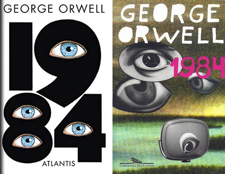
Different eras associate different technologies with mass surveillance. A couple of decades ago, as these covers show, it was screens and omnipresent CCTV, while today it’s all-pervasive AI that can record and influence everything we do in our digital and physical lives.

This is a subtler take designed by Jason Johnson for Plume Harcourt Brace. It shows the title formed by myriad eyes, suggesting that surveillance isn’t just enabled by technology, but by society’s complicity, too.

OBEY-style covers for 1984

Before turning our focus to other symbols that appear on covers for 1984, we’ve got one more Big Brother eye to bring you. It’s from a pop art cover produced in 2008 for Penguin by street artist Shepard Fairey.
Fairey is the man behind OBEY GIANT, an aesthetic and cultural phenomenon (and now a brand) that grew out of a sticker campaign in the eighties.
It’s no accident that Penguin commissioned the creator of OBEY GIANT to design a cover for 1984. In his work, Fairey explores ideas like propaganda, freedom and consumerism in a style that borrows from art made in the Soviet Union, one of the totalitarian states that Orwell satirises in the book.
So what better artist than Fairey to design the cover?
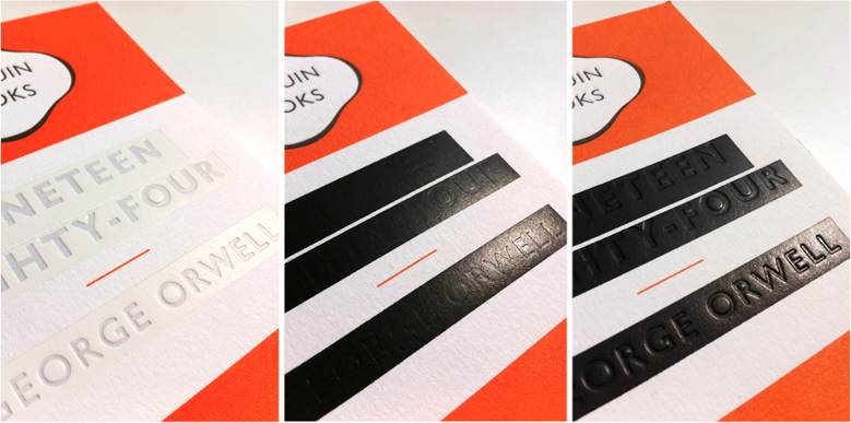
The cover redacted by the Ministry of Truth.

Other neologisms coined in 1984, like Newspeak – a language invented and controlled by the Party – and doublethink – a mechanism that makes it possible to hold two diametrically opposed facts in one’s mind at the same time – remain eerily relevant in our times. Indeed, it wouldn’t be much of a shock to see a state create an actual Ministry of Truth.
The Ministry of Truth is where Winston Smith works. Here, in an endless rewriting of history, he censors references to people that the Party has disappeared.
It’s this that gave Penguin art director Jim Stoddart and designer David Pearson the clever idea to “redact” the cover of 1984. It wasn’t as straightforward as it might seem, because the pair had to work closely with the printers to make sure the book’s title and author were still legible to sharp-eyed readers!
Covers for 1984 from around the world
The events of 1984 take place in a precise geographic location: the island of Great Britain after it has been absorbed into the totalitarian state of Oceania, one of three superpowers that have divided up the world into zones of influence. The idea for the novel came to Orwell when he saw that the winners of World War II were doing exactly the same thing.
The bleak future imagined by Orwell touches universal themes that resonate with readers everywhere, which is why the book’s considered a classic the world over. Let’s look at our favourite international covers for 1984.
We begin with editions from Indonesia and Slovakia, two states on the long list of countries to have suffered under dictatorship in the past.
Big Brother is watching you (all over the world). Here are more of those omnipresent eyes on Swedish and Brazilian editions of 1984.
Big Brother’s beady eye stares out from this French version published in the 1980s.
Here’s a weird Russian cover for 1984. Despite seemingly having little to do with the book’s contents, the picture still captures its grim mood. Funnily enough, Russia is one country where the novel has become popular again (another is… the United States).

The city of the future is the theme on this abstract cover by Swedish designer Olle Eksell.

And technological surveillance features on these versions from Denmark (left) and Lebanon (right).

(Dar Al-Rafidain, 2021). Image: bokklubben.no; daralrafidain.com. All rights reserved. Image used for illustrative purposes.
Look carefully and you’ll notice a reference to mass surveillance in the typography of the Chinese edition on the left below. We’ve paired it with another elegant type-only cover from Japan.

Our final pick of the best covers for 1984 is this one from China. Strange as it sounds, Orwell’s critique of totalitarianism is well known in the country.

What are your thoughts on this dystopian classic? Is there a cover for 1984 that you’re particularly fond of? And has our selection given you inspiration for your next graphic design projects?