
Table of Contents
All of us, at least once in our lives, have been drawn to a book by its cover: a quirky photo, a striking title or, at the other end of the scale, a clean and minimalist design. A book cover should be designed to catch the reader’s eye in a library or bookshop. “Chip Kidd once said that bookshops, even those online, are like discotheques: you have 3 seconds, 5 at most, to catch someone’s eye. So if you decide not to dress well, that’s up to you, but you should know that you’ll have no chance of being noticed. (…) In this situation, the only sensible thing to do is find something clear, a focal point, to capture people’s attention,” explains Ottavio Di Brizzi, head of non-fiction at the Rizzoli publishing house in Italy.
Illustrators and graphic designers have the important job of making a book as attractive as possible through an original and eye-catching cover design. Above all, with the tools at their disposal – images, colours, fonts and graphical elements – they must create a clear and understandable semantic universe that will trigger a specific thought or emotion in the reader. The overall objective is to draw in the book’s target audience by arousing their curiosity.
We’ve picked out nine particularly interesting examples for those who want to learn more about cover design.
The Gone-Away World
The cover of this book – British author Nick Harkaway’s debut novel blending the science fiction, horror and thriller genres – manages to embody the surreal adventure narrated in the novel, which sees the two main characters navigate the dangers of “the gone-away world”.

It’s interesting to compare the cover of the American edition, designed by Evan Gaffney, with the Italian version, which carries an illustration by British artist Mark Brown. The former, featuring ‘unhinged’ lettering with distorted perspective, perfectly sums up the world to which the reader is transported. A world that, according to one reader review, is a “parable of the human condition in which the main character must come to terms with a universe that will literally fall apart around him, leaving him speechless.” This graphical choice shows how it’s possible to create a feeling of bewilderment in the reader by simply changing the orientation of the lettering.

The second cover, from the Italian edition by Mondadori, depicts the disconcerting atmosphere of the story – which is populated with monstrous creatures, cannibalistic dogs and ninja warriors – with an image seemingly plucked out of a children’s fairy tale, which makes it all the more disturbing.
Borne
The enigmatic cover for the Italian edition of “Borne” by Jeff VanderMeer, published by Einaudi in February 2018, was created by Italian illustrator and designer Lorenzo Ceccotti, a.k.a LRNZ. A luminescent sphere framed by a thin blue semi-circle and surrounded by mysterious grey hair or fur piques the readers’ interest, inviting them to dive into the author’s bizarre universe in which the main character and his companion, having survived a climate catastrophe, must face Borne, a strange creature that is half animal and half plant.

The image perfectly encapsulates the post-apocalyptic future recounted by the master of New Weird, a literary genre that mixes fantasy, science fiction and horror.
The Psychopath Test: A Journey Through the Madness Industry
Published in 2011, the book by journalist and documentary maker Jon Ronson explores the world of mental illness and the mental health industry. It reveals how in the corridors of power, and even among professionals treating and studying such illnesses, there are many individuals afflicted with serious mental health disorders.

Its cover, designed by illustrator Matt Dorfman, does a great job of evoking the personalities associated with psychopathy: the ‘ripped paper’ effect neatly symbolises the fracture caused by psychological disorders in the human mind. Dorfman shows how it’s possible to give a true-to-life effect to a cover with bespoke artwork.
The Sickness Unto Death
This cover was created by book designer David Pearson for the Penguin edition of Søren Kierkegaard’s philosophical work “The Sickness Unto Death”. Pearson uses raised lettering to express the book’s central theme, despair, which the Danish philosopher describes as a disease of the soul that leads man to desire death.

The ‘funereal’ subject matter is powerfully represented by the colour black, the uneven font size and the lack of line spacing, which reduces the letters to a chaotic mass of looming, barely legible symbols. It’s a great starting point for illustrators after a dark mood for their cover.
Black Transparency: The Right to Know in the Age of Mass Surveillance
The cover of this essay was designed by its authors, design studio Metahaven. It represents the idea of “black transparency” imposed on politics by the activities of hackers and spies who leak information of geopolitical import to achieve their goals. The famous Amsterdam-based duo of Vinca Kruk and Daniel van der Velden are no strangers to political themes, having worked for several years with WikiLeaks to design their merchandise.

Their design is compelling because it communicates a complex concept using a relatively simple but powerful graphical idea: the title is overlaid with fragments of an image, evoking the secrets of the halls of powerful spied through a keyhole.
Viaggio in Islanda (A journey to Iceland)
If you thought that you couldn’t have a book cover without a title, here’s the exception that proves the rule. Scooping the jury’s prize at the “Buona la prima” cover exhibition held as part of the 2018 “Tempo di libri” book fair in Milan, it is the perfect example of how a white cover devoid of text can arouse the curiosity of a reader more than a bold image. Designed by the book’s author, Guido Scarabottolo, this design is perfect for a work of art but less so “for a book that wants to sell more than 300 copies,” explains Stefano Salis, the show’s curator.


A courageous choice that nicely sums up the metaphysical and dreamlike spirit of this notebook, a graphic novel that tells the story of an imaginary trip to Iceland. There’s also a surprise for the reader at the end: the back of the dust jacket features all the drawings contained in the book. Food for thought for anyone designing a cover for a niche publication.
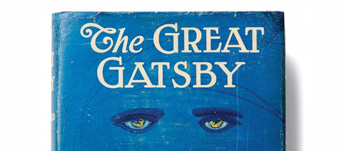
The Great Gatsby
This list would not be complete without one of the most famous covers in publishing history: the design for the first edition of Francis Scott Fitzgerald’s masterpiece “The Great Gatsby”. Loved by some, hated by others, it didn’t even convince Fitzgerald in the end. In 2013, when a new edition hit the shelves of American bookshops with a cover featuring Leonardo Di Caprio (star of the then-just-released film adaptation), it sparked a fierce debate between those who loved the old design and those who believed it necessary to offer an apparently new product to a public ever hungry for something fresh.

While the design by Spanish illustrator Francis Cugat may be of dubious taste, it succeeds magnificently in conveying the sense of debauchery and decadence described in the novel. Something that none of the subsequent covers, while often more refined from a graphic design point of view, have quite managed to equal.
