
Table of Contents
It had to happen sooner or later. In our long-running series exploring the greatest book covers in literature, at some point we were going to have to step into his dark universe. We are of course talking aboutStephen King, a name synonymous with the words “horror” and “bestseller”: his books have sold over 350 million copies worldwide and been translated into some 40 languages, rightfully earning him the moniker “The King of Horror”.
Of King’s dozens of books, we’ve picked The Stand to explore today. Though it may not be the first that springs to mind, many fans regard the work as the best Stephen King novel.
The Stand came out in 1978, a year after The Shining. Three years in the writing, it’s an epic in the mould of The Lord of the Rings [which, incidentally, was the first title in our #CoverStories series] but set in the United States.
This struggle between good and evil takes place in what is now a classic post-apocalyptic scenario: an America where 99% of the population has been wiped out by a lethal virus that has leaked from a military lab.
But how have artists distilled this dystopian saga into a book cover? It’s time to find out with our pick of the best covers for Stephen King’s The Stand.
The first, enigmatic cover for The Stand
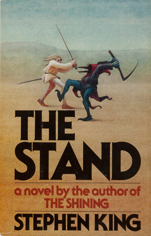
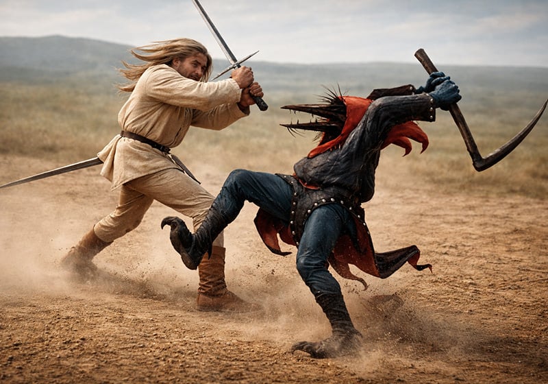
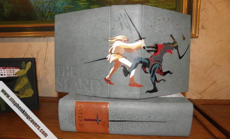
The first edition of The Stand was published on 3 October 1978 by Doubleday. The cover is not what you’d expect. Or at least not what you’d expect today for a Stephen King book: it shows two mysterious mediaevalesque figures – one light, one dark – engaged in hand-to-hand combat against an immense but indistinct backdrop. It’s almost as if they’ve spilled out of a Hieronymus Bosch painting mid-battle.
But isn’t the book supposed to be set in a post-apocalyptic eighties America, you’re wondering? True, but this cover designed by John Cayea is perhaps the most fitting ever produced for the novel. Because, taking a leaf out of Tolkien’s books, King weaves a plot in which the cast of characters face off in a battle of good versus evil. And by using this allegorical image, Cayea focuses on neither a single character nor the setting, but the theme at novel’s core: the forever war between darkness and light that rages inside each of us.
You might disagree, but it remains one of the best-loved covers among Stephen King aficionados. So much so, in fact, that fans have gone as far as having the duelling figures tattooedon their skin and printed on custom-bound covers for the book.
The cover for the first paperback edition, featuring the fearsome Randall Flagg.
Two years after the hardback came the paperback edition of The Stand. It was published by Signet, who hired painter Don Brautigam to produce the cover art. Brautigam would later go on to create the iconic album art for Metallica’s Master of Puppets.
While we see good and evil fighting it out on the cover for the hardback, on the paperback we only see evil. And it comes in the form of Randall Flagg.
Readers familiar with King’s books will know exactly who he is. A recurring character in the author’s work, he first appears in The Stand. Flagg is described as a tall, ageless man with a demonic presence. In a pandemic-stricken America, he rules Las Vegas with tyrannical terror. He will be the main antagonist in The Dark Tower series.
In Brautigam’s spine-chilling artwork – which won best cover of the year – Flagg’s face is morphing into a crow’s. A harbinger of evil, this bird will appear on many more covers for the novel, as we’ll soon see. But first we need to talk about another edition featuring the diabolical Flagg on the front.
The uncut edition of The Stand
Flagg’s malevolent face grins out from the cover on the 2012 paperback edition of The Stand. The first of these versions hit bookshops in 1990, 12 years after the original.

In 1990, King was well into his reign as the King of Horror. But unlike the stories inside, the page count of his books didn’t scare anyone (the first edition of The Stand ran to over 800 pages). Which is why he could restore over 400 pages that had been cut from the original, move the setting to the nineties and change… a “small detail” about Flagg in the denouement.
This uncut version of the novel became King’s longest, surpassing It by a dozen or so pages.
A murder of crows
Back to that unsettling avian presence: the black crow. It’s not giving too much away to say that in The Stand, when a crow shows up, things don’t end well. But more than that, the bird seems to represent pure evil.
This – and the crow’s decadent beauty – is no doubt why the bird appears on so many covers for The Stand.

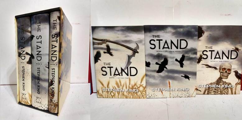
Swooping crows (and other ominous symbols) fill the covers for a superb three-volume 1000-copy limited edition published in 2019 by PS Publishing. These gothic designs were created by Don Maitz, an American artist renowned for his work in the fantasy and science fiction world.
More proof that the crow is the image most readily associated with Stephen King’s novel can be seen on the front of these international editions of The Stand, published in China and Germany respectively in 2016.

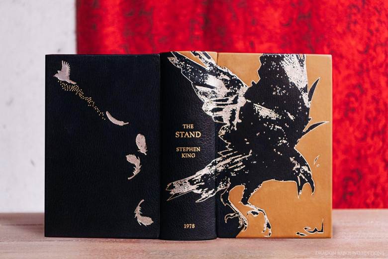
A crow also stars on the cover of this opulent custom-bound edition of The Stand produced in just 10 copies.
And here are two more crow-themed covers. On the left, a Signet edition; on the right, one of the most common English-language covers in circulation.

Left: The Stand by Stephen King (Penguin Publishing Grouphttps://stephenkingcovers.com/publisher/shanghai-translation/, 1980). Right: The Stand by Stephen King (Hodder Paperbackhttps://stephenkingcovers.com/publisher/shanghai-translation/, 1991) Images: rhapsodyinbooks.wordpress.com; amazon.it
The CBS series tie-in edition
Dozens of Stephen King novels have been turned into films over the years, with Carrie, Misery and The Shining among the most critically acclaimed. Others have been adapted for the small screen, as was the case with The Stand. In 2020, at the height of the COVID-19 pandemic, the book was made into a TV miniseries by CBS.
The poster for the series also doubled as the cover for a new tie-in edition of the novel. And it’s pretty powerful stuff! As well as the now obligatory crow, this bleak and foreboding image features another symbol laden with meaning: a crucifix-like telegraph pole dangling mid-air against the backdrop of a desolate wintry landscape. For readers living through the events of 2020, it would have delivered a strong dose of anxiety!
A coffin for a cover
Before we venture into the eclectic universe of international covers for The Stand, we want to show you one of the weirdest covers out there. If you like a bit of black humour, it’ll be right up your street.

The legendary “coffin edition” released in 1990 by Doubleday includes illustrations by comics artist Bernie Wrightson. With just over 1000 copies produced, today it’s a coveted collector’s item.
The Stand: the best covers from around the world
International editions provide a canvas for the world’s finest designers to showcase their creativity on the cover.
And in the case of The Stand, translators got in on the act too: rather than a literal rendering of the novel’s enigmatic English title, the translators of some international editions opted for names that more explicitly evoke the darkness inside.
In Spanish, for example, the book is called La danza de la muerte [The dance of death]. And with a title like that, there was plenty of inspiration for a blood-chilling cover, as these two examples show: on the left is a 1991 edition; on the right, a 1986 edition.

This cover for a Spanish edition published in two volumes by Pomaire in 1978 clearly takes its cues from the US edition.

In Italy, The Stand was titled the L’ombra dello scorpione [The scorpion’s shadow]. Inevitably, it spawned a series of covers with the venomous arachnid featuring prominently!
On the left is the first uncut edition published by Sonzogno. On the right, the Bompiani edition from 1990.
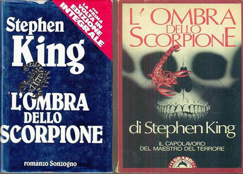
Left: The Stand by Stephen King (Sonzognohttps://stephenkingcovers.com/publisher/shanghai-translation/, 1983). Right: The Stand by Stephen King (Compianihttps://stephenkingcovers.com/publisher/shanghai-translation/, 1990). Images: amazon.it; ebay.it
Over to China now. Strangely, it’s here that we first get a cover alluding to the man-made virus behind the apocalypse in the novel. The 2013 Chinese edition (Crown Publishing) is a three-volume set.

Next, we have these two rare Afghan editions of Stephen King’s novel: the first sinister but abstract, the second decidedly more explicit!

The setting and characters in The Stand provide more than enough material for arresting cover art. Here are two final examples from Brazil (left) and The Netherlands (right) respectively.

Left: The Stand by Stephen King (Objectiva:https://stephenkingcovers.com/publisher/shanghai-translation/, 2005). Right The Stand by Stephen King (Luitingh-Sijhoff:https://stephenkingcovers.com/publisher/shanghai-translation/, 1990). Images: stephenkingcovers.com
What’s your favourite cover for The Stand? Will it inspire your next graphic design project? Let us know!