

Table of Contents
The first movable typefaces – invented in Germany in the mid-1400s –‑ were inspired by the “Gothic” handwriting used by German monastic scribes at the time. An example of one such font is Textura, which Gutenberg used to print his Bible in 1455.
In 1470, a new font appeared in Venice: Jenson. Named after its creator, Nicolas Jenson, this typeface was closer in form to the handwriting of Italian scribes.
Until the start of the 1800s, all typefaces had pointed, curved or rounded end strokes. They were all serifed. Over the years, serifs have evolved, first becoming more geometric (Baskerville, Bodoni, Didot), then finer and more squared with slab serifs (also known as Egyptian). Egyptian typefaces first came to prominence in 1815 with Figgins Antique, while the first typeface with clean, unadorned stroke ends appeared in the 1816 catalogue for the William Caslon type foundry, listed as Two Lines English Egyptian.
The first sans-serifs
In 1832, the catalogue of English typefounder Vincent Figgins featured a new typeface with the same characteristics as Caslon’s “Egyptian”: Figgins Sans Serif. It would eventually lend its name to an entire genre of typefaces. In the same year, another English typographer, William Thorowgood, began selling Seven Lines Grotesque (also known as Thorowgood Grotesque)[1]. Grotesque would become the byword for the sans-serif faces of the 1800s.
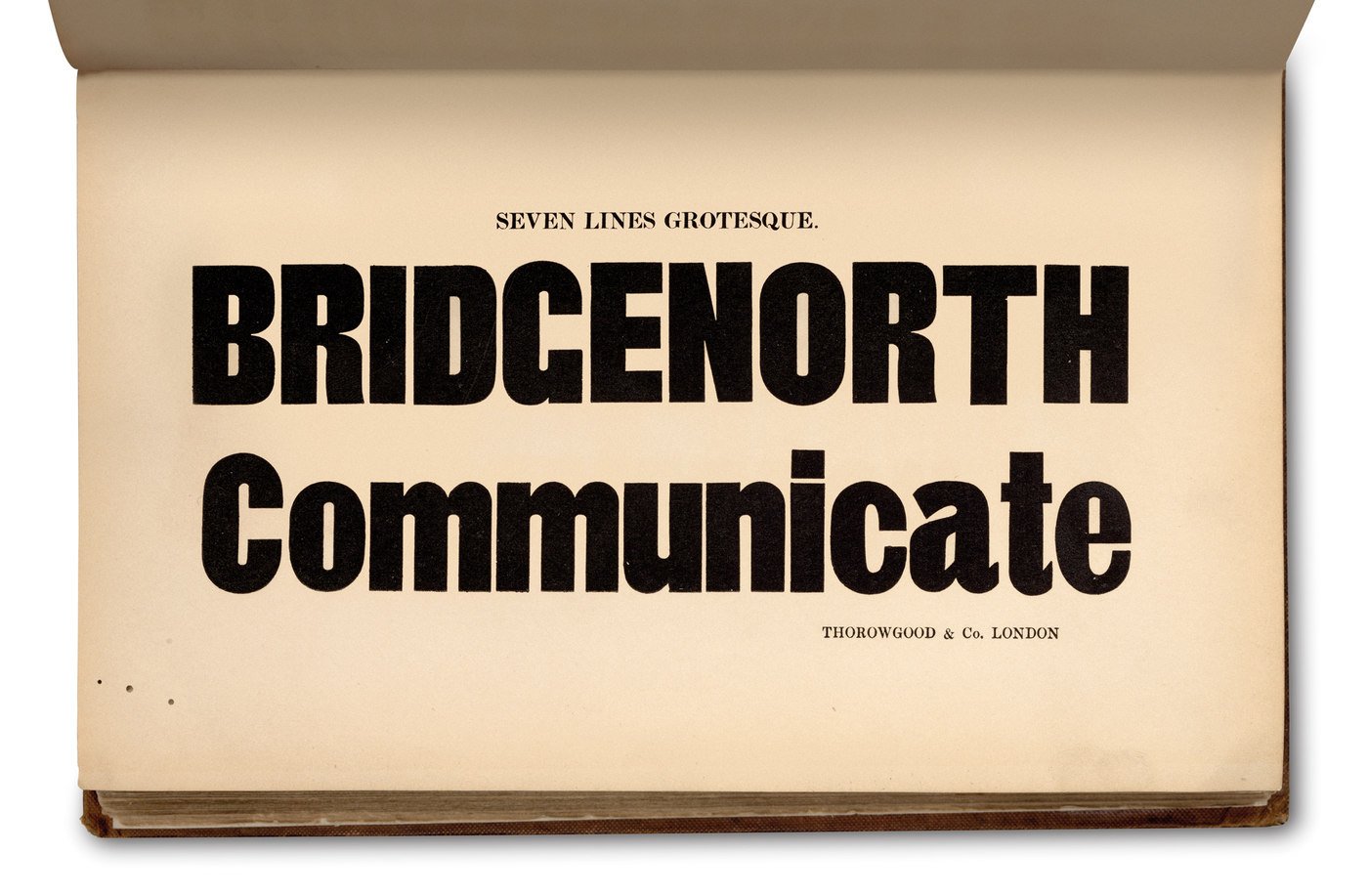
Egyptian faces and the first grotesques were born out of the emerging advertising market’s need for large, eye-catching text: both Figgins Sans Serif and Thorowgood Grotesque comprised only upper case letters.
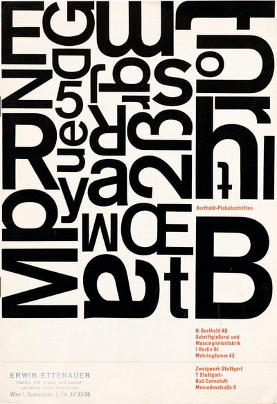
During these years, various versions of grotesque began to circulate, the origins of which are now difficult to determine. In fact, it wasn’t uncommon to see the same font sold under a different name by different foundries. In 1890, German foundry Shelter & Giesecke created Bertie Grotesk, which included lowercase letters, and in 1898 another German foundry, Berthold, released the first version of Akzidenz-Grotesk. Over the years, Akzidenz-Grotesk would undergo a number of changes influenced by Berthold’s acquisition of other foundries. The most significant of these came with the take-over of the Theinhardt foundry. Akzidenz-Grotesk began to incorporate features found in Theinhardt’s Royal Grotesk, which made it cleaner and more linear. In doing so, Akzidenz-Grotesk became the first sans-serif to gain widespread popularity, creating a market for a type of font that is today considered the forefather of almost all modern grotesque faces.
The influence of Akzidenz-Grotesk
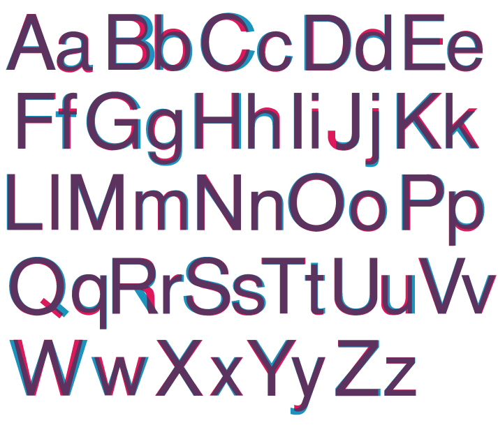
Akzidenz-Grotesk – which was also called Standard in Britain and the United States – would influence the first American grotesque, Franklin Gothic, as well as one of the most popular and best-known fonts, Helvetica.
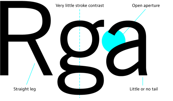
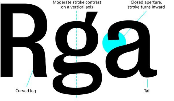
Franklin Gothic was created by the Morris Fuller Benton foundry in 1908. Don’t be confused by the inclusion the term Gothic in its name, though: American Gothics are in fact a variant of European grotesques[2].
American Gothics differ from European grotesques in a number of ways: they have simpler and more open forms, and less contrast; they also tend to be slimmer and less curvy. Other examples include News Gothic (1908) and Trade Gothic (1948)[3].
Below are two images that show the differences between Gothics and grotesques (courtesy of a post by Stephen Coles on Quora).
Helvetica
Created by Swiss typeface designer Max Miedinger in 1957, Helvetica is in large part inspired by Akzidenz-Grotesk.
Helvetica remains an incredibly popular font today. In 2007, to celebrate its 50th birthday, Gary Hustwit dedicated an entire documentary to it. It’s impossible to go anywhere on the web without bumping into Helvetica. It has come to symbolise both “design” – loved by graphic designers like Massimo Vignelli — and “laziness”, as type designer Bruno Maag explains in an interview with Eye on Design.
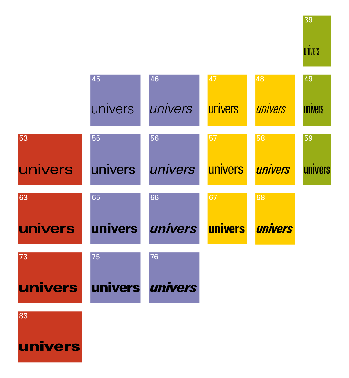
The year that Helvetica was released also saw the launch of Univers by Adrian Frutiger and Folio by German foundry Bauer. Of these, Folio is the closest to Akzidenz-Grotesk, but the height of its lower-case version is lesser.
Available in a total of 21 different styles, Univers was the first font specifically designed for use in a range of widths and weights.
From 1800 to today, the “thirst” for grotesk still hasn’t been quenched. Almost all foundries have at least one in their catalogue. Like in many other fields and industries, there’s more choice today than ever before in typography, and you can now choose from many different versions of grotesque. Monotype has even created a more modern version of Helvetica, Helvetica Now.
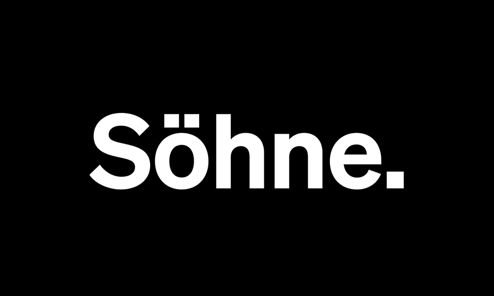
Söhne
New Zealand foundry Klim Type recently released its own reinterpretation of Akzidenz-Grotesk, Söhne (2019). It was inspired by the signage created by Massimo Vignelli and Bob Noorda for the New York subway.
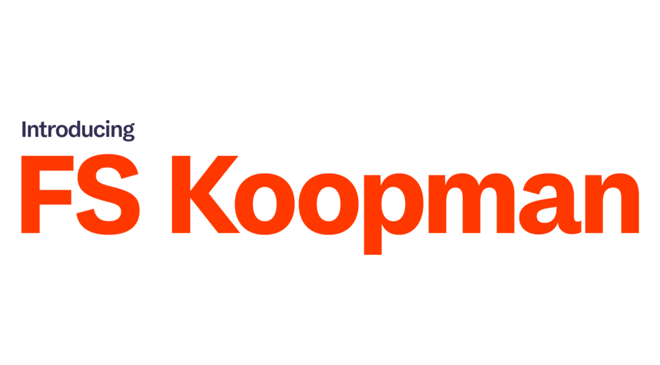
Koopman
In 2018, British type foundry Fontsmith created a hybrid between English and German grotesques[4] and American Gothics, which they baptised Koopman.
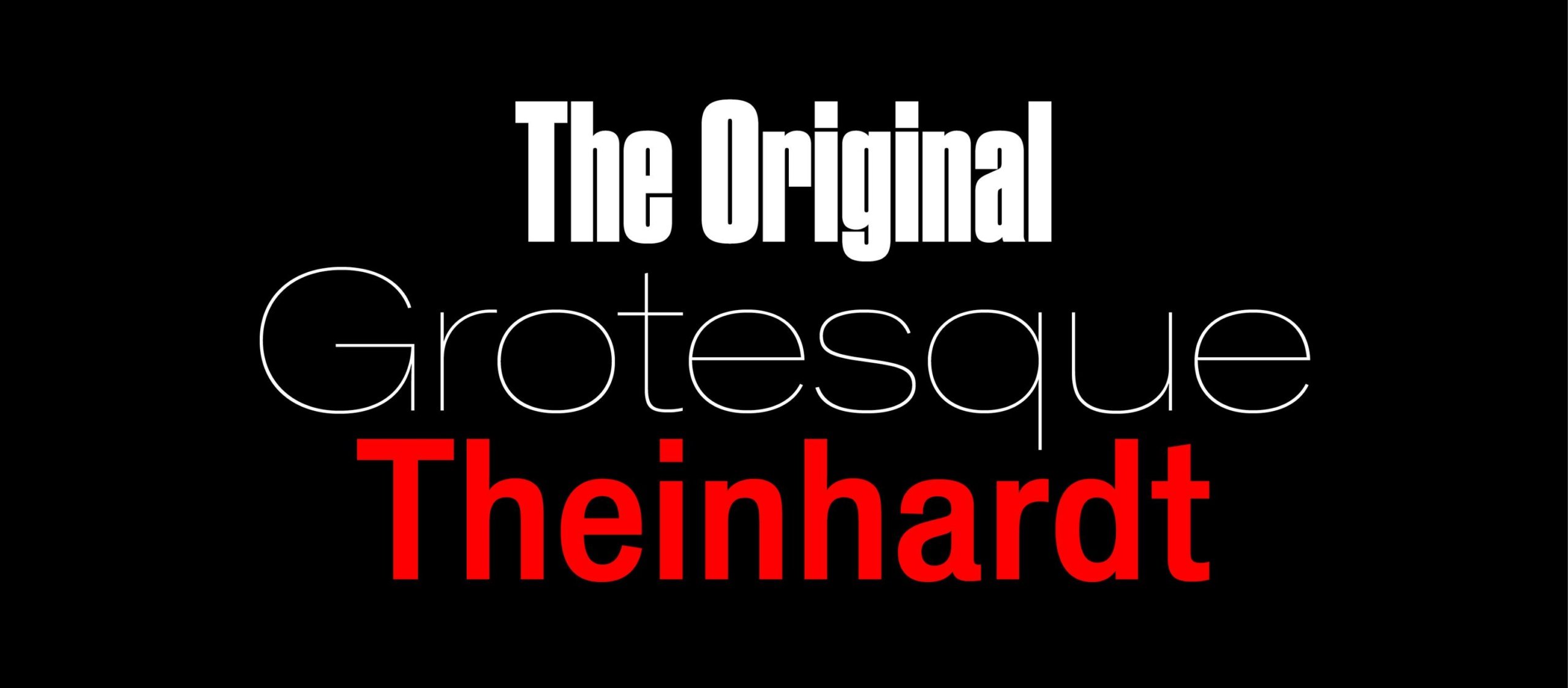
Theinhardt
In 2009, Swiss foundry Optimo paid homage to Ferdinand Theinhardt by creating a font named after him. Theinhardt, as we saw above, was the creator of Royal Grotesk, a typeface that helped popularise Akzidenz-Grotesk.
[1] Recently, the Commercial Type foundry created a digital version of Thorowgood’s Seven Lines Grotesque.
[2] Paul McNeil, The Visual History of Type, Laurence King, London, 2017
[3] Stephen Coles, The Geometry of Type: The Anatomy of 100 Essential Typefaces, Thames & Hudson, London, 2016
[4] Grotesk is the German translation of the word “grotesque”