
Table of Contents
New York, a city to ❤
New York, 1976. Our look at city branding had to start here. The famous “I ❤ NY” logo was one of the first created with the stated aim of promoting a city’s identity among tourists and remains one of the most iconic to this day. But it seems that the graphic design process was more complicated and muddled than is generally recognised. What is certain is that the final design was the work of Milton Glaser, hired by advertising agency Wells Rich Greene, who themselves had been commissioned by the New York State Department of Economic Development.
At the time, New York’s reputation was less than stellar: seen as chaotic, dangerous, dirty and grey, it needed a strong, marketable identity that was attractive to tourists. But the apparent simplicity of this famous logo is deceptive: in reality, it contains three different languages condensed into a single visual identity.
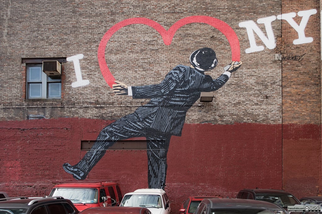
The three languages of I ❤ NY
• “I” is an actual word.
• The heart is a graphic symbol used in place of the verb “love” in a way that predates today’s widespread use of emojis by decades.
• N and Y are the city’s initials: not really words, but an abbreviation of them.
A word, a pictogram and an abbreviation: it’s in part thanks to this powerful blend that the logo became an icon recognised, loved and imitated around the world. The boost that this logo gave the city was enormous: more than just an exercise in branding, “I ❤ NY” not only helped improve the city’s image in the eyes of foreigners, it also generated a real sense belonging, a soul, a symbolic idea around which to unite, a pride that touched the hearts of all New Yorkers. So, resonating so strongly with visitors and residents alike, this logo truly is a great example of city branding.
Is Bologna. The freedom of a thousand identities
“Is Bologna” is the first co-generative logo for a city, designed to visually translate the infinite facets and perceptions that define what Bologna is,” says the website for this interesting city branding initiative. It mixes graphic design and the power of digital, something which you don’t see everywhere.
In this fascinating TEDxBologna talk, head of city branding Roberto Grandi tells us about the project’s objectives, and how it was the result of a long research and development process that included the use of big data. From this work emerged the idea of a city that was free and multifaceted, one that can be explored by tourists in all sorts of ways, all equally interesting. And so was born the idea of a logo that condensed complexity without reducing it: one that, through digital technology, could become infinite logos.
So, what is it? More than a brand, it’s a digital visual alphabet created from five graphic elements associated with historical symbols of the city. With this alphabet, anyone can write their own “visual words” that represent the way they experience the city: Food is Bologna, Culture is Bologna, Beauty is Bologna and so on. Rather than a logo that imposes a fixed visual identity on the citizen, it’s a solution that combines graphics, technology and interactivity to give each of us the chance to create our own logo based on the way we use the city. The brains behind the project are Michele Bartoli and Antonio Pastore, winners of an international contest held by the city to redesign its identity.
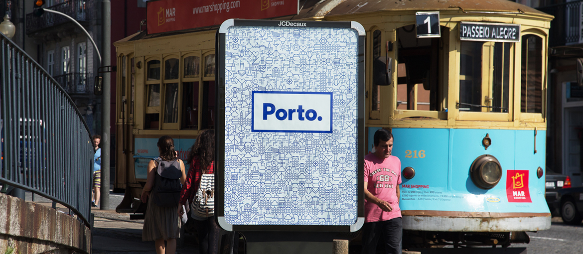
Porto, a mosaic of modernity and tradition
As we move from Bologna to Porto, we run into an idea that’s in some ways similar, and in others quite different. Again, it’s less about just a logo and more about an overall city branding project developed through the creation of a graphical alphabet: a set of recognisable symbols used to express every aspect of the city. But here the starting point is very different from Bologna: the graphical alphabet uses pictograms inspired by the typical decorations featured on azulejos, the traditional Portuguese tiles that have always been a hallmark of the city.
Porto’s city branding project has devised a compelling graphical mosaic that blends tradition and modernity in a surprisingly intuitive and versatile way: all the city’s qualities are represented while maintaining a clear stylistic coherence. From history to the future, from the sea to food, from culture to innovation: this is Porto’s soul, expressed through a strikingly successful exercise in city branding.
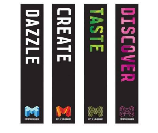
A flexible and malleable identity: Melbourne’s city branding
On the last leg of our journey, we take a long-haul flight to Australia and the Landor design agency in Sidney, which designed a new visual identity for… Melbourne. In this case, the complexity lay in the fact that the Australian city already had an array of different logos for its disparate programmes and services for residents and tourists: it’s a situation found in cities around the world. The result was a mishmash of incoherent signs and symbols that was unable to express a unique and consistent personality to residents or visitors. Melbourne lacked a soul.
The problem was brilliantly resolved with a modular system of logos based on the letter “M”. The “M” takes on different colours and patterns to convey the multiple aspects of the city, without losing visual and narrative coherence. As in the cases of Bologna and Porto, Melbourne moves beyond the idea of identity condensed into a single logo and sees it evolve into a design with a broader and more effective goal.
City branding: beyond the logo
As we near the end of our journey, it’s worth highlighting an important design principle for this type of exercise. As we’ve seen in our examples, the best city branding seems to emerge when the project is not confined to simply designing a mark or logo, but instead attempts a synthesis that embraces complexity. Starting with symbols from the city’s history, natural environment and urban context, we can build a true corporate image system, a modular visual system that succeeds in conveying the soul of the place while incorporating every side to the city.