

Table of Contents
When searching for handwriting fonts or italic fonts, it is easy to come across some confusion. Terms such as italic, script, handwriting and calligraphic are often used interchangeably, even though they refer to different types of typefaces designed for different purposes.
In this guide, you’ll discover:
- the differences between the main font categories;
- how to choose the right typeface for your project;
- the best free and professional fonts;
- where to download them safely;
- how to pair them effectively without making mistakes.
What is a handwriting font?
The term handwriting font generally refers to any typeface designed to resemble handwritten text. In reality, there are several typographic families, each with its own characteristics and ideal applications.
Script fonts
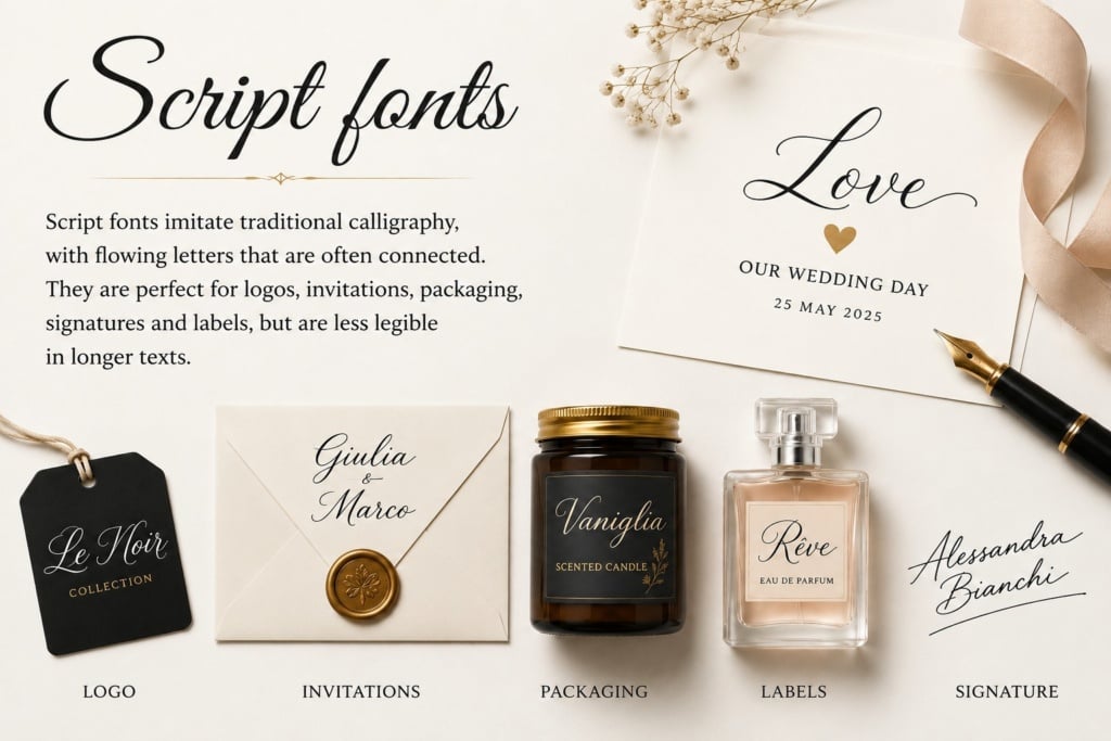
Script fonts imitate traditional handwriting, featuring flowing letterforms that are often connected. They are ideal for logos, invitations, packaging, signatures and labels, but are generally less suitable for long passages of text due to reduced readability.
Handwriting fonts
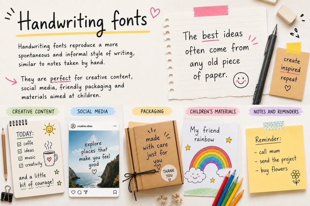
Handwriting fonts recreate a more spontaneous and informal style of writing, similar to handwritten notes. They are perfect for creative content, social media, friendly packaging and educational materials aimed at children.
Calligraphic fonts
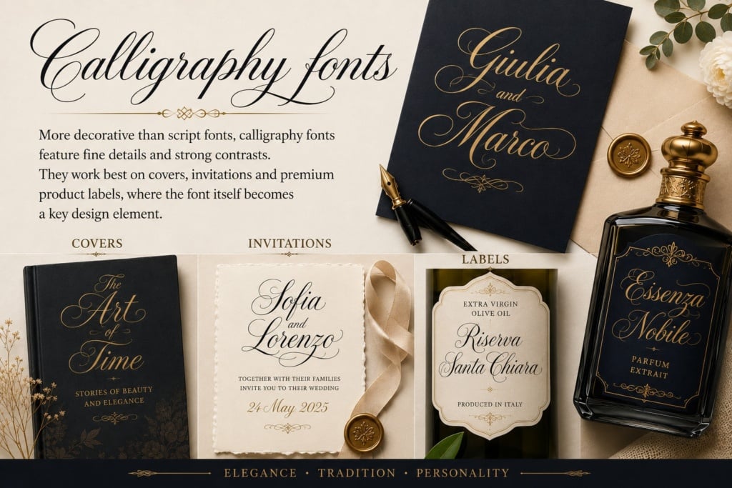
More decorative than script fonts, calligraphic fonts feature detailed strokes and strong contrasts. They work particularly well on book covers, invitations and premium product labels, where the typeface itself becomes a key design element.
Italic fonts
This is where one of the most common misunderstandings begins.
From a typographic point of view, italic is not a font category but a stylistic variant of a typeface family. Typefaces such as Garamond, Helvetica and Times New Roman include an italic version designed to emphasise words or short passages of text without compromising readability. This makes italics fundamentally different from script or handwriting fonts, which are specifically created to imitate handwritten lettering.
Did you know?
In typography, the correct term for a family such as Helvetica or Garamond is typeface, while a font refers to one specific variation within that family, such as Regular, Bold or Italic. Today, however, the word font is commonly used to refer to the entire typeface family as well.
Italic, script, handwriting and calligraphic fonts: what’s the difference?
Although they are often confused with one another, these font styles serve very different purposes.
| Category | Appearance | Best for | Avoid using for |
|---|---|---|---|
| Italic | Slanted version of a typeface | Emphasising words and quotations | Long paragraphs |
| Script | Flowing, connected letters | Logos, invitations, packaging | Long blocks of text |
| Handwriting | Natural handwritten style | Social media, creative content, educational materials | Formal documents |
| Calligraphic | Elegant and decorative | Events, certificates, premium labels | Small-size text |
The right choice depends on the context and the message you want to communicate, not simply on how attractive the typeface looks.
How to choose the right font
Before downloading dozens of fonts, ask yourself these three questions.
1. What impression do you want to create?
- Elegance → Script or calligraphic fonts.
- Creativity → Handwriting fonts.
- Professionalism → Serif or Sans Serif typefaces with a restrained use of italics.
- Modernity → Minimalist script fonts paired with Sans Serif typefaces.
2. Where will it be used?
A font intended for a logo can be far more decorative than one used in a brochure, packaging or a website, where readability remains the priority. Always consider the final medium and the context in which the typeface will be used.
3. How will your audience perceive it?
Every typeface conveys a different personality. Before choosing one, ask yourself whether it reflects the tone of your project and the expectations of the people who will read it. An elegant, creative or minimalist typeface can influence how a brand is perceived just as much as colours, imagery and content.
The most common mistakes
Many typographic issues are not caused by the font itself, but by the way it is used.
Avoid:
- setting entire paragraphs in calligraphic or script fonts;
- using more than two or three typeface families within the same project;
- choosing a font simply because it “looks nice”, without considering the context;
- overlooking the licence terms of fonts downloaded online.
Good typography is almost always understated: it supports the content without stealing the spotlight.
The best handwriting and italic fonts
Below you’ll find a selection of some of the most popular fonts among designers and creative professionals. For each one, we’ve included its style, ideal use, licence and a direct link to the official page so you can preview it straight away.
| Font | Style | Best for | Licence |
|---|---|---|---|
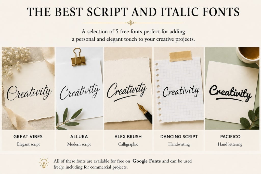
| Great Vibes | Elegant script | Invitations, weddings, premium packaging | OFL (free) |
| Allura | Modern script | Labels, brochures, invitations | OFL (free) |
| Alex Brush | Calligraphic | Logos, signatures, branding | OFL (free) |
| Dancing Script | Handwriting | Blogs, social media | OFL (free) |
| Pacifico | Hand lettering | Food, events | OFL (free) |
| Caveat | Natural handwriting | Presentations, infographics | OFL (free) |
| Patrick Hand | Handwriting | Educational materials | OFL (free) |
| Shadows Into Light | Informal | Social media | OFL (free) |
| Kalam | Handwriting | Notes, publishing | OFL (free) |
| Kaushan Script | Dynamic brush style | Posters, merchandising | OFL (free) |
| Satisfy | Flowing script | Covers, packaging | OFL (free) |
| Yellowtail | Vintage script | Retro branding | OFL (free) |
| Bickham Script Pro | Premium elegance | Fashion, luxury, branding | Adobe Fonts |
| Snell Roundhand | Classic calligraphic | Weddings, certificates | Adobe Fonts |
| Burgues Script | Elegant script | Beauty, jewellery | Commercial |
| Adorn Collection | Sophisticated | Luxury packaging | Commercial |
| Lavanderia | Vintage | Food & Beverage | Commercial |
| Aphrodite | Fashion | Fashion and cosmetics | Adobe Fonts |
| Signatura Monoline | Signature effect | Personal branding | Commercial |
| Amsterdam Signature | Modern signature | Logos, watermarks | Commercial |
Note: some commercial fonts distributed through marketplaces such as Creative Market or Envato do not have a permanent official webpage. In these cases, it’s best to search for the font by name directly on the marketplace or on the designer’s website.
How to pair fonts without making mistakes
Choosing a good font is important, but pairing it correctly can make the difference between an amateur-looking design and a professional one.
The simplest rule is this: create contrast, not competition.
Avoid pairing two fonts that look too similar or two highly decorative typefaces. In most cases, the best results come from combining a distinctive script font with a clean, highly legible typeface.
Recommended font pairings
| Pairing | Best for |
|---|---|
| Great Vibes + Montserrat | Invitations, weddings |
| Allura + Lato | Brochures and packaging |
| Alex Brush + Playfair Display | Elegant branding |
| Dancing Script + Poppins | Social media |
| Pacifico + Open Sans | Food & Beverage |
| Caveat + Roboto | Presentations |
| Bickham Script Pro + Garamond Premier Pro | Fashion and luxury |
Practical tip: in most projects, two typeface families are all you need: one for headings and one for body copy. If required, you can add a script font for signatures, quotations or small decorative details.
Which fonts work best in print?
A font that looks perfect on screen does not always produce the same result in print.
If you’re designing printed materials, it’s important to consider not only the appearance of the typeface but also its readability at the final printed size.
| Project | Recommended fonts | Why they work |
|---|---|---|
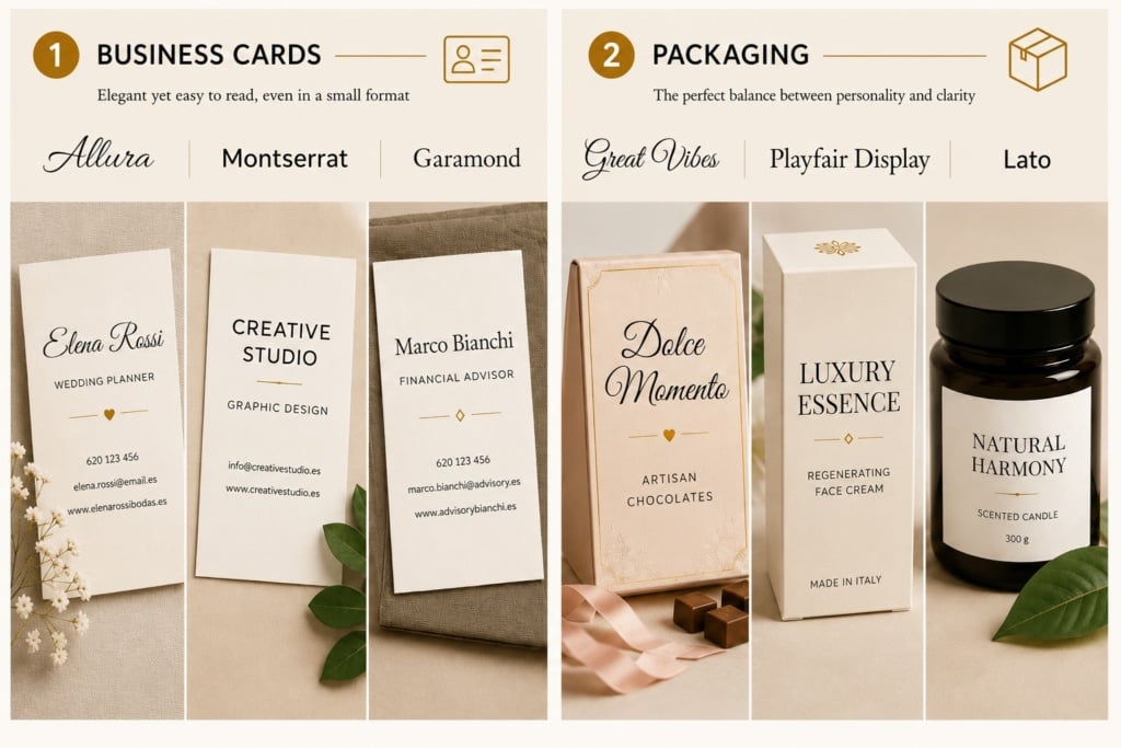
| Business cards | Allura, Montserrat, Garamond | Elegant while remaining legible in small spaces |
| Packaging | Great Vibes, Playfair Display, Lato | An excellent balance between personality and clarity |
| Labels | Alex Brush, Cormorant Garamond | Sophisticated without compromising readability |
| Catalogues | Garamond, Minion, Source Serif | Ideal for long-form text |
| Brochures | Playfair Display, Lora, Merriweather | Excellent readability and print performance |
| Posters | Pacifico, Bebas Neue + Script | Strong visual impact, even from a distance |
Your font choice should always be validated with a printed proof, especially when working with small text sizes or specialist print materials.
Where to download fonts safely
There are hundreds of websites offering font downloads, but not all of them provide the same guarantees in terms of quality, updates and licensing.
To avoid problems, it’s always best to rely on trusted platforms.
| Platform | Free fonts | Commercial use | Best for | Visit website |
|---|---|---|---|---|
| Google Fonts | ✔ | ✔ (Open Font License) | Web and print | Open |
| Adobe Fonts | Included with Creative Cloud | ✔ | Professional use | Open |
| DaFont | ✔ | Varies | Extensive font library | Open |
| FontSpace | ✔ | Varies | Free fonts | Open |
| MyFonts | ✖ | ✔ | Premium fonts | Open |
| Creative Market | ✖ | ✔ | Designers and branding | Open |
| Lost Type | Freemium | ✔ | Independent typefaces | Open |
Pay attention to licensing: a free font is not necessarily free for commercial use. Before using it in a logo, on packaging or in any product intended for sale, always check the licence terms provided by the designer or the platform.
Perfetto. Ecco la UK English – Tranche 4, conclusiva, mantenendo la stessa struttura, lo stesso contenuto e lo stesso tono della versione italiana. Ho utilizzato una terminologia naturale per il mercato britannico e coerente con il resto dell’articolo.
How to install a font
Once you’ve chosen your typeface, it only takes a few seconds to make it available in the main design and publishing software.
- Windows: open the .TTF or .OTF file and click Install.
- macOS: open the file using Font Book and click Install Font.
- Adobe Creative Cloud: Adobe Fonts are activated directly from your Creative Cloud library.
- Canva Pro: you can upload custom fonts through the Brand Kit.
- Microsoft Word and Office: once the font has been installed on your operating system, it will automatically become available in compatible applications.
If the font doesn’t appear immediately in the font list, simply restart the software you’re using.
7 tips for choosing the right font
Even the most attractive typeface can be ineffective if it’s used in the wrong context. Before making your final decision, keep these best practices in mind.
1. Prioritise readability
A highly decorative typeface may catch the eye, but if it’s difficult to read, it quickly loses its effectiveness.
For headings, logos or signatures, you can be more adventurous. For paragraphs and longer texts, simpler typefaces are usually the better choice.
2. Use italics sparingly
Italics are designed to emphasise words, quotations or short passages of text.
If overused, they can make reading more tiring and reduce their visual impact.
3. Don’t use too many fonts
Two well-matched typeface families are almost always enough.
Three is generally the maximum if you want to keep your design clean and consistent.
4. Always check the licence
Before using a font in a logo, on packaging or in any commercial project, make sure the licence allows the intended use.
This simple check can save you from legal issues and having to redesign your project later.
5. Test the font at its actual size
A typeface that looks perfect on screen may be difficult to read once printed.
If your project is intended for print, always produce a proof at the final size to check how it performs on the chosen material.
6. Keep your typography consistent across all materials
Your website, brochures, packaging, social media and catalogues should all share the same typographic identity.
A palette of two or three carefully selected typeface families helps make your brand instantly recognisable.
7. Let the content do the talking
Your typeface should support the message, not become the main attraction.
If readers notice the font before they notice the content, you’ve probably chosen the wrong typeface.
Final checklist
Before exporting your project, check the following.
✅ Is the typeface consistent with your brand’s tone of voice?
✅ Is it still readable at the final size?
✅ Does it work well both on screen and in print?
✅ Does the licence allow your intended use?
✅ Is it paired with no more than one or two secondary typefaces?
✅ Have you produced a print proof, if required?
Frequently Asked Questions
What’s the difference between an italic font and a script font?
An italic font is a slanted version of an existing typeface, used to add emphasis to text. A script font, on the other hand, is specifically designed to imitate handwriting and is mainly used for logos, invitations, signatures and other graphic elements.
Which are the best free fonts for imitating handwriting?
Some of the most popular options include Great Vibes, Allura, Dancing Script, Caveat, Patrick Hand, Shadows Into Light and Kalam, all available free of charge from Google Fonts.
Can I use a free font for a logo?
It depends on the licence.
Many free fonts also allow commercial use, while others are restricted to personal use only. Always check the licence terms provided by the designer before using a font in a professional project.
Which is the best website for downloading fonts?
If you’re looking for reliable free fonts, Google Fonts is generally the best choice.
Professionals looking for a wider selection will find extensive libraries on Adobe Fonts, MyFonts and Creative Market.
How many fonts should I use in the same project?
In most cases, two typeface families are enough: one for headings and one for body copy.
A script font can be added as a third element for signatures or small decorative details.
Which format is better: OTF or TTF?
Both formats are widely supported.
OTF (OpenType) fonts generally offer more advanced typographic features, such as ligatures, alternate glyphs and special characters, making them the preferred choice for professional projects. TTF (TrueType) fonts, meanwhile, provide excellent compatibility with older operating systems and software.
Handwriting fonts and italic fonts: making the right choice
Choosing a font isn’t simply about finding a typeface that looks attractive. It’s about selecting a tool that strengthens your message, improves readability and makes your project instantly recognisable.
Whether you’re designing a logo, a label, packaging, a brochure or content for the web, spending a little extra time choosing the right typeface can make a huge difference to the final result.
If you start by considering your project’s personality, check the licence, choose an effective font pairing and produce a proof before printing, you’ll already have completed much of the work needed to achieve a professional result.