
Table of Contents
A short guide to colour harmony: foolproof techniques for combining different colours
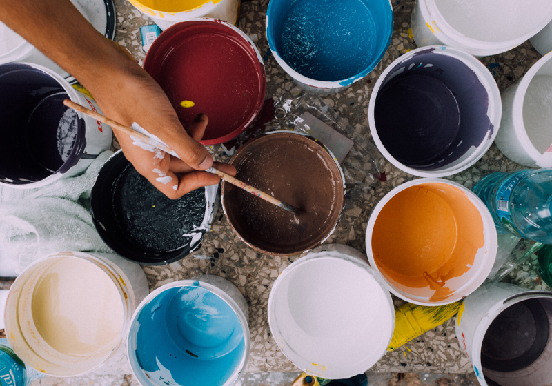
Which trousers shall I wear today? Which poster should I put up above my olive green sofa? Which colour should I choose for the buttons on my website? Decisions on colour combinations crop up in our everyday lives much more frequently than you might think!
We live in a world of colours and, through tints and shades, we can use them to convey states of mind and emotions. Although ultimately determined by personal taste, there are rules of thumb that can help us to create harmonious colours combinations.
Today we’re going to explain what colour combinations are and share with you some useful tips and tools.
Combining colours: what it means and why it’s important
Combining colours means taking two or more colours and placing them together or making them interact in a visual space. In fact, what’s fascinating about colours is that the perception of some of their attributes varies depending on the context in which they are found.

That’s right: colours are far from static and immutable. For example, when placed side by side, some colours mute one another, whereas others accentuate each other’s brightness and intensity. Some colours appear very close to others: on a dark background, a black object will appear closer to green. Colour combinations can also be used to create depth and movement in a composition.
Some colours are warm and others cool, but their perceived temperature changes depending on the context: a cool colour like blue may appear cooler than it really is when placed in a “warm” composition of mainly yellows or browns.
Communicating through colour combinations
Combining colours is also a way to communicate using a special visual language. It requires a bit of experience and knowledge of the basics, but the results can be incredibly useful for in all sorts of fields.
Graphic designers’ stock in trade is the combination of colours, which often involves experimenting with new forms of communication that challenge convention, while interior designers may use the rules of colour combination to create harmonies and, for example, make certain spaces brighter. But anyone can use the rules of colour harmony to try out a new idea for an outfit or to lend a more professional touch to a homemade flyer.
Combining colours is not always straightforward to master, but luckily there are some simple rules to follow that will help you find the right matches and guide you in experimenting.
The colour wheel: a key tool for combining colours
The main tool for understanding colour combinations is the colour wheel[2] . The best-known and most useful variant for matching colours is the so-called Itten wheel.

Colour wheels are especially useful because they order colours and, in so doing, enable you to find the right combination or colour harmony. Itten’s colour wheel is a circle of colours organised into primary colours, secondary colours and tertiary colours.
We’re now going to look at some of the rules that govern colour combination so that we can create palettes: these are sets of harmonious colours that you can use for projects. And don’t forget that there are lots of online tools that you can use for this! [In this article, we explain what a colour palette is and how to create one online].

Rules of thumb for combining colours
Three-colour combinations: complementary colours
Complementary colours enhance one another: this colour combination therefore gives very bright results!
But what are complementary colours? They are those that are found opposite each other in the colour wheel. For example: yellow and purple, red and green or blue and orange.

Three-colour combinations
What happens if we add a third colour to our palette? Three-colour combinations can be really compelling. One approach is to use split complementary colours: you take a colour and combine it with two others that are found to the left and right of its complementary colour.

This too creates a bright, high-contrast effect, but one that is less aggressive than two complementary colours. Another rule of thumb when combining three colours is to always pick a dominant colour and use the other two as accompaniments in your compositions.
Let’s look at an example: a colour palette might comprise purple and its split complementary colours, orange yellow and green yellow. This colour combination can be used to decorate a living room whose dominant colour is green and that is brightened up with splashes of purple and orange.


Another three-colour scheme is the triad or triadic harmony, which brings together three equidistant colours on the colour wheel. With this approach, you can combine three very vibrant colours like yellow, red or blue to achieve a bright effect. Or you can pick softer tones like pastels for a more reflective and relaxing ambiance.

Combinations of three or more colours: analogous, monochrome and tetradic colours
Colour palettes can contain more than three colours, but you need to make sure that they are balanced and choose one dominant colour. One option is to choose analogous colours, in other words three (or more) colours that are next to each other in the colour wheel.

This approach ensures that your composition is harmonious, so it’s hard to go wrong. Here’s a very similar palette applied to interior design.

Monochrome colour combinations work in a similar way: you take a base colour and just change the tint, tone and shade. It’s a very conservative choice for harmonious colour palettes. But the results can be anything but boring. Here’s an example of a monochrome colour scheme from the Wachowskis’ cult film The Matrix.

A far more daring approach is tetradic harmony, which involves choosing four colours that are equidistant from one another on the colour wheel. [For a deep dive on colour harmonies, read our article “The colour wheel: what it is and how to use it”]
Ready to experiment with new colour combinations for your projects?