
Table of Contents
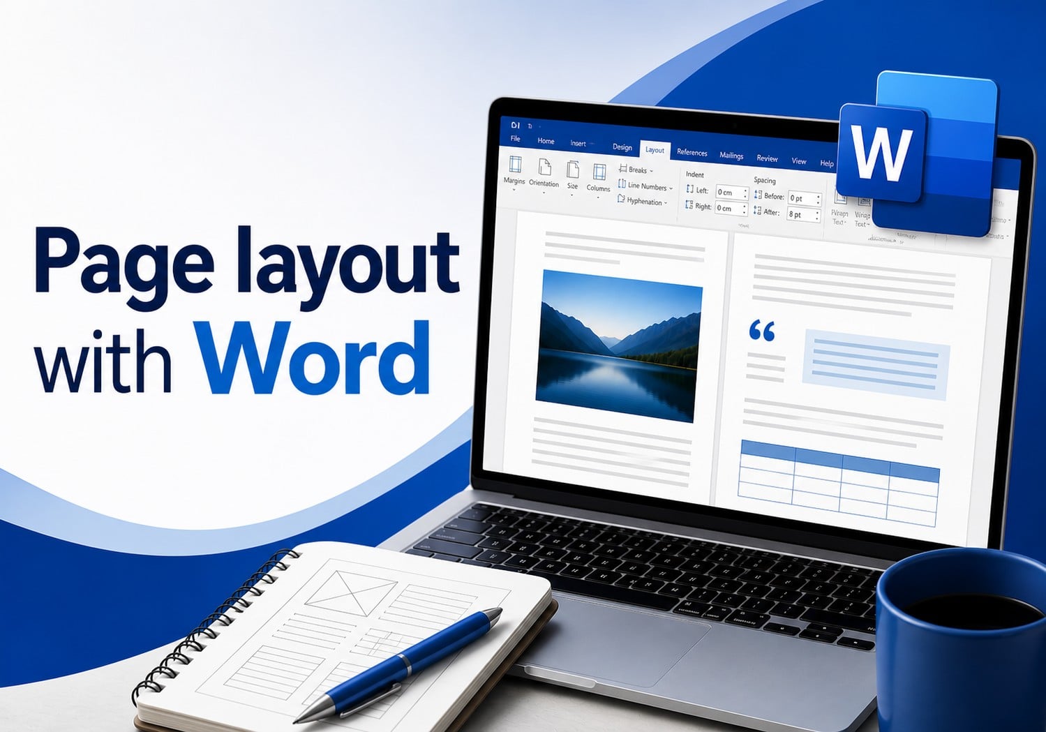
Microsoft Word is one of the most widely used tools for writing documents, yet it is often underestimated when it comes to layout design. In reality, when used correctly, Word allows you to create clean, readable layouts that are ready for professional printing.
Whether you are working on a university dissertation, a book, a business report or a small magazine, learning how to design a layout in Word means turning a simple text into a clear, consistent and enjoyable document to read.
In this guide, we will look step by step at how to:
- properly set up a document in Word;
- organise content effectively;
- manage images and page numbering;
- create an automatic table of contents;
- export a print-ready PDF.
What does it mean to design a document layout?
Many people confuse writing a document with designing its layout, but the two are very different tasks.
Writing means producing textual content. Layout design, on the other hand, means organising that content visually so that it is readable, well-structured and consistent.
Good layout design helps to:
- improve readability;
- give the document a professional appearance;
- make information easier to consult;
- prepare files correctly for print or digital distribution.
Even high-quality content can appear unprofessional if it contains issues such as:
- irregular margins;
- misaligned images;
- inconsistent fonts;
- random spacing;
- poor page numbering.
For this reason, it is important to set up the document correctly before you even begin writing.
A well-designed document layout does more than simply improve the appearance of the page: it makes reading smoother and immediately conveys greater care and professionalism. This is particularly important for materials intended for print, such as books, brochures, catalogues or magazines.
Before you start: setting up your Word document correctly
Choosing page size and orientation
The first step towards a well-designed Word document is defining the page size.
In most cases, the following formats are used:
- A4 for standard documents;
- A5 for books or booklets;
- portrait orientation for text-based documents;
- landscape orientation for tables or presentations.
For example, many professional books, catalogues and booklets printed with Pixartprinting are designed in A5 format because it offers an excellent balance between readability, practicality and printing costs.
In Word, these settings can be adjusted via:
Layout → Size → Page Setup
and
Layout → Orientation
Choosing the correct format from the outset helps avoid problems later on and allows you to work with proportions that are already close to the final printed result.
Setting margins and binding
Margins have a major impact on document readability.
Margins that are too narrow can make the text feel cramped, while margins that are too wide waste valuable space.
For a professional-looking document, it is common to use:
- 2–2.5 cm margins on each side;
- a slightly larger inner margin if the document will be bound.
In Word, this setting can be found under:
Layout → Margins
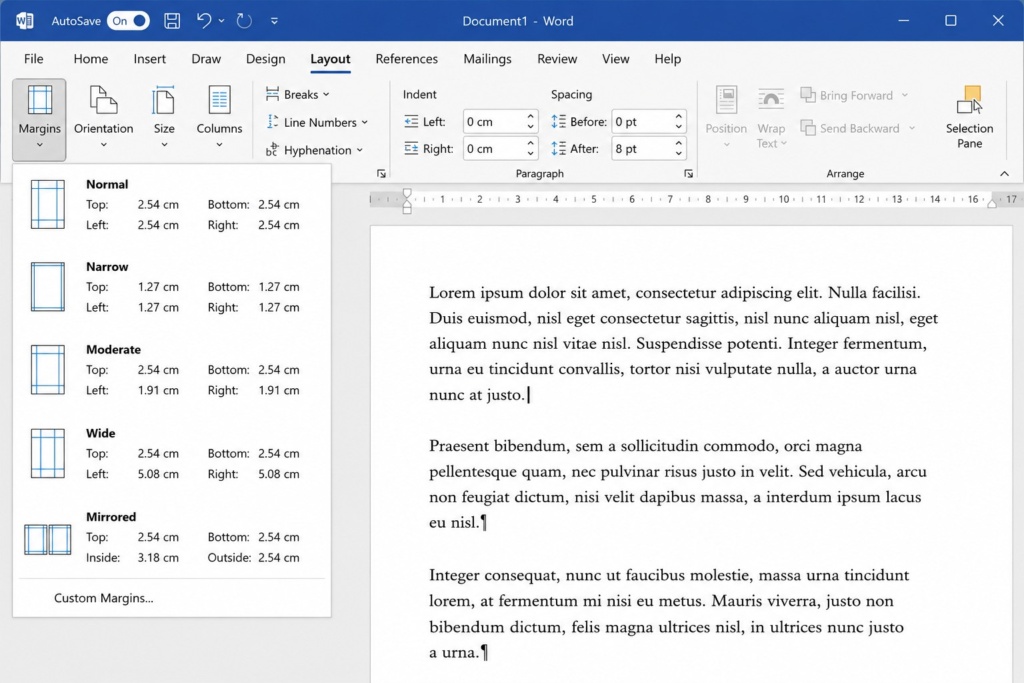
If you are preparing a book or dissertation, you can also use:
- “Mirror Margins”;
- “Gutter”.
These settings help keep the text readable near the spine and improve the overall balance of the page.
Many documents that look perfectly fine on screen become difficult to read once printed because of inner margins that are too narrow. This is a very common mistake, especially in books and multi-page catalogues.
If the document is intended for professional printing, it is always advisable to consider from the very beginning:
- the type of binding;
- the number of pages;
- the final product format.
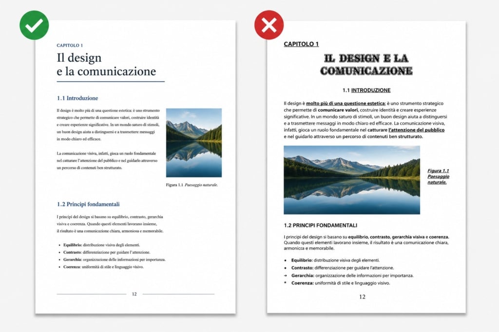
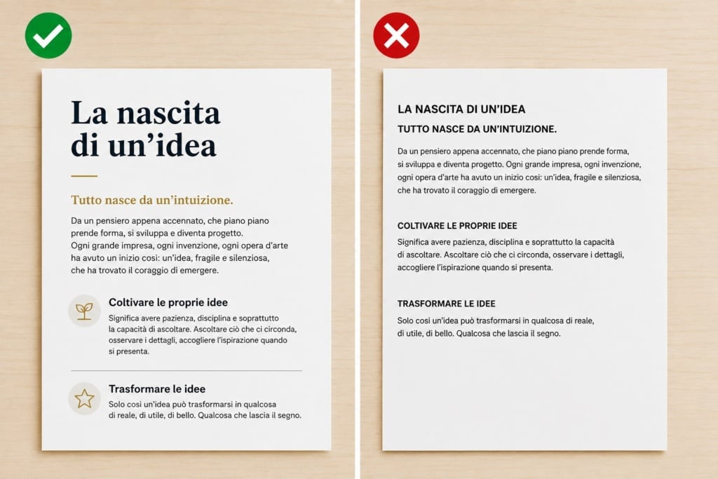
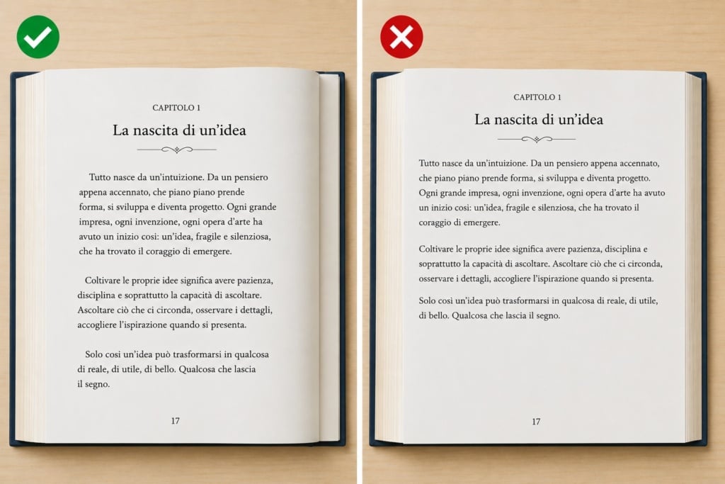
Choosing fonts, sizes and line spacing
Good layout design starts with typographic consistency.
For long texts, it is best to use readable fonts such as:
- Times New Roman;
- Garamond;
- Georgia;
- Calibri.
As a general rule, try to maintain:
- body text size: 11–12 pt;
- line spacing: 1.15 or 1.5;
- black text on a white background.
Avoid using too many different fonts within the same document. It is far better to maintain visual consistency by using a single font family with well-balanced variations for headings, subheadings and body text.
To adjust line spacing and paragraph settings in Word:
Home → Paragraph
For printed documents, it is also advisable to avoid fonts that are too thin or decorative: they may look elegant on screen, but on paper they can become difficult to read, especially at smaller sizes.
How to organise text professionally
Using Word styles
One of the most important — and most overlooked — features in Word is the styles system.
Styles allow you to apply automatically:
- sizes;
- hierarchies;
- colours;
- spacing;
- consistent formatting.
For example:
- Heading 1 → chapters;
- Heading 2 → main sections;
- Heading 3 → subsections.
Using styles is not just about improving aesthetics:
it is also essential for generating an automatic table of contents.
In lengthy documents such as manuals, books or dissertations, using styles from the beginning also makes it much easier to update the entire layout without manually editing each heading.
Managing paragraphs and spacing
Many users create space between paragraphs by pressing Enter multiple times. This is a very common mistake.
The correct approach is to manage:
- spacing before;
- spacing after;
- indentation;
- line spacing.
All these settings can be found in Word under:
Home → Paragraph
This keeps the document organised, consistent and easy to edit.
Proper spacing also helps create a cleaner and more professional-looking page, significantly improving the reading experience.
When to use justified text
Justified text aligns content evenly on both the left and right sides, creating a cleaner and more editorial appearance.
It is widely used in:
- books;
- magazines;
- catalogues;
- dissertations.
In novels and printed catalogues, for example, justified text is often used to create more uniform and visually balanced pages.
However, if the text contains many long words or narrow columns, justification can create irregular gaps between words.
In these cases, it may be better to consider:
- automatic hyphenation;
- left alignment.
Headers, footers and page numbering
How to number pages correctly
Page numbering is essential in long documents.
In Word:
Insert → Page Number
You can choose:
- position;
- style;
- number format.
For professional documents, it is often useful to divide the file into sections.
This allows you, for example, to use different numbering systems for:
- cover pages;
- contents pages;
- main body text;
- appendices.
Making the first page different
In many cases, cover pages or title pages should not display a page number.
Word makes this easy through:
Header & Footer → Different First Page
This setting is especially useful for dissertations, books and editorial documents intended for print.
Managing different sections
Section breaks are essential for:
- changing page orientation;
- modifying headers and footers;
- restarting page numbering;
- creating complex layouts.
Many layout problems arise precisely because sections are used incorrectly.
For this reason, it is worth learning how to use them properly from the early stages of the project, especially when working on longer multi-page documents.
How to create an automatic table of contents in Word
One of Word’s greatest advantages is the ability to generate an automatic table of contents.
To do this correctly, you must first apply heading styles consistently throughout the document.
Then simply select:
References → Table of Contents
Word will automatically generate:
- chapters;
- subsections;
- page numbers.
The table of contents can be updated at any time with a single click.
This is particularly useful for:
- dissertations;
- manuals;
- catalogues;
- ebooks;
- long business documents.
In professional documents, an automatic table of contents also offers a major practical advantage: it keeps page numbers and document structure updated automatically, even after significant layout changes.
Inserting images, tables and graphics without ruining the layout
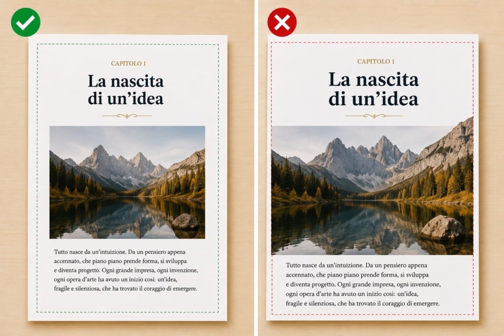
Managing images correctly
Images are often the main cause of unstable layouts in Word.
To avoid problems:
- use high-quality images;
- avoid copying and pasting directly from the web;
- set text wrapping correctly.
The most useful options are:
Layout Options → Square or In Line with Text
For documents intended for print, it is also important to check that images and graphics maintain the correct proportions and do not become distorted after resizing.
Pay attention to image resolution for print
An image that looks sharp on screen may appear pixelated once printed.
To achieve good print quality:
- use 300 DPI images;
- avoid compressed screenshots;
- do not enlarge images that are too small.
Many users work with images downloaded from the web without realising that print requires a much higher image quality than screen display.
Tables and charts
Tables should be:
- simple;
- easy to read;
- consistent with the rest of the document.
Avoid:
- excessive colours;
- heavy borders;
- overcrowded cells.
In catalogues, brochures or business reports, an overly complex table can compromise the clarity and cleanliness of the entire page.
How to layout a book or magazine in Word
Is Word suitable for editorial layout design?
It depends on the project.
Word is ideal for:
- simple books;
- novels;
- dissertations;
- manuals;
- reports;
- small catalogues.
For highly complex editorial projects, software such as Adobe InDesign offers greater control.
However, Word remains an excellent solution for those looking for:
- simplicity;
- speed;
- accessibility;
- collaboration features.
For example, many independent authors and small publishers use Word to prepare drafts and layouts that are later printed as professional books or booklets.
Setting up a book format
When laying out a book, it is advisable to:
- use mirror margins;
- set facing pages;
- define a consistent style;
- maintain uniform chapter formatting.
A coherent structure across headings, numbering and spacing helps give the book a far more professional and organised appearance.
Managing facing pages
In book layout mode:
- odd and even pages use different margins;
- the spine is automatically taken into account;
- the reading experience feels more natural.
This setting is particularly useful for double-sided printing and bound documents.
Preparing a Word file for print
Final document checks
Before exporting the file, always check for:
- spelling mistakes;
- missing images;
- inconsistent fonts;
- correct page numbering;
- alignment issues;
- spacing problems.
A final review can prevent extremely costly printing mistakes.
Many issues that go unnoticed on screen become immediately obvious once printed on paper.
Exporting a proper PDF
PDF is the best format for preserving document layout.
In Word:
File → Export → Create PDF/XPS
For documents intended for print:
- choose high quality settings;
- embed fonts;
- check margins and images carefully.
Most professional print providers require properly exported PDF files because they help preserve layout stability and avoid unwanted changes during printing.
If the document is intended for professional printing — such as books, catalogues or brochures printed with Pixartprinting — it is always advisable to carry out a final PDF check before sending the file.
Standard PDF vs print-ready PDF
A PDF intended for print requires:
- high-resolution images;
- stable layout formatting;
- embedded fonts;
- correct dimensions.
A PDF designed purely for web use, on the other hand, is usually lighter and more compressed.
The difference may seem minor on screen, but in print it can have a huge impact on the final quality of the document.
Layout mistakes that only become visible after printing
Some problems are almost invisible on screen but become obvious once the document has been printed.
The most common issues include:
- images that appear sharp on screen but are too small for print;
- inner margins that are too narrow near the binding;
- graphic elements placed too close to the page edge;
- fonts that are too thin;
- PDF files exported with excessive compression;
- blacks that appear weak or difficult to read.
For this reason, it is always recommended to review the final file carefully before printing, especially for books, catalogues or multi-page brochures.
The most common Word layout mistakes
Here are some of the most common mistakes:
| Mistake | Consequence |
| Using too many fonts | A messy-looking document |
| Adding manual spaces | Unstable layout |
| Not using styles | Unusable table of contents |
| Low-quality images | Pixelated print results |
| Incorrect margins | Binding problems |
| Manual page numbering | Page numbering errors |
| Using multiple line breaks for spacing | Difficult-to-edit document |
FAQ: frequently asked questions about layout design in Word
How do you properly layout a Word document?
To properly layout a document, you need to set margins, fonts, line spacing, styles, page numbering and images consistently and logically.
Is Word suitable for laying out a book?
Yes, Word is suitable for simple books, novels, manuals and dissertations. For more complex editorial projects, professional desktop publishing software may be a better option.
How do you create an automatic table of contents?
You need to apply heading styles to the different chapters and then use:
References → Table of Contents
What is the best format for printing?
A high-quality PDF is generally the best option because it preserves the layout of the document accurately.
What margins should you use when printing a book?
It depends on the format and binding type, but in general it is advisable to increase the inner margin to make reading easier near the spine.
Conclusion
Learning how to create a layout in Word means going beyond simple writing and developing a method for organising printable content professionally.
With the correct settings, it is possible to create documents that are:
- organised;
- easy to read;
- visually consistent;
- ready for print or digital distribution.
From managing styles to exporting the final PDF, every detail contributes to the overall quality of the result.
Even when using an accessible tool such as Microsoft Word, good layout design can make a huge difference to both the reading experience and the professional perception of the document.
Once the layout has been completed and the final PDF checked, the file can be used digitally or sent to print to create professional books, brochures, catalogues and magazines with Pixartprinting.