Table of Contents
The advent of desktop publishing
The advent of desktop publishing revolutionised the graphic design profession. The ease and speed of image reproduction and the ability to effortlessly put together text and images saw computers with desktop publishing software rapidly replace traditional typesetting methods. From the eighties onwards, a computer and a digital printer were all that was needed for DIY printing, doing away with the specialist knowledge and equipment that was hitherto necessary.
But while desktop publishing has democratised and speeded up the designing and printing process, enabling much more experimentation along the way, it has also resulted in a gradual distancing of the designer from the production process, creating a divide between the design phase and the production phase.

The return of letterpress printing
The traditional setting of movable type for letterpress printing which, barring a few tweaks here and there, was the standard production process for all printed materials for over four centuries, was quickly replaced first by phototypesetting and offset printing, and then by desktop publishing and digital printing.
Cases full of metal and wooden types of every size and font, typesetting materials and every kind of press, from the screw press to linotype and monotype machines, all suddenly became obsolete.
In recent years, however, techniques from the analogue printing world have been making a comeback, throwing into sharp relief a digital aesthetic based on repeatability and regularity. After a few decades spent in the dustbin of history, letterpress printing machines and materials are finding a new lease of life.
Letterpress printing is extremely labour-intensive and time-consuming compared to other methods but, when done well, the end result achieves an incomparable level of detail and charm.
The value of letterpress printing today lies not only in the results it achieves, but also in the design constraints it imposes: developing a composition idea involves the manipulation of physical objects, each with their own shape, weight and colour, which have to be fitted together in metal grids; even white spaces are objects in traditional typesetting.

The educational value of movable type
Setting movable type requires you to abstract visual space from reality and imagine the result in your head, without recourse to a screen. The educational benefit of using production techniques that are no longer in use has been repeatedly highlighted by teachers and designers. Rather than stifling creativity, the materials’ physical constraints stimulate it, encouraging problem-solving by using the tools at your disposal. Various universities, such as the Royal College of Arts, the London College of Communication and the New York School of the Arts, offer extremely well-equipped workshops and courses dedicated to trying out letterpress printing.
Forward-looking experiments in movable-type printing
Presses that went for a few hundred dollars at the turn of the century are today changing hands for tens of thousands. Many far-sighted designers and artisans have managed to salvage high-end equipment and create their own workshops, such as Officina Tipografica Novepunti in Milan, or New North Press and Thomas Mayo in London. An endless source of inspiration for letterpress devotees is the Type Archive. Its collection holds moulds, matrices and punches from some of the world’s most famous wood and metal type foundries.

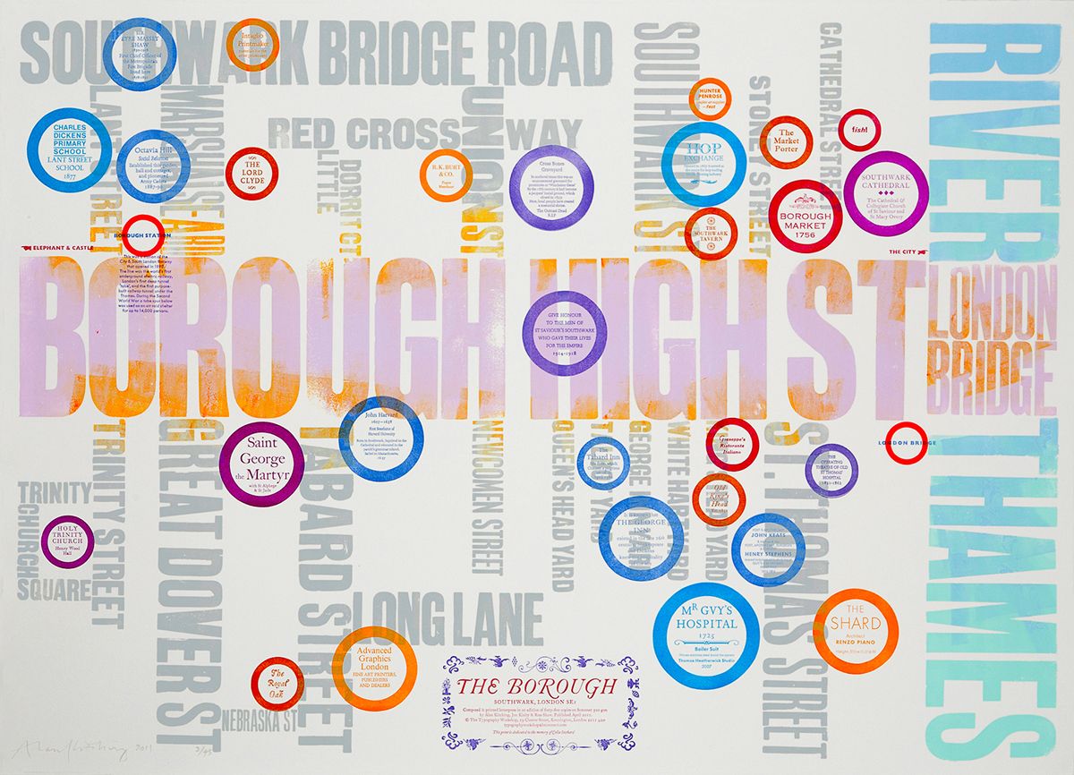
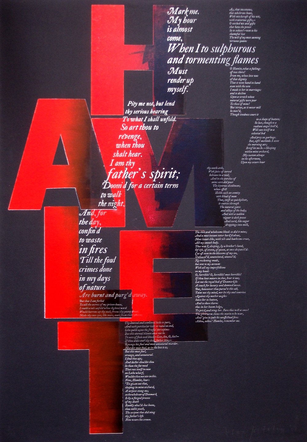
It’s not a case of simple nostalgia for lost arts, but a revival aimed at innovatively employing traditional techniques, combining old technologies with new ideas and content and using typesetting as an expressive language, rather than just a utilitarian tool. The use of movable type is being adapted for modern communication. The work of Alan Kitching, the British designer and teacher internationally renowned for his innovative use of wooden and metal type, provides an excellent example of this trend. Alan Kitching started his career as a young apprentice compositor. It brought him into contact with modern design and sparked his interest in typography. In 1988, Kitching started his own business. “I didn’t really know what I was going to do but I wanted to buy a press and movable type and go and print somewhere,” he recalls. At the same time, he started teaching typography at the Royal College of Art, where he taught several generations of students the art of letterpress printing, keeping it alive and turning it into a new form of expression. Kitching’s involvement in teaching continues today with “The Typography Workshop”, recently established in collaboration with Kelvyn Smith. The project gives participants the possibility of developing a letterpress project, while being guided and taught by the designer, both in the design and production phase.
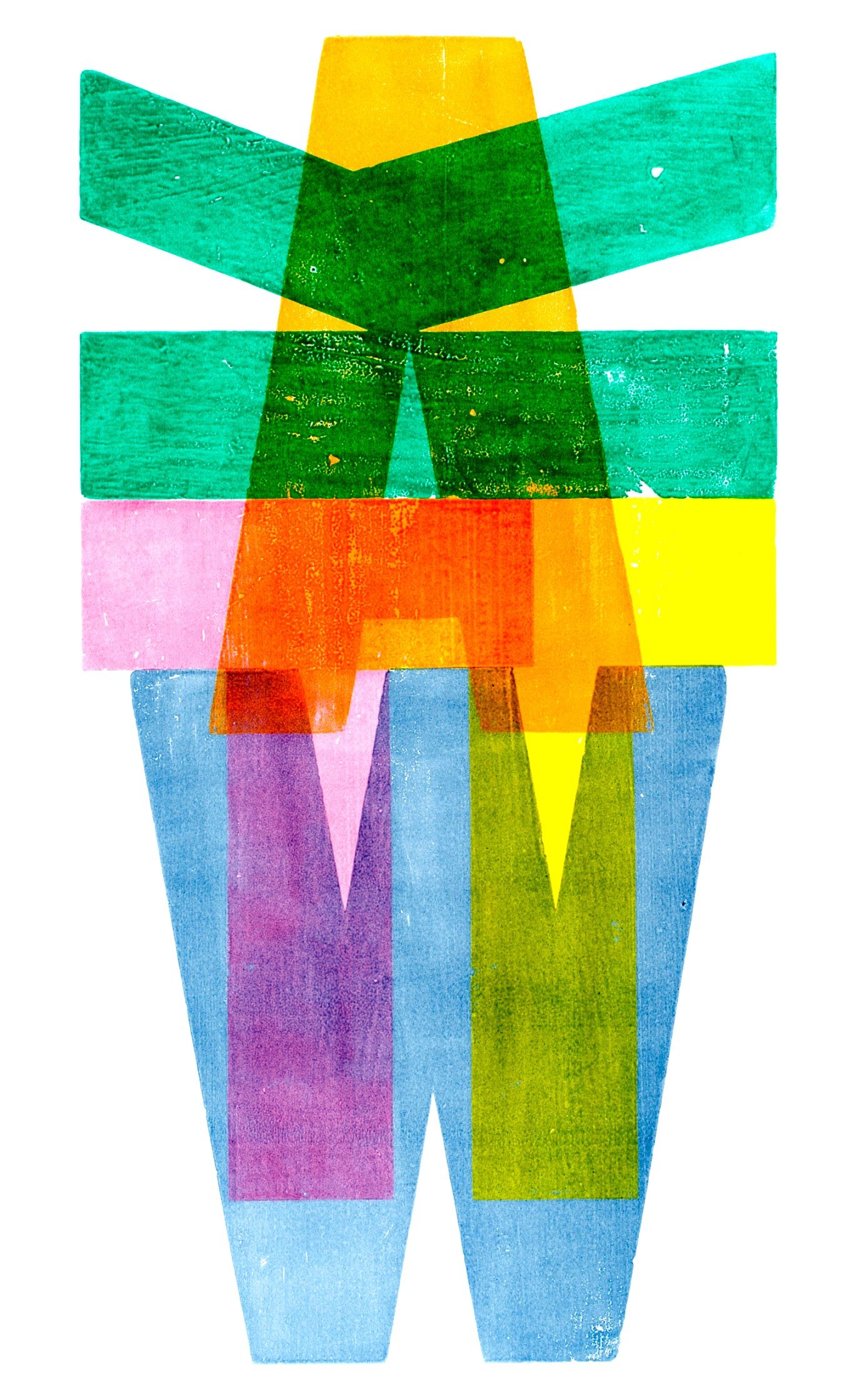
Kitching’s work features both personal projects and commercial commissions. His clients include The Guardian, for whom he has done typographic work for over 14 years, showing how letterpress printing is not just appreciated by a select few, but by the general public too. By using movable wooden type and harnessing the power of overlaps, the properties of ink and the texture of wood, Kitching’s work straddles the boundary between typography and illustration.

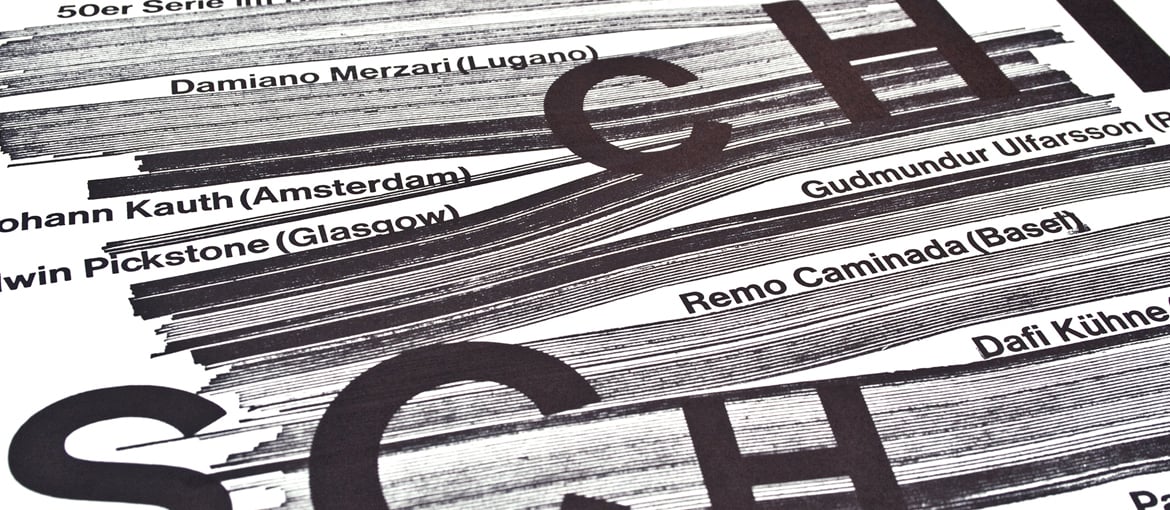
Another extremely interesting body of work belongs to Dafi Kühne, the Zurich-based graphic designer and typographer who blends contemporary graphics with old techniques. Since 2009, he has been designing and printing paper artefacts for various clients from his Babyinktwice studio. As well as a computer, he uses tools like manual letterpress machines from the sixties, wooden and metal type, laser cutters for wood, plexiglass and linoleum, and polymer plates . These tools and machines give the designer complete control of the design and production process, from colours and paper to pressure and ink. Dafi Kühne’s goal is quite simply to find the right tools to turn his ideas into reality and meet the needs of his clients. Kühne might find an analogue source of inspiration for a project, then use a computer to produce a print matrix, which will then be physically made using various different tools, and then used in a printing press.
The experimental blending of traditional printing with modern techniques also lies behind the A23D project (read more about it here), a 3D-printed letterpress font commissioned by Richard Ardagh, a graphic designer and partner at New North Press, designed by A2-Type and physically produced by model-making specialists Chalk Studios.
Rather than being antithetical to digital design, letterpress printing, as the examples above show, has been revived by the possibilities offered by new technology.

