
Table of Contents
The Museo Bodoniano in Parma
“The more classic a book, the more appropriate it is for the beauty of the characters to shine on their own”. So said Giambattista Bodoni, the typographer from Saluzzo in Piedmont, northern Italy, who changed the history of typography forever. The extraordinary legacy left by this artist, a skilled typographer, designer and publisher, is preserved in the Musei Bodoniano in Parma, Italy’s oldest printing museum.
Bodoni – a brief biography
Born in 1740 in Saluzzo in Piedmont, north-west Italy, Bodoni gained experience in his father’s printing workshop before continuing his training in Rome. It was there, while working for the Catholic Church’s Propaganda Fide printing house, that he first encountered Oriental characters, which would heavily influence his work. Bodoni’s big break occurred in February 1768, when he was hired by Duke Ferdinand of Parma to set up the Stamperia Reale, or royal press, in Parma, where he remained director for the rest of his life. This gave him the chance to start producing his own typefaces and to create various multilingual publications that saw his fame spread across the world. During this period, Bodoni also started to study the shape of the letters of the alphabet, and in 1788 he published his first Manuale Tipografico, an inventory of typefaces that contained 100 roman, 50 italic and 28 Greek alphabets. In 1791 he opened his own printing works, where he would go on to produce all of his masterpieces.

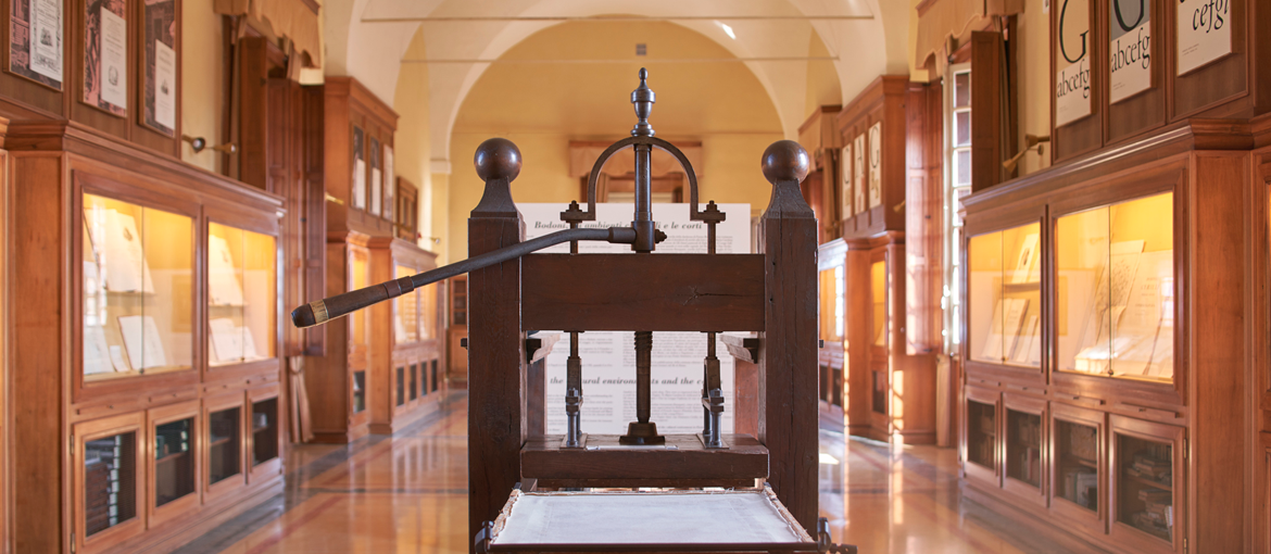
The museum’s structure
The Museo Bodoniano contains 1,000 works published by Bodoni, including some extremely rare items made of silk and parchment, over 80,000 tools from Bodoni’s print works, more than 12,000 letters and numerous documents and essays on typography from leading Italian and foreign foundries. The materials are divided up into three sections:
- Print before Bodoni: a series of volumes illustrate how the printed book developed from the second half of the fifteenth century to the early 1700s.
- Bookmaking: this section explains all the various stages involved in the design and production of a book, through the extraordinary collection of Bodoni’s printing tools and some archive documents.
- Giambattista Bodoni: a selection of the works produced by the Piedmontese typographer, laid out chronologically, allowing visitors to appreciate how Bodoni’s style developed from his early, highly ornate publications from the Ducal Printing Office to his later private creations, where the neoclassical clarity and simplicity of the design gave the typeface a central role.
Finally, two sets of display boards illustrate the graphical evolution of the printed page from the fifteenth century to the nineteenth century, suggesting major points of contact between publishing and other art forms, and the evolution of the typographic character from its origins to the nineteenth century, showing the efforts made by designers, engravers and typographers over the centuries to improve typefaces’ clarity and legibility.
Bodoni’s ‘typographic revolution’
Bodoni dedicated his life not only to studying typefaces, but also to the graphical layout of books and printing techniques. His work was based on honing the most ancient of practices, such as creating characters by hand, but at the same time he radically changed books’ appearance thanks to a completely new approach to layout.
He gradually abandoned the baroque and rococo style of his early work, and introduced a taste for neoclassical design to the world of publishing. He banished decorative frames and images (typical features at the time) from his books, leaving space for geometric harmony and the simple elegance of modern roman typefaces, which were the only real point of interest on the page. His search for the perfect balance between the printed elements and the empty spaces, combined with a new way of putting together frontispieces and dedications and the uniform appearance of the fonts he used, make his works true masterpieces in terms of both style and readability.
Some of Bodoni’s works in the museum
Manuale Tipografico – 1788
This first collection of typefaces, published in 1788, included 100 roman and 50 italic alphabets. His ‘Serie dei caratteri greci‘ (‘Series of Greek typefaces’), published the same year, contained 28 alphabets. On the page below Bodoni uses his largest font, Papale, to pay homage to his hometown of Saluzzo.


Oratio Dominica – 1806
This immense work contains a translation of the Lord’s Prayer in 155 languages. and is the most comprehensive catalogue of old typefaces in existence. It contains over 215 different fonts, including Roman, Greek and exotic alphabets. Apparently Bodoni decided to create it when Pope Pius VII told him about a similar work in 150 languages published in France, which spurred him on to create an even more extensive edition. Bodoni created 97 different exotic typefaces for this book, far exceeding the edition produced by the French Imprimerie Nationale.

Homer’s Iliad – 1808
This work in three volumes is undoubtedly one of the most significant of the many works Bodoni produced. The typographer from Saluzzo created two copies of it on Bavarian parchment: the first dedicated to Napoleon (now at the Bibliothèque Nationale in Paris) and the second for the viceroy of Italy, Eugène Rose de Beauharnais, now held in the Biblioteca Palatina, adjacent to the museum. This gargantuan work took Bordoni five years, during which he had to found a huge number of new Greek characters. The frontispiece shown below, a masterpiece of elegance and balance, is a perfect example of the ‘pure typography‘ the Piedmontese master strived for, in which fonts and empty spaces are the only decoration on the page.

Manuale tipografico del cavaliere Giambattista Bodoni – 1818
This manual in two volumes, published posthumously by Bodoni’s widow, is the true ‘typographic legacy‘ of the famous printer, and its 600 pages contain an infinite variety of roman, Greek and Oriental characters along with a wide range of flourishes and symbols, including musical notation.
In the long preface to the manual, which has become a classic text on the art of typography, Bodoni sets out some of his main aesthetic principles, including the four key characteristics a type family should have:
- a uniform design
- clarity
- good taste
- grace
By grace, Bodoni means the elegance “with no trace of affectation or ostentation” that had always inspired him. A digital version of the work is available to browse online, along with other books by the same author.
Bodoni’s typefaces today
Over the last two centuries, many Italian and foreign foundries have created digital fonts inspired by Bodoni’s typefaces, which are used by graphic designers and creatives in their publishing or marketing work. Here are some of the most interesting projects completed in Bodoni-inspired fonts.
Bodoni – an illustrated biography
When Giorgio Camuffo set out to create an amusing illustrated biography of Bodoni, he was inevitably going to be inspired by Bodoni’s fonts. The book recounts the most important episodes in the typographer’s life, as well as a few little-known anecdotes, abandoning the pompous style of previous books and revealing the more human side of the famous typographer.

The Library of Babel – Franco Maria Ricci, 1975-85
This series of fantasy books stemmed from the friendship between publisher Franco Maria Ricci and Jorge Luis Borges. In the early 1970s, the famous writer accepted a request to assemble the books that made up his personal library, which included everything from Western classics by authors like Poe and Kafka through to several lesser-known Asian writers. Each volume in the collection is printed in Bodoni’s typefaces on Fabriano laid paper.

Brookstone – Massimo Vignelli
When Vignelli Associates was commissioned in 1992 to design the visual identity and packaging for Brookstone, an American chain of hardware stores, the studio decided to use an original combination of colours, type and high-quality materials to differentiate the brand from its competitors. The font used was Our Bodoni, a reworking of Bodoni’s fonts created a few years earlier by Tom Carnase, under the direction of Massimo Vignelli.
