

Table of Contents
Imagine you find yourself holding a shopping list which includes the item “tins”. What would spring to mind? Without hesitation, we would think of pet food, the type that comes in aluminium tins. Pondering this, we realised that in some cases a product’s packaging is synonymous with the product itself. Which hints at the importance that packaging has.
In this article, we’ll be talking about packaging design with the help of some true icons: the Coca-Cola bottle, the Nutella jar and the Pringles tube.
Cult packaging
Usually, when we do our shopping in the supermarket, we tend to favour those products which, at first sight, appear most reliable, tasty and attractive. Our first interaction with a product is purely visual. If this “first date” goes well, the product earns a spot in our trolley.
Packaging design, the way in which a product is packaged, in large part determines whether a product is a success or failure. It’s a means for standing out from competitors, telling the brand’s story and expressing its identity. Which kind of packaging manages to do this? We’re going to look at a few famous examples – we bet they’ve made it into your trolley at one time or another.
Iconic packaging: the Coca-Cola bottle
We start with the history of the world’s most famous glass bottle: the Coca-Cola bottle. Over 100 years ago, on 16 November 1915, the Root Glass Company of Terre Haute, Indiana, designed the contour bottle, a bottle with a tapered form resembling the female figure. The design brief? It was very clear: the bottle had to be identifiable even to the touch, or if found shattered on the ground.
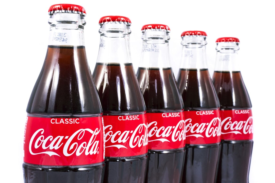
A 1949 study showed that 99% of Americans were able to recognise the product simply from the shape of the container. What’s more, the bottle had to stand out among thousands of others: on the shelves, the Coca-Cola bottles fit perfectly, meeting one another at the label and creating a continuous band of red that caught the consumer’s eye.
In a letter addressed to the company, Raymond Loewy, the father of modern design, described the Coca-Cola bottle as the “perfect liquid wrapper”.
With over 300 billion products sold, the glass Coca-Cola bottle has become a true cult object. It’s no accident that
- It appears in numerous films, including “The Help”, “Saving Mr. Banks”, “Dreamgirls”, “The Secret Life of Bees” and “The Curious Case of Benjamin Button” to name but a few.
- It was turned into art by Andy Warhol with his painting “Green Coca-Cola Bottles”. Other notable artists to have featured the Coca-Cola bottle in their work include Howard Finster, Tom Wesselmann, Alberto Murillo, Pakpoom Silaphan, Todd Ford, Debra Franses Bean, Luigi Bona and Daniele Basso.
- In 1950, it became the first commercial product to appear on the cover of TIME Magazine.
The Coca-Cola bottle is also an example of packaging that transcends its original function. Some examples? The “bottleneck slide” is a technique used by blues musicians to play the guitar with the neck of a Coca-Cola bottle. What’s more, there was the “distance game”, played by kids in the sixties when the bottles carried the name of the city in which the beverage was bottled. How was it played? Simple: players would each read out the place their Coke was bottled in and the winner was the person whose bottle came from furthest away.
Reusable packaging: the Nutella jar
In 1964, Michele Ferrero invented a spread made from hazelnuts and chocolate that would conquer taste buds the world over: Nutella. The following year, it was launched on the German market in a reusable glass jar. It was conically shaped with a narrow, faceted base and a red plastic lid.

The jar has changed over time, becoming first cylindrical, next cubical, and then, from the 2000s, barrel-shaped. Unlike the Coca-Cola bottle, it was not the shape of the packaging, which has changed on several occasions, that made the jar into a cult object. Rather, the genius idea was to create a piece of packaging that could be re-used as a glass or kitchen container. Thus, the packaging itself became the product, sometimes even a collectable product: remember the series of jars featuring cartoon characters?
https://www.instagram.com/p/Y8nD3aR8Bj/?hl=it&tagged=bicchierenutella
Re-using the jar not only brought the brand into the houses of millions, but helped it stay there for years – in our kitchen, we’ve still got some chipped Nutella glasses decorated with Smurfs ! There have also been jars customised with first names and expressions in local dialect, creating a sense of authenticity, closeness and belonging.
https://www.instagram.com/p/9-7WD2hUxG/?utm_source=ig_web_copy_link
Nutella packaging has become a tool for creating a dialogue with the consumers of the product and a vehicle for a message. Or for encouraging interaction, like the recent series of jars featuring letters of the alphabet, which let you create words or phrases by combining a number of them. There’s also the limited edition Nutella Unica: a jar customised with a unique riot of colours and patterns. Around 7 million of these unique artworks will be produced, each created by a random image generator and identified by a serial number.
https://www.instagram.com/p/BnWbBMwjiLb/?hl=it&tagged=nutellaunica
Customisation, uniqueness and reuse are the three keywords that inform Nutella packaging design.
The Pringles tube: innovative packaging
The container for Pringles crisps is an example of packaging design that merits appreciation for its perfect blend of functionality and originality.
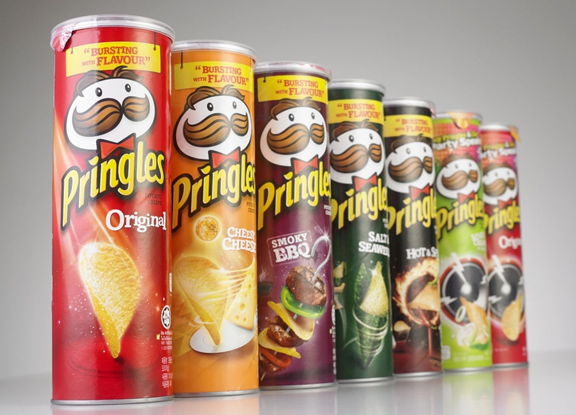
It was designed in 1966 by a chemist named Fred Baur and patented in 1970. First of all, it’s important to know that Pringles differ from traditional crisps in that they’re not actually made from potatoes, but a blend of various flours and flavourings. They also differ from traditional crisps in their shape, which is even and saddle-like, making it possible to stack them.
The container that Baur designed for these “crisps that aren’t crisps” is a tube of stiff cardboard sealed with a plastic lid. It’s clever and innovative for various reasons:
- Inside it, the crisps remain stacked on top of one another and don’t break, unlike what happens in bags
- The lid is resealable, which helps the product stay fresh for longer
- The tube’s design allows the product to be stacked during shipping, which means more containers can be carried in one, thus reducing transport costs.
- The packaging stands out from similar products, making Pringles immediately recognisable.
Furthermore, the packaging also creates a new product experience, because the crisps are no longer picked out of the pack one by one, but slide out of the tube (when tilted) on their own: we no longer go to the product, the product comes to us. It’s a nice change!
We’ll leave you with one last titbit. Fred Baur was so proud of his invention that, before he died, he requested his ashes be kept in a Pringles tube. In case you’re wondering, yes, his children respected his wish.