

Table of Contents
Whether you’re a freelancer in search of a new project or you are applying for the job of your dreams, a curriculum vitae is normally your first port of call.
Leaving aside the content – work experience, education and skills, all carefully compiled – your CV is probably the first product of yours your employer will have seen.
Particularly if you are applying for a creative job, the care you take over formatting your curriculum vitae and the graphic design ideas you experiment with will say a lot about your personality and can sometimes be worth much more than words in convincing the company that you’re the right person for them.
With this in mind, here are a few brief pieces of advice for formatting your CV: from using templates as inspiration to some ideas to make the content easier to read!
1. Don’t start from zero: copy a template (but do it well)
When formatting your CV, one of the first questions you are sure to ask yourself is whether it is worth starting from a template. The answer, as is often the case, is that it depends. For example, for certain positions and calls for tender you have to use the Europass, the standard EU CV format. A CV created using this template will say very little about your personality and will not catch the eye in a pile of hundreds of applications. Unless the rules of the position you are applying for require it, we recommend not using the European template… especially if your job requires a certain amount of creativity.
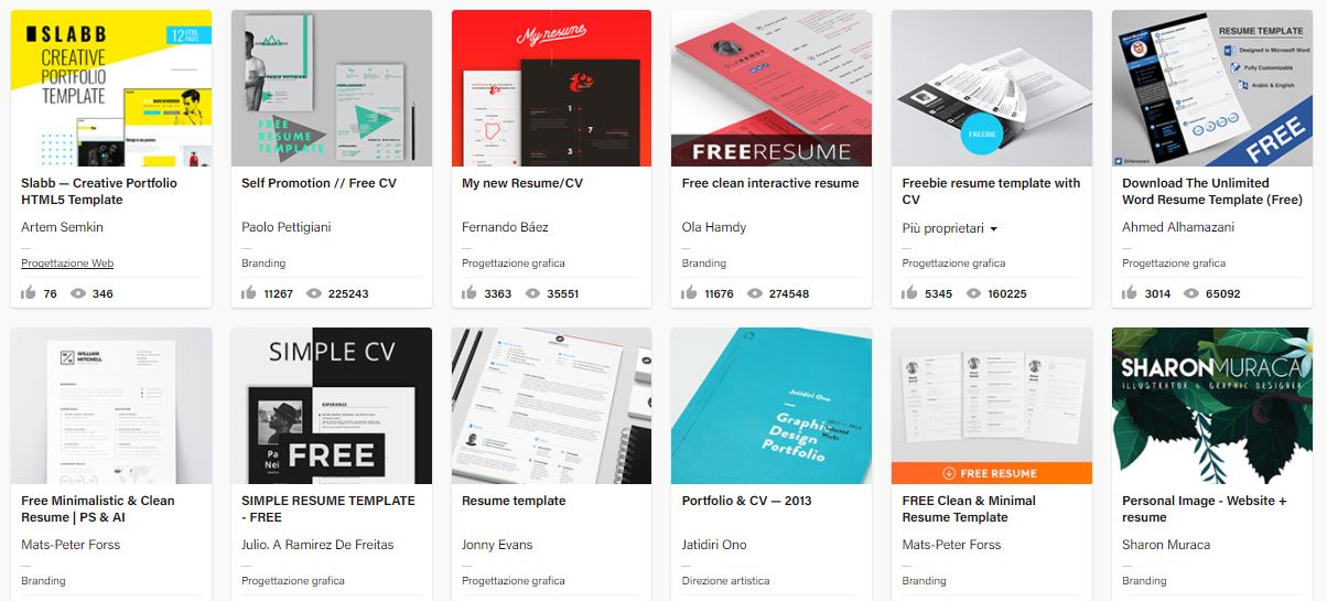
Having said that, carefully adapting and modifying a template is not necessarily a bad idea: you can ‘steal’ some excellent ideas from the templates available online! Behance has lots of interesting design templates (and some can be used free of charge).
Free online desktop publishing programs like Canva also provide templates to base your work on. While you’re at it, have a look at our guide to 5 free (or almost free) and easy-to-use DTP programs.
2. Choose a layout that makes your content easy to read
The person reading your CV will most likely only give it a few seconds of their time at first reading. You should therefore make sure you organise the content in a well-structured layout to improve readability: the reader must be able to work out where to find your skills, work experience and references at a glance. Templates can undoubtedly give you a hand with this.
The most important information should be positioned in the top third of the page. This content can be highlighted using a spot of colour or a simple frame.
3. Think hard about which font to use
Your choice of font is also crucial for the readability of your CV. We therefore recommend spending a bit of time looking for a font that is readable but that also reflects your personality. This is a detail that will not escape someone with a trained eye.
This interesting list offers 50 excellent fonts to use in your curriculum vitae, while DaFont.com has thousands of fonts to download free of charge or for a small fee. A font recognition tool like What The Font, meanwhile, can help you ‘copy’ a font you particularly like.
4. Use icons and infographics
Your CV is a description of your work experience and aspirations boiled down to a few pages. As a result, the information you provide must be clear and concise: why not try summarising various key concepts with icons and infographics?
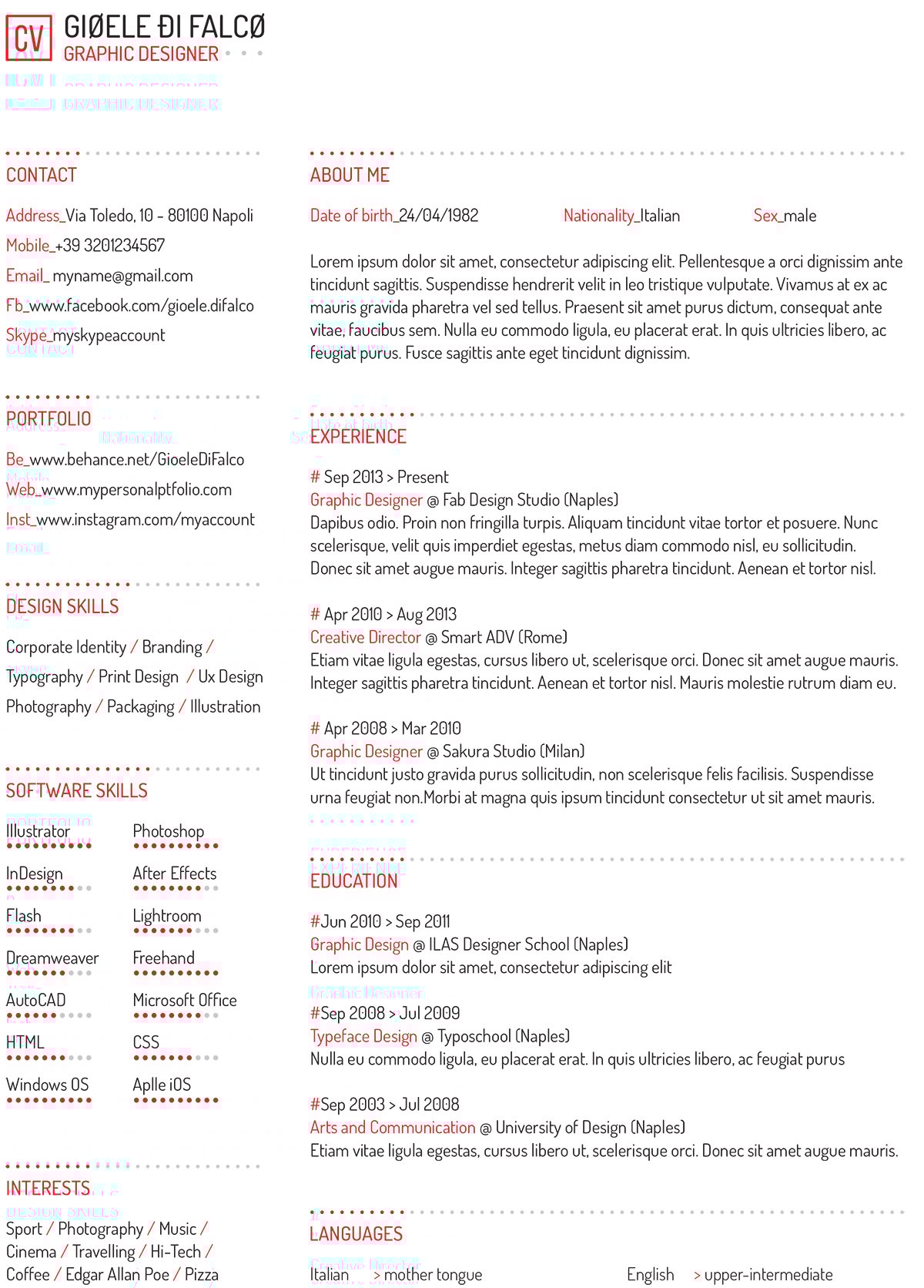
This CV template is a good example.
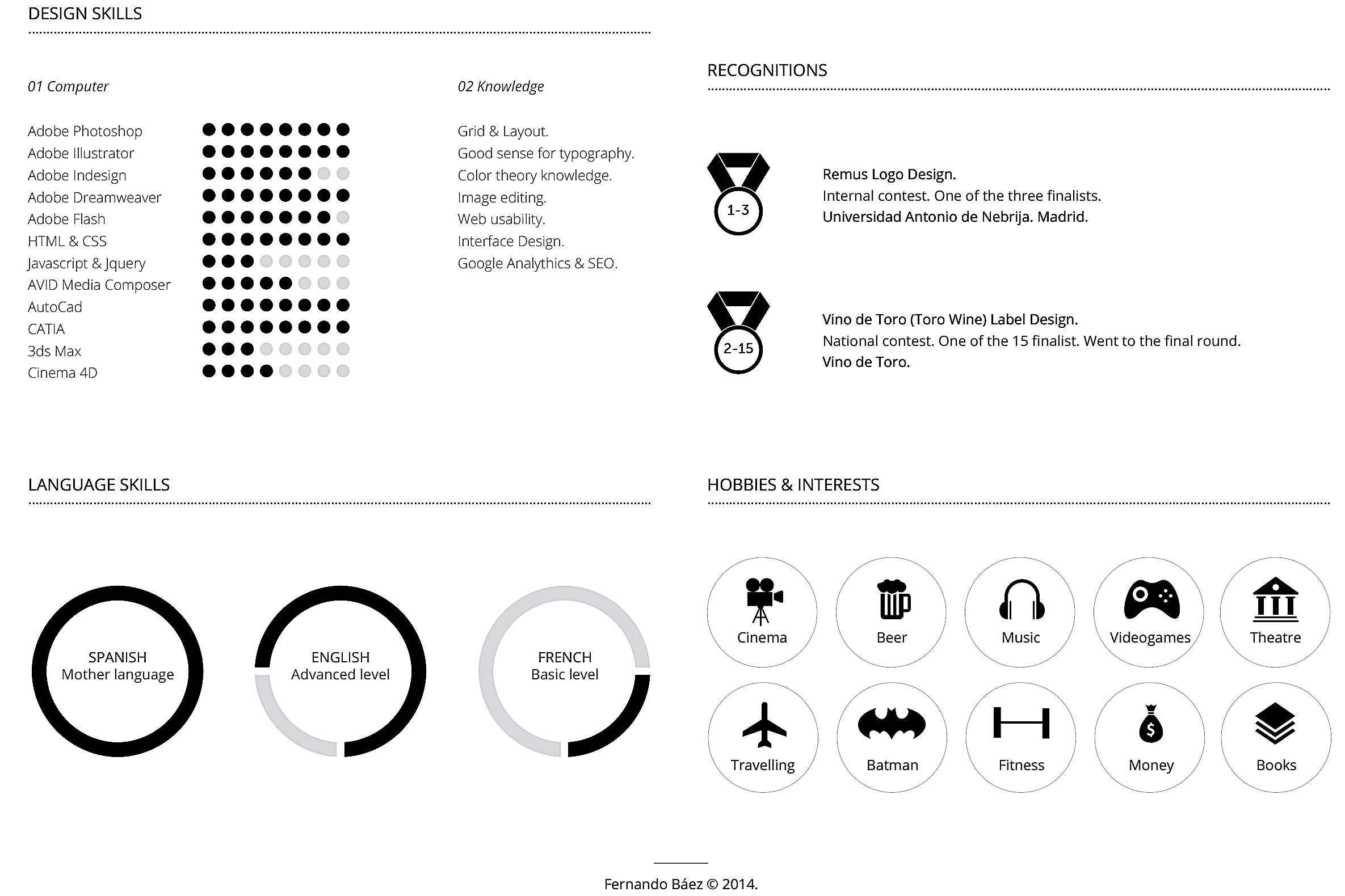
Basic infographics can summarise your language ability or technical skills, while icons can be used to mark a particular section or describe your interests.
You can find free or cheap icons on the The Noun Project portal.
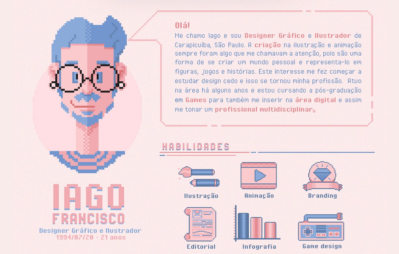
5. Your CV represents your personality
The style you use when formatting your CV says a lot about your personality, and you can also use it to give your document a tongue-in-cheek feel, to catch the attention of the person sifting through them. For example, you could choose an image that recalls pixel art to reinforce your inner nerd, add a few pirate-related elements to highlight your desire for adventure or use some typographic tricks to reveal a passion of yours.
Naturally, to avoid gaffes, always take into account the type of company you are applying to and the role for which you are applying when making these decisions.
All that’s left now is to wish you good luck with your applications!