

Table of Contents
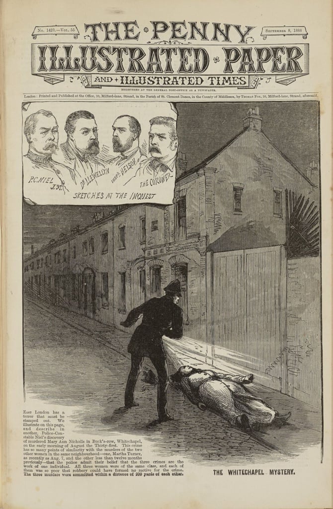
There are countless English-language films set in the Victorian era – the period of Queen Victoria’s reign that covered almost the entire nineteenth century (from 1837 onwards, to be precise). These include animations like The Jungle Book, written by an English settler on Indian soil; films about Jack The Ripper, one of the age’s anti-heroes; film versions of Charles Dickens’s works, such as A Christmas Carol; myriad Sherlock Holmes adaptations and Jane Eyre, not to mention Christopher Nolan’s The Prestige and David Lynch’s The Elephant Man. I won’t bore you by listing any more, but try to dig up a few scenes from these films from the deepest recesses of your mind (or, if you prefer, from YouTube!). One of the main things you’ll notice is the way news travels fast, either through newspapers sold by newsboys in the streets, or through posters on the walls, stuck amidst myriad similar posters, which people crowd around to read up close.
Then there are the theatre posters, flyers and adverts: any set designers working on films set in Victorian Britain have to familiarise themselves with the specific graphic style used for communication, which fostered the passing on of information by word of mouth, gossip and the creation of urban legends.
It was a period of relative peace, in the wake of the Napoleonic campaigns, and of incredible technological progress; of social mobility and huge injustice; of colonial expansion and enrichment for the settlers; and also a period where irrational, esoteric and romantic thinking was routinely used as a means of escape from the rigid social norms.
In this article, we’ll discover a visual and graphic style that even today – almost two centuries on – still exerts its charm.
An era of visual overload
The first impression a contemporary graphic designer gets when they look at Victorian visual communication is one of visual overload – the polar opposite of the Swiss concept of ‘less is more’. It also appears rather unplanned, haphazard and generally a bit OTT, like a lot of folk graphics and painting.
However, this plethora of lettering, ornamentation and images hides a story of technological innovation and a focus on communication in cities where the density of both the inhabitants and communication materials was comparable to cities today.
It was a period of rapid development across all industrial sectors, with mechanisation invading every area of production. Printing was no exception: it developed from something carried out entirely by hand to an industrial process that could operate on a large scale and therefore deliver mass communication.
Four innovations underpinned this technological leap forward: steam-powered printing, the mechanisation of typesetting, improved illustration techniques (lithography and wood engraving) and the industrialisation of paper production. The rotary press, for example, was invented in the mid-nineteenth century, speeding up the dissemination of news by enabling large numbers of pages to be printed in a short space of time, and giving rise to the daily newspaper as we know it today.
A new visual language
In the nineteenth-century British Empire a whole new visual language was invented that drew on the numerous compositional opportunities provided by the industrialisation of typography. Moreover, the ability to produce large quantities of communication materials (books, posters, newspapers, magazines, flyers, tickets, etc.) meant this language could spread increasingly widely, resulting in improved literacy among the poorest classes. It is worth noting that at this point in time in northern Europe only half of the population could read and write, while in the Mediterranean countries the situation was even more dire – real mass literacy wasn’t achieved in Italy until the twentieth century.
04
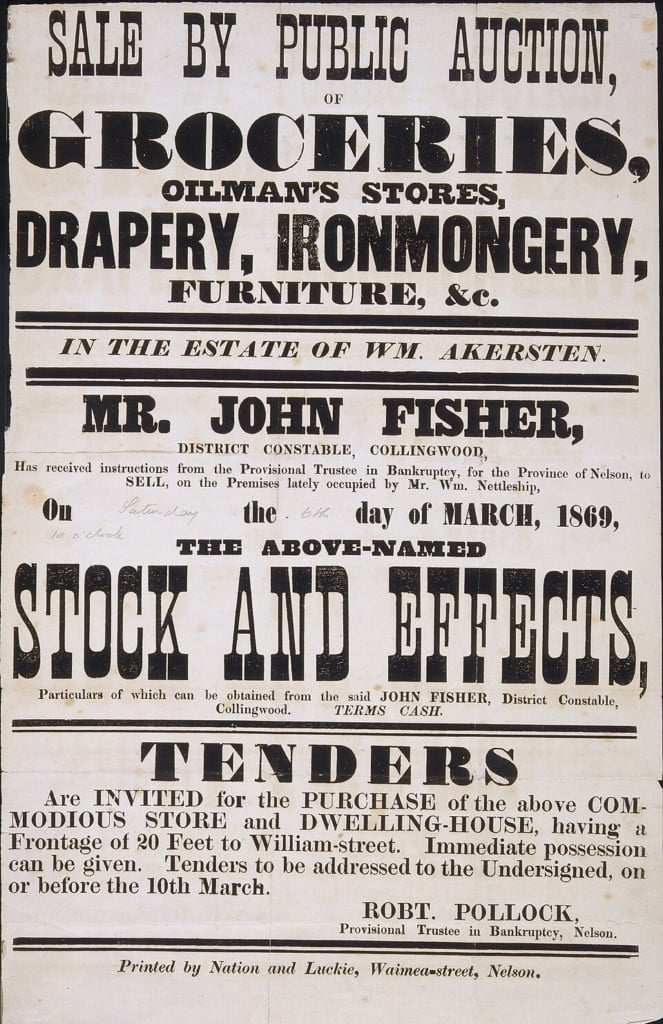
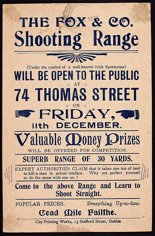
Victorian visual language is instantly recognisable from the density of its various elements, its expressiveness (it gave rise to some imaginative, bizarre and indeed barely legible fonts) and the wealth of ornamentation and decoration (which modernist graphic design in the early twentieth century, led by El Lissitsky and the Russian avant-garde, sought to avoid at all costs, ultimately finding refuge in the comforting minimalism of the Swiss school). Looking at this visual language with modern eyes, it appears exaggerated, sentimental, redundant and difficult to understand.
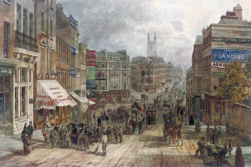
However, one should not forget that the majority of these graphics had to grab people’s attention on city streets, where everyone was constantly busy, where the noise was relentless, where colours faded due to the ash that fell from industrial fumes, and where there were only a few billboard spaces. Businesses therefore had to rely on information being passed on by word of mouth and through printed sheets of paper of various sizes, as well as pamphlets, brochures and newspapers. For a rough idea of what this might have been like, think about the supermarket junk mail that comes through your letterbox. But now replace it with political propaganda, including subversive messages, edicts, administrative communications, adverts for theatre performances, news, and information on missing persons, dangers, special events and so on, as if the full content of your smartphone were spread around the city streets, both on printed paper and in the shouts of those paid to spread the word. This information pandemonium was very stimulating for those working with typography.
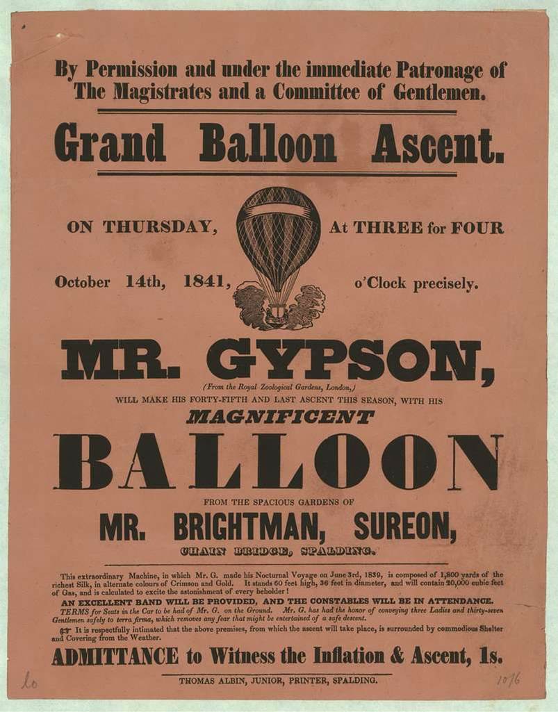
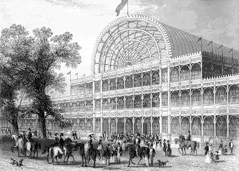
The Victorian taste for abundance should not, however, be seen merely as a simple lack of restraint, although the euphoria surrounding the new technologies certainly did lead some to take things too far. On the contrary, it can be seen as a cultural response to a rapidly changing world that seemed to be heading in an unprecedented direction. Large international exhibitions, like the ones in London and Paris, created – for the first time in human history – great expectations for the future from both a social and technological perspective, and this was reflected in the literary invention of science fiction in those same decades.
An aesthetics of persuasion
The Victorian nineteenth century was not just a time when information became pervasive; it was also a century of visual persuasion. Graphic design was no longer limited solely to providing information – it also had to convince and attract people and create desires and needs, giving rise to advertising as we know it today. The large quantities of goods produced as a result of industrialisation had to be sold to people who didn’t understand them or didn’t feel they needed them. The solution to this was advertising, which, until the invention of the radio, was predominantly produced in printed form.
For the first time, the purpose of graphic design became more complex, and it had to perform a range of different roles: informing, selling, describing, evoking, reassuring, admonishing, engaging, convincing and alerting, while always trying to stand out from all the other communication.
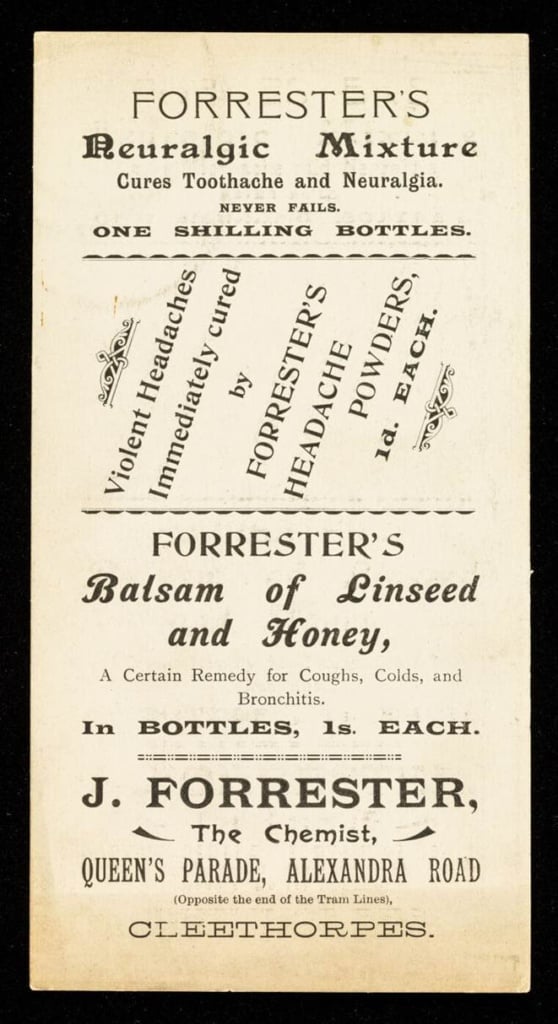
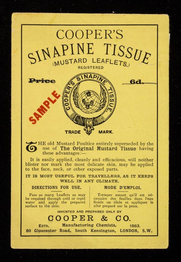
Source: https://wellcomecollection.org/works/aezf4fqd
A new typography
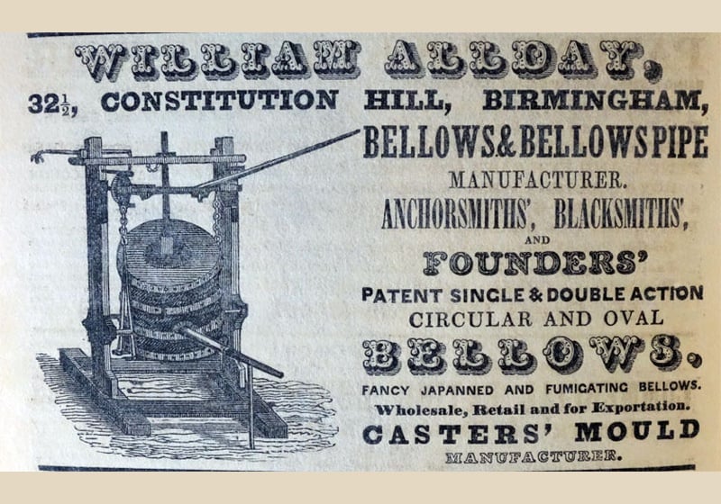
The period was marked by widespread experimentation in typography, as the mechanisation of printing allowed printers to play with composition, leading to some expressive – and sometimes bizarre – typefaces.
While lead characters laid the historical foundations for printing in the West when they were invented by Johanes Gutenberg in the fifteenth century, in the industrial nineteenth century they became the driver of an explosion in graphic design, with speed, commercial competition and new printing techniques leading to the use of larger, bolder and more decorative fonts.
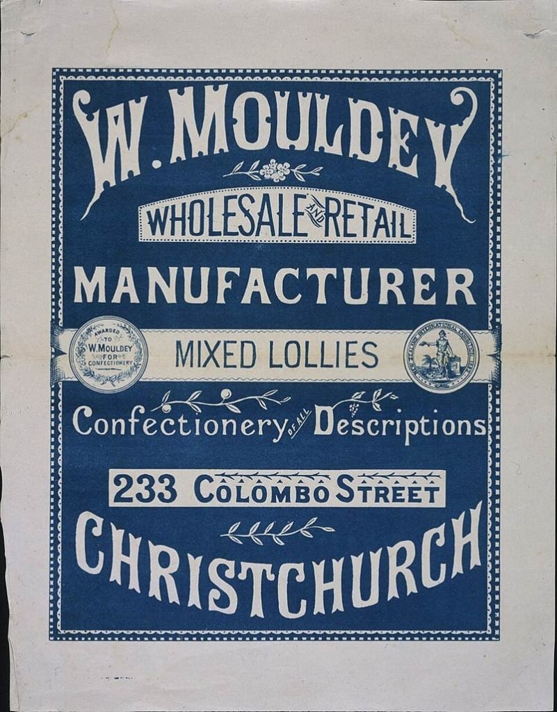
Typefaces became forms of expression, with significant variations in weight, contrast and decoration. Type foundries became a central part of graphic design production, creating some true typographic masterpieces that are still in use today. Take Baskervile, for example, an updated version of Garamond that took it from the Renaissance to the modern era. Or the eighteenth-century Caslon, relaunched during the Victorian era, which ended up cementing the British preference for soft and stylish serif fonts. The work of British typographers was in stark contrast to the great Dutch and Italian typographers (like Gianbattista Bodoni), who focused on restoring and transforming Roman engraving and the Renaissance tradition, and to the German typographers, who were still firmly attached to gothic designs.
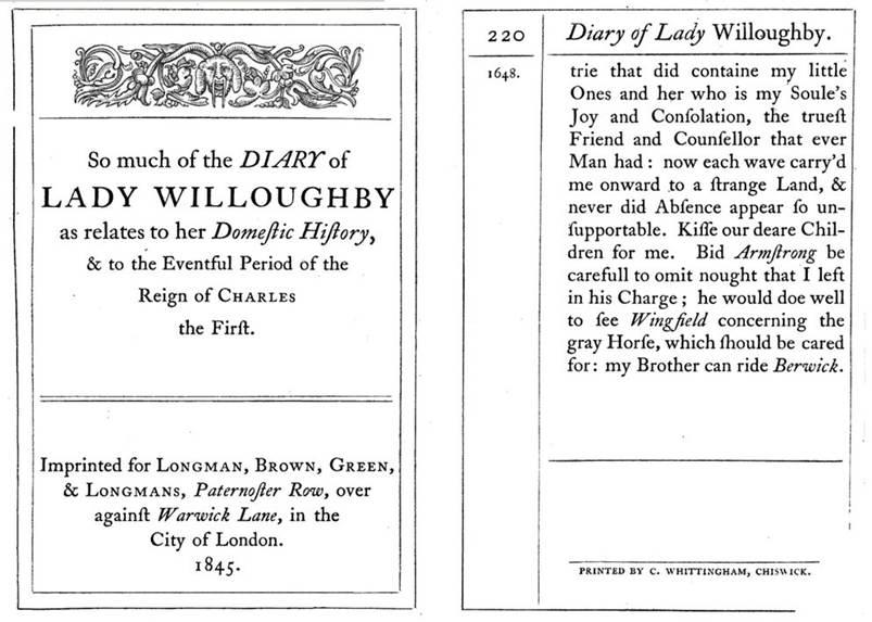
The quality of their work is confirmed by the fact that these fonts are still used centuries later, along with the older Garamond, in much of Western publishing.
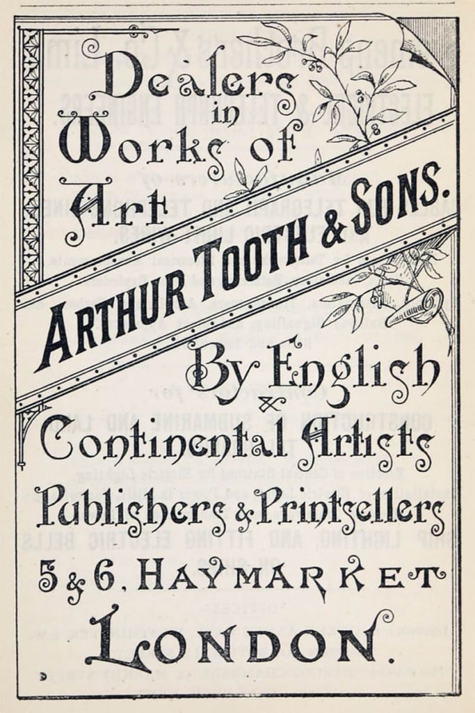
One of the most noticeable features of the Victorian approach to graphic design is the use of different fonts on the same page, often mixed up to create something that looks visually messy, a far cry from the pragmatic style of modern designers, like Massimo Vignelli, who suggests only using a few fonts, and never more than two different ones in the same layout. In the Victorian era, people liked imagination, eclecticism, exoticism and magical irrationality – this irrepressible vibrancy contrasted with their increasingly scientific and mechanical world with its rigid social norms. The graphic design was a reaction to this, incorporating a new vitality that overturned any previous rules.
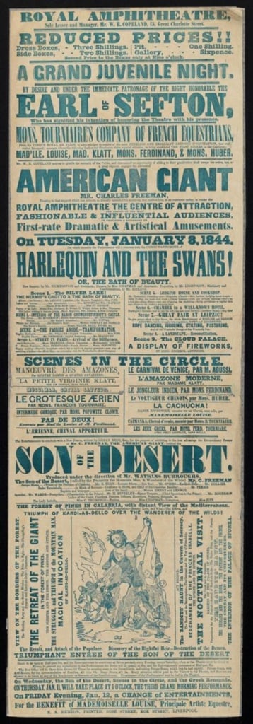
Very strong display types, ornamental and floral fonts, heavy serif characters, gothic fonts, condensed versions and alphabets designed more for titles, signs and adverts than for body text were all used interchangeably.
This variety makes Victorian typography instantly recognisable. Indeed, what is now known as ‘vintage’ graphic design follows the same approach: the text becomes an image, and the font becomes part of the overall visual identity.
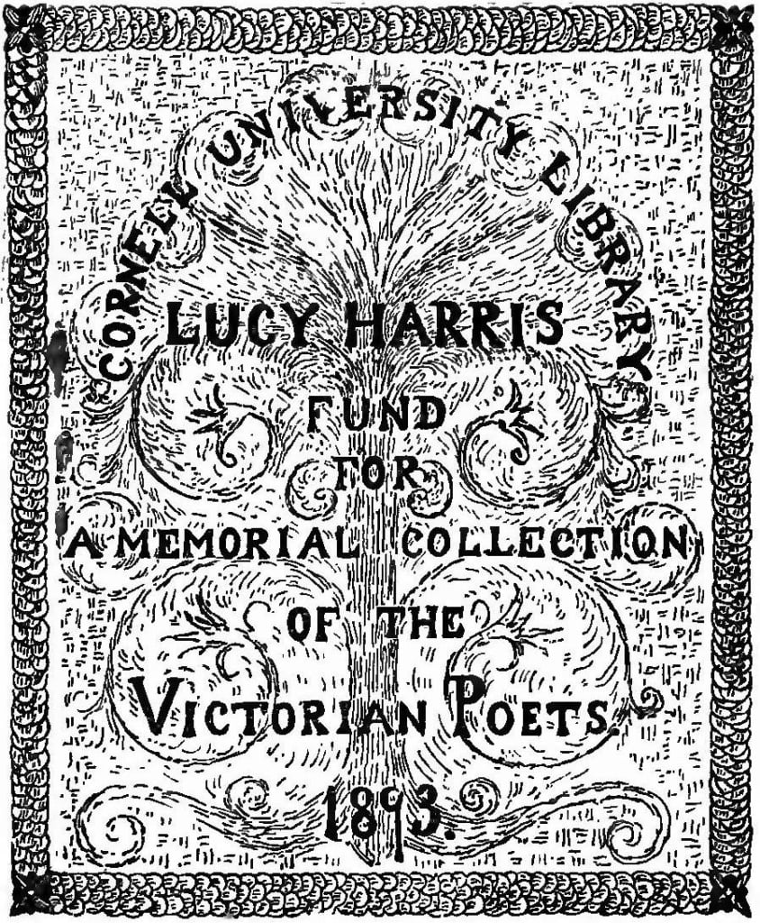
Source: https://commons.wikimedia.org/wiki/File:Bookplate,_%22Cornell_University_Library_Lucy_Harris_Fund_for_a_Memorial_Collection_of_the_Victorian_Poets_1893%22_from,_Departmental_ditties_and_other_verses_(IA_cu31924013493303)_(page_2_crop).jpg
Illustration and ornamentation in graphic design
For the first time in the history of modern graphic design, illustration and ornamentation became part of the language of communication, no longer an add-on, but an integral part of the message. William Morris, the founder of the arts and crafts movement who promoted a return to craftsmanship, sought to bring back craft and decoration to the era’s visual language, which was heading towards the cold industrial rationalism of the following century.
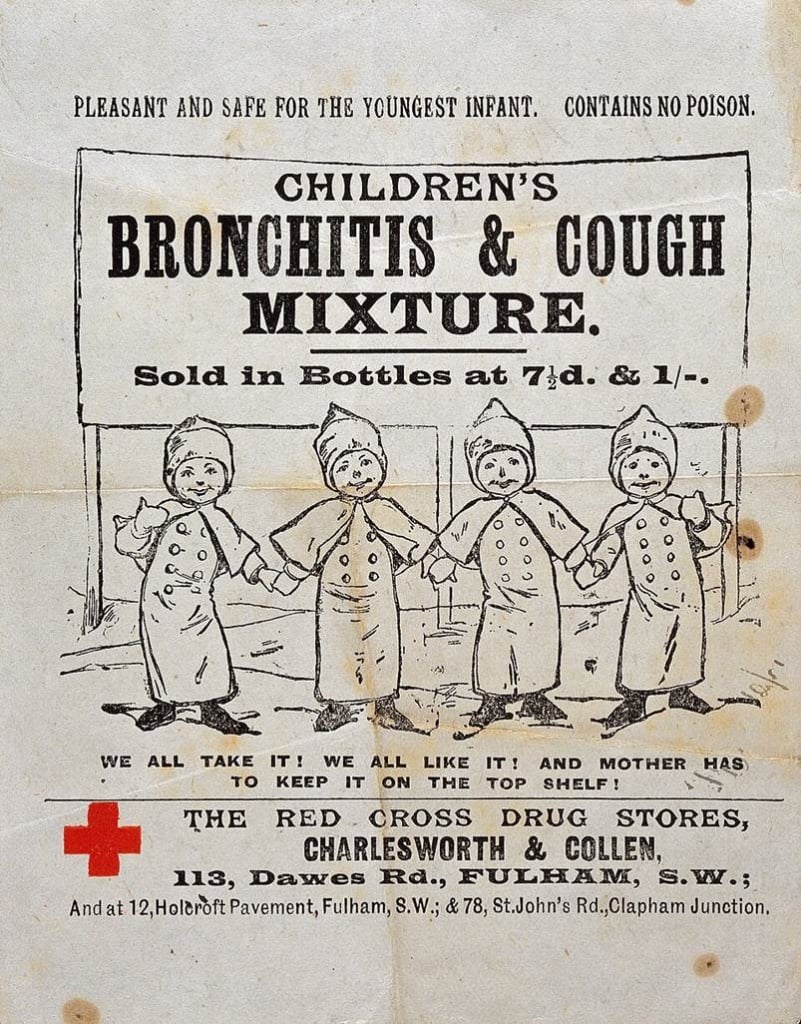
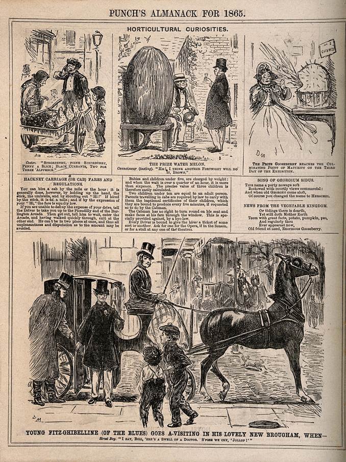
Low literacy rates among readers encouraged publishers to use illustrations, which as well as depicting the contents of the text also became an integral part of the graphic design of posters, covers, playbills, title pages and so on. During the Victorian era, a type of illustration was developed that would change the world and which is still encountered frequently today: the use of wood engraving and lithography made it easy to add drawings to typographical layouts. This type of illustration has made a comeback with the vintage and hipster trends of recent years, but it has always been appreciated (and plundered) due to its recognisable style and the large number of subjects and situations depicted.
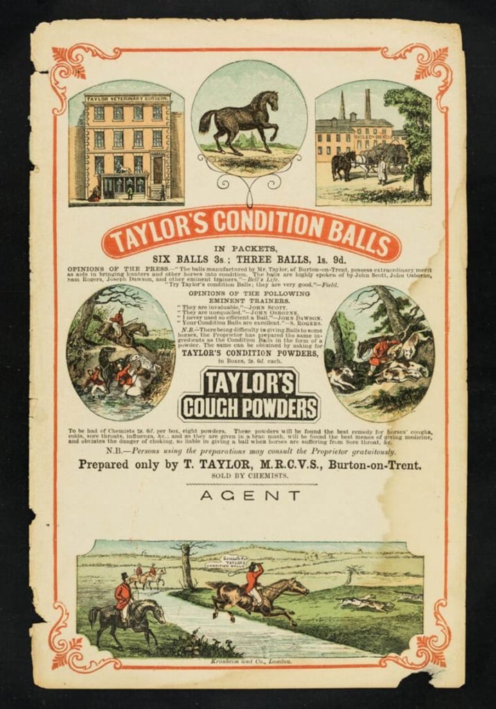
Source: https://wellcomecollection.org/works/aa53sty4.
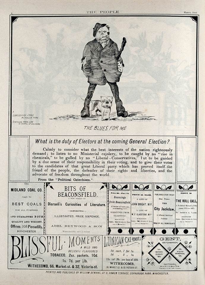
Legacy in contemporary design
Victorian graphic design’s influence can still be seen today in numerous fields, both in the use of lettering and in the way designers combine illustrations, decoration and typography, albeit in a style updated to suit modern tastes. Its legacy is not just its retro or vintage appearance, but also its ability to combine information and flamboyant graphics within the same composition, without worrying about seeming over the top.
These features meant it was used for popular and commercial graphics, but rejected by the great modernist designers.
Classic Victorian engravings are still used widely. Illustrations taken from nineteenth-century sources or inspired by historic printing techniques produce a recognisable stylish and retro look. In an era dominated by digital images that all look the same, engraving offers a tactile and temporal quality that immediately stands out.
A graphic design style for the masses worth revisiting
Victorian graphic design was a particularly interesting chapter in the history of visual communication, which demonstrated that you can hold people’s attention by combining multiple ideas and creativity, so long as you control the hierarchies and message.
The Victorian world, with its information overload, is not dissimilar from our current experience with digital communication. While back then people tried to outdo one another using typographical layouts, nowadays people are using titles and lettering to attempt to pull people’s attention away from their phones in cities overloaded with messages. After years of images dominating proceedings, the web’s typographical limits have led to renewed focus on typefaces and fonts, putting them at the centre of communication, just as they were 150 years ago.
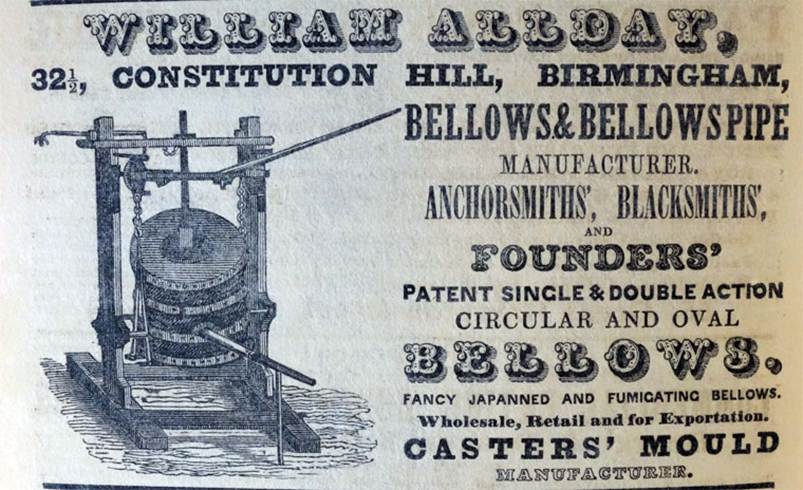
Victorian graphic design reminds us that visual communication does not have to be simple to be effective: sometimes you can exaggerate and juxtapose multiple elements. Ornamentation, illustration and typography can be used together to grab people’s attention, making the user experience both fun and profitable.