
Table of Contents
The printed page: we look at how and why you should use it to communicate with customers
Branded content, stories, vertical video. Every day, new languages, channels and formats are being born online. These innovations seem to provide ever more opportunities for reaching the public and getting them to click, and then tracking their actions and gathering data on results. It’s natural that traditional languages, methods and tools for communication suddenly seem obsolete and inadequate for today’s communication needs. Yet, perhaps the good old printed page still has something to say in the digital era. We take a closer look at an iconic ad page that proves how this channel can still be highly effective in this day and age.
Norwegian Airlines. Straddling the on and offline worlds
In a previous article, we compared the design structure of a traditional ad page with a digital version to be served, say, on Facebook. And we saw that there were clearly many similarities between the two. Indeed, to communicate, mastering the relationship between words and images (link) is fundamental, regardless of whether the ad will appear on a printed page or a social media platform.
At times, the central idea behind the ad is so clear, and the way it’s expressed is so precise and effective, that the line between on and offline completely disappears. That’s exactly what happened with this great Norwegian Airlines campaign, which went viral online in a matter of days: a textbook example of real-time marketing pulled off at a time when many experts were declaring that this practice was dead.
Curiously, it doesn’t seem that anyone has ever analysed the Norwegian Airlines campaign in terms of its management of the relationship between analogue and digital. Yet, now that Facebook has matured as a platform, it’s rather surprising to find a message presented in an almost identical way in the printed press as well as web and digital format. Indeed, this was not uncommon in the early years of Facebook, when some nuances had yet to become clear: once companies had created a flyer, they didn’t see why they shouldn’t just publish it – perhaps even with registration marks still visible – on their Facebook page.

Only with time have we learnt that this approach distances the public, rather than bringing them closer. Today, we know full well that not everything created on paper works in digital. So, how do we explain the success of this great campaign, which seems to completely ignore the language barriers between print and digital? In reality, the difference between the flyer published on Facebook and a message like this is pretty obvious: the Norwegian Airlines campaign was not just a clumsy attempt to publish an advertisement developed natively for print.
Quite the opposite: in this case, we’re dealing with a message that was designed following a media-neutral approach, agnostic to the medium that it would eventually be used in. Put another way: the starting point for developing the campaign was not the medium – “We have a full newspaper page, so we need a nice vertical image, then we can put the headline above it and the logo in the bottom right-hand corner” – but an actual idea, uninfluenced by the medium.
And what was this idea? To use the news of Angelina Jolie and Brad Pitt’s split to promote a flight, harnessing the resulting media storm for their own benefit. It’s a brilliantly effective creative strategy; so much so that it requires virtually no modification to work well in both digital format and in print.
What can we learn from the Norwegian Airlines ad?
The advertising page is one of the oldest tools in marketing. It came of age in the 18th and 19th centuries, evolving and establishing itself as the principal means for conveying messages in which words and images interact to pique the interest of the reader. But, despite its long and distinguished career, successes like the one we’ve just analysed would suggest that it is not yet time for the ad page to retire. Here, we try to learn some clear and relevant lessons for our everyday projects.
1. First come up with an idea, then think about how to present it in the media
As we’ve seen, with the Norwegian Airlines page, we don’t start with a product description, but an idea (in this case, somewhat irreverent): if Brad Pitt is single, that’s one more good reason for visiting Los Angeles. This idea works on its own: it can potentially be used to create a TV or radio ad, or – in this case – web banners and a print campaign.

So, the takeaway is to resist the temptation to start off by thinking about the container, about filling a blank page with what we know: words, images, graphics. We also see this principle applied, for example, in ads by Monster.com: they start with a very powerful and resonant premise: all of us have at some point felt trapped in the wrong job. This idea, like that behind the Norwegian Airlines campaign, works just as well in print as it does every other medium because it is clear and true enough to capture the public’s imagination.
2. Be open to the world and use your target audience, not what you do, as a starting point
The focus of the campaign that we’re analysing is not the company and its products. This comes afterwards, as a witty response to a hot topic that is sure to pique the public’s interest and break through the indifference that advertising messages are often met with. As you can see, the company was not scared of addressing subjects not typically considered in its wheelhouse, but which were on the lips of its actual and potential customers.

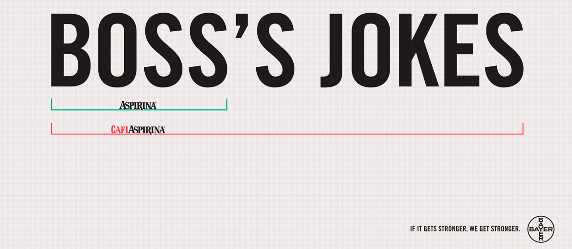
Here’s another excellent piece of advice for creating your next ad page: focus a bit less on you, and a bit more on your target audience. Don’t be scared of talking about the everyday, news or events if these can arouse the public’s interest and get them to engage with your product or service. Want another example of an ad that applies the same principle? In this campaign for Cafi aspirin, the product is once again presented secondarily, as a response to a problem that all parents face sooner or later: the adolescent daughter who is already a headache but becomes a veritable migraine when she brings her first boyfriend home.
3. Keep it simple
This campaign tells us that when an idea is powerful, you don’t need spectacular illustrations, arty photos and lavish post-production. Sometimes, the winning formula can just be picking the bare minimum of elements necessary to get your idea across. Paring down rather than augmenting can be an advantage because it ensures the brand stands out in a world in which people are bombarded with messages and images. Here it’s hard not to think of The Economist, which continues to achieve success with an astonishingly understated visual identity. “I’ve never read The Economist,” a phrase uttered by a 42-year-old “young” apprentice manager. The intent is very clear: if our apprentice had read the famous newspaper, he would surely have enjoyed skills and knowledge that would have speeded up his career.

A parting thought
Find an idea, show your audience that you’re putting them at the centre, and don’t use budgetary constraints as an excuse. These three principles are the biggest lesson we can take from the campaigns that we have looked. And, when you think about it, the same advice holds true for digital content too: good design, as we’ve seen, is fundamental for any advertising project, regardless of the medium.