


Table of Contents
There’s something curious about the history of Art Déco, even before getting into its geometries and colours: the style existed for years before anyone gave it a name. The term we use so casually today was only coined in 1966, forty-one years after the event that made it famous worldwide — the International Exhibition of Modern Decorative and Industrial Arts in Paris, in 1925. 2025 marked its centenary, a perfect opportunity to look back not just at the movement’s history, but above all at its most concrete legacy for anyone working in graphic design and print today: posters, bills and typefaces that remain a living reference.
The name arrives after the style: the origins and the 1925 Paris Exhibition
The Exhibition that gave the movement its name was meant to take place over a decade earlier. It had already been approved in 1912, but the First World War forced its postponement: the style that would go on to symbolise the “roaring twenties” was born, paradoxically, out of an interruption rather than a straightforward origin.
When the Exhibition was finally held, from 28 April to 8 November 1925, across the Esplanade des Invalides, the Pont Alexandre III and the Grand Palais and Petit Palais pavilions, the result exceeded every expectation: between 18 and 21 participating countries (sources vary slightly on this figure) and more than 16 million visitors, to the point that the event — originally planned to run until 25 October — was extended by two weeks due to the sheer turnout.
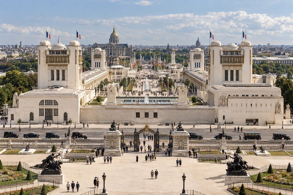
It was only four decades later, in 1966, at the retrospective exhibition Les Années 25 at the Musée des Arts Décoratifs in Paris, that the style finally received an official name: Art Déco, short for “Arts Décoratifs”. That same occasion also fixed the movement’s conventional dating, running from the early twentieth century through to 1939 — the year the Second World War began, which symbolically marked its end.
The characteristics: geometry, luxury and a synthesis of cultures
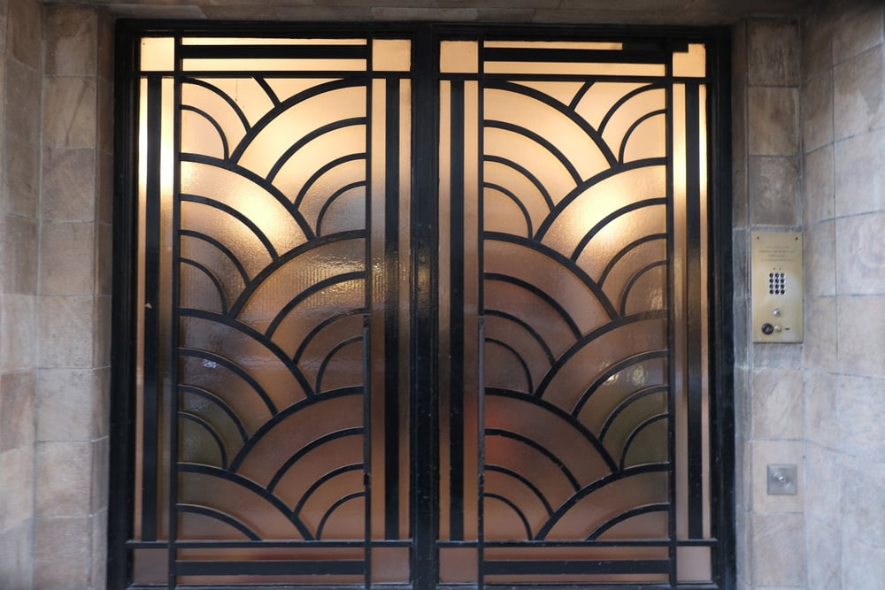
What, in practice, makes an object or image “Art Déco”? The most honest answer is that it’s a synthesis, not a single formula. The movement absorbs and reorganises a wide range of influences — clean geometries partly inherited from Cubism, luxurious materials (lacquer, ivory, precious metals), decorative motifs drawn from African, Asian and South American art — holding them together through a recognisable visual code: clean lines, strong symmetry, a taste for stylisation that favours overall effect over naturalistic detail.
It is also, quite explicitly, a move beyond Art Nouveau: where the latter drew inspiration from the organic, flowing forms of nature, Art Déco looks instead to the machine, to speed, to industrial modernity — without ever giving up on elegance, and often leaning into an almost aristocratic opulence. It’s no coincidence that the style is so often associated with the post-war European bourgeoisie, newly wealthy and eager for an aesthetic language that communicated progress and status at once.
The Art Déco poster: when advertising art becomes art
This is where the heart of Art Déco’s legacy lies for anyone working in graphic design, print and visual communication today: it’s the period in which the advertising poster stopped being a mere informational tool and became a genuine artistic language in its own right.
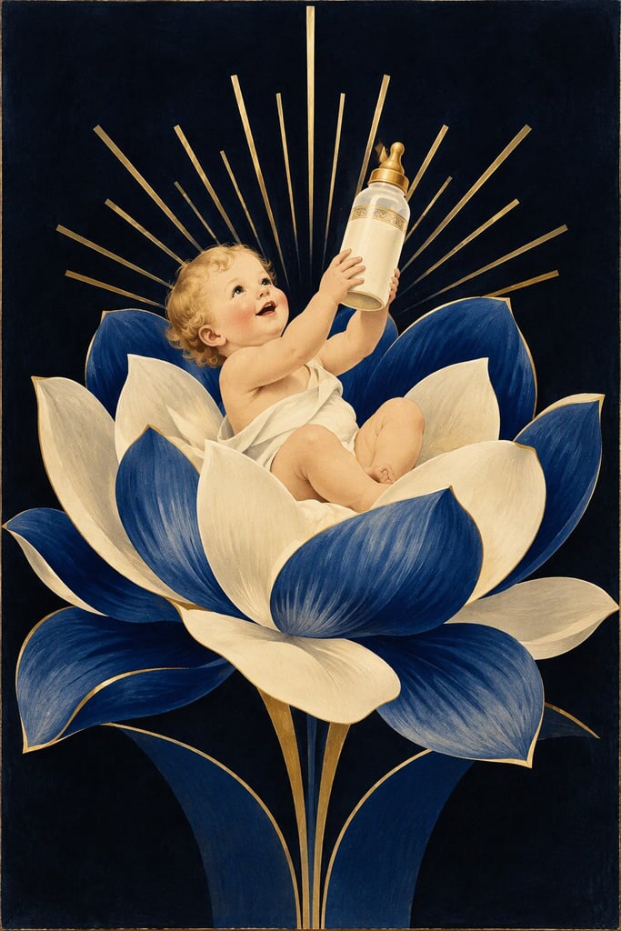
The most celebrated Art Déco posters — think of the work produced for the great railway and transatlantic shipping companies of the era — share some distinctive traits: typography integrated into the image as a compositional element in its own right, not simply supporting text; reduced, high-contrast colour palettes; compositions that use perspective and geometry to communicate speed, power and modernity in a split second — exactly what a street poster needed to do, at a time when catching a passer-by’s eye was already a specialist skill.
One example that embodies this language well is the following:
The association with France, as Art Déco’s country of origin, is tied to Paris, which hosted the Exhibition, but also to many of the creatives whose mark we still remember today as leading figures of the movement. Among them are Émile-Jacques Ruhlmann, Jean Dunand and René Lalique, each an expert in a different material — glass, wood, metal — and in translating it into the design lines that would come to define the aesthetic sensibility of Art Déco.
From France to the world: the geography of Art Déco
The style born in Paris didn’t stay confined to France for long. In the United States, it found one of its most spectacular expressions in the architecture of New York’s skyscrapers: the Chrysler Building (1930) and the Rockefeller Center are perhaps its most photographed examples worldwide, with their vertical geometries, stylised decorative elements and that sense of upward thrust that reads almost as a manifesto of American industrial optimism.
Further south, in Miami, the style took on a lighter, more colourful turn, with the famous pastel façades of Ocean Drive that still define the city’s image today. In Italy, Art Déco found leading figures such as Gio Ponti, closely linked to the high-quality output of the Richard Ginori manufactory, and Galileo Chini, who blended Art Nouveau and Eastern influences into his decorative language — a demonstration of how a style born from a single Paris exhibition went on to take a different shape in every geographical context it touched.
Closer to home, Britain has its own striking Art Déco landmark: the Hoover Building in Perivale, west London, completed in 1933 to designs by Wallis, Gilbert and Partners. Grade II*-listed and often described as one of the finest Art Déco structures in the country, its striking cream façade with splashes of green, red and blue was originally built as a factory and headquarters for the Hoover Company — proof that the style’s reach extended well beyond grand civic buildings and into industrial architecture itself (source: Wikipedia).
The modernist counterpoint: when Art Déco met its critics
Here’s a detail that’s rarely told, and well worth recovering: the 1925 Exhibition was by no means a unanimous chorus of approval for the style that would make it famous. Within the same event, openly critical voices coexisted alongside the dominant decorative, eclectic taste. The “L’Esprit Nouveau” pavilion, designed by Le Corbusier, was effectively a manifesto against ornament for its own sake, in favour of an essential functionalism that anticipated the Modern Movement. Along the same lines of rupture stood the Soviet pavilion, designed by Konstantin Melnikov, and the workers’ dining room designed by Aleksandr Rodchenko, both expressions of a rationalist aesthetic that stood at the opposite pole from Déco’s ornamental luxury.
The 1925 Exhibition wasn’t just the crowning of a single triumphant style, but also the stage for a clash — between decoration and function, between ornament and rationalism — whose consequences would shape the whole of twentieth-century design.
Gatsby, Baz Luhrmann and Art Déco: a film that pays homage to the style
There’s a coincidence that makes this chapter almost unavoidable: F. Scott Fitzgerald’s The Great Gatsby was published in 1925, the very same year as the Paris Exhibition. When Baz Luhrmann directed the film adaptation in 2013, entrusting production design to Catherine Martin — his wife and long-time collaborator — the result was one of the most explicit homages to Art Déco ever put on screen. Martin’s work, combining lavish set design with an almost scholarly attention to period detail, won her two Academy Awards that year, for Best Production Design and Best Costume Design (source: Wikipedia). The film’s impact went well beyond cinema: Tiffany & Co. created an entire jewellery collection inspired by it, while Brooks Brothers launched a menswear line (“The Gatsby Collection”) directly inspired by Martin’s costumes (source: Wikipedia). Curiously, Luhrmann chose to pair those Déco geometries with a thoroughly contemporary soundtrack, produced by Jay-Z — a deliberately anachronistic mix, designed to give today’s audiences the same sense of brash modernity the novel conveyed to readers in 1925.
Quick facts
- The name “Art Déco” arrived 41 years after the event that made it famous.
- The term Art Déco was first used in 1966 and was firmly established by the British art historian and critic Bevis Hillier, in his 1968 book Art Deco of the 20s and 30s (source: Wikipedia).
- The 1925 Exhibition drew more than 16 million visitors in seven months.
- The movement’s conventional dating (early twentieth century–1939) was also fixed in 1966, alongside the name itself.
Frequently asked questions
Why is it called “Art Déco” if the name came so late?
The name is short for “Arts Décoratifs”, coined in 1966 during a retrospective exhibition in Paris that looked back at the 1925 Exhibition. Before then, the style was simply known as “modern style” or “1925 style”.
What’s the difference between Art Nouveau and Art Déco?
Art Nouveau (late nineteenth–early twentieth century) draws on the organic, flowing forms of nature; Art Déco, which follows it chronologically, favours clean geometries, symmetry and an aesthetic tied to industrial modernity and speed instead.
Are Art Déco posters free of copyright?
It depends on the individual artist, not the age of the work: copyright follows the designer’s life plus 70 years in most jurisdictions. Artists who died before the 1950s are often already in the public domain; others, such as Cassandre or Paul Colin, remain protected for several years yet.
What are the most famous Art Déco buildings in the world?
The Chrysler Building and Rockefeller Center in New York are probably the best known, followed by the pastel façades of Ocean Drive in Miami. In Europe, beyond Paris, the style also left a significant mark elsewhere, including the Hoover Building in London.
A century of geometry worth bringing home
A hundred years on, Art Déco remains one of the most frequently cited sources of inspiration for anyone working in graphic and visual design — it’s no accident that many of the principles that made it recognisable (clean geometries, bold palettes, striking compositions) still sit at the heart of so much contemporary visual communication. If this journey through its history has left you wanting to bring a little of that geometric elegance into your own spaces, take a look at Pixartprinting’s range of custom framed posters — the perfect way to turn inspiration into something printed and real.