

Table of Contents
What is it about an image that makes it look professional rather than amateur?
A few tricks can make all the difference.
Here are a few simple pieces of advice to take your designs up a notch.
Photographs
With photographs, it is important to ensure that the colours and light look perfect. Many photo-editing programs have standard colour correction options that can do a good job.
Other aspects that can make a difference are sharpness, in other words the amount of detail you can see, and contrast. Photo editing software can help you out with these parameters too.
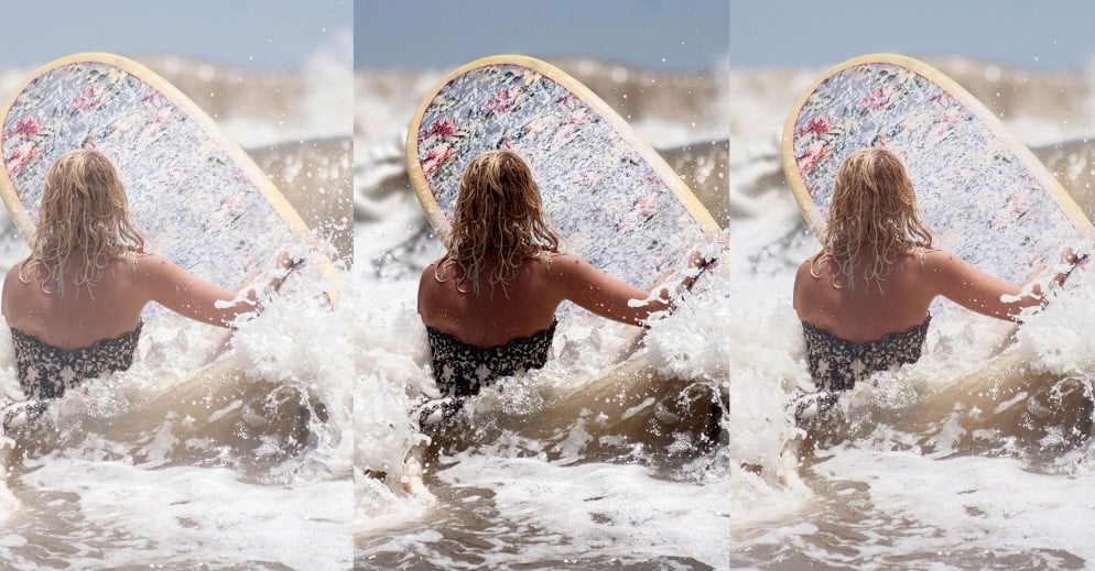
The final thing to consider is the white point, which can be adjusted even on the camera of a basic smartphone. Once you pinpoint the brightest and whitest part of the entire photo, you will see that the picture magically corrects itself, sometimes creating a perfect result. This type of correction can also be found in an image’s ‘colour temperature’ options.
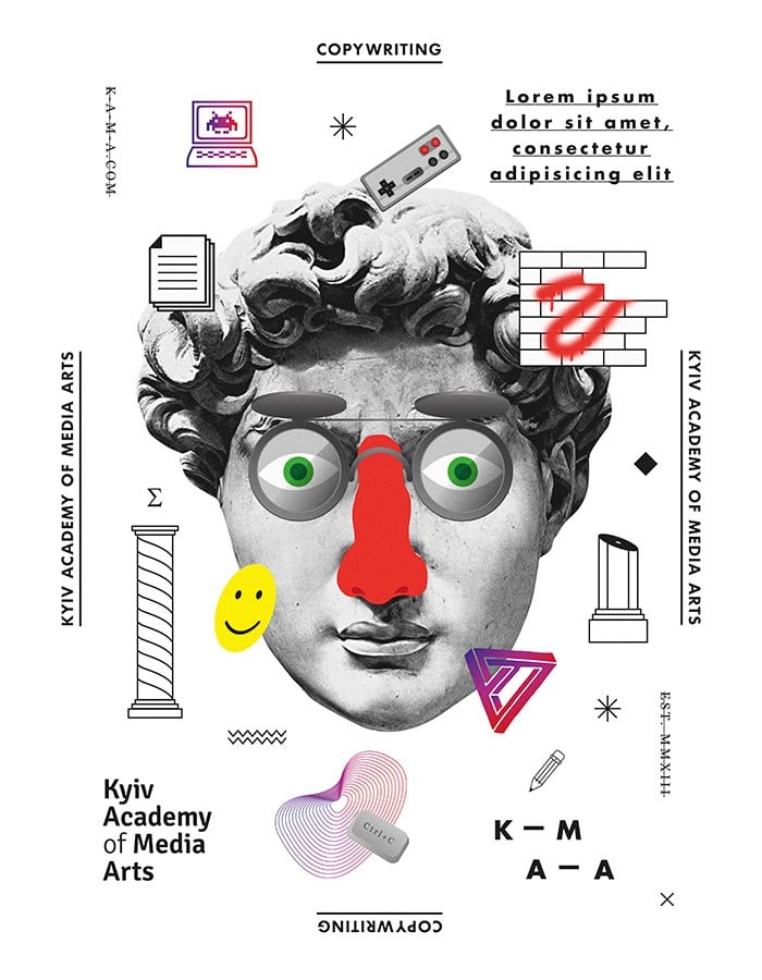
If the image really can’t be improved, try changing it to black and white and using graphics to add colour,
like in the example below.
Composition
Whether using photos or illustrations, it is very important to decide what the focal point of the image is, i.e. the area to which people’s eyes should be drawn.
Placing the focal point at the centre is the easiest and most effective option: you really can’t go wrong. It is obviously important to leave enough space to organise your graphics around it.
Text should be kept at a good distance from the cut lines: at least 5 mm in small publications, and up to 5 cm for large-format items like posters. The margin between the cut line and the image is a space our eyes perceive very clearly, and use as a frame: placing images or text too close to the edge therefore creates a negative perception in the mind of the person looking at it, as if everything has accidentally been placed too close to the edge.
A blank space around the main image or piece of artwork is often the best way to make it stand out.
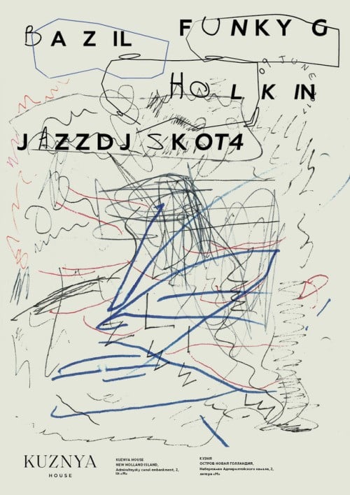
Have a look at this seemingly cluttered example: it’s a poster for a gig at a well-known venue in St Petersburg. At first the scribbles and the apparent chaos grab your attention, but after a while you realise that the information is well laid out and a long way from the margins.
Great graphic designers take many other elements into account, but by using these small tricks even those who do not do graphic design for living will be able to achieve excellent results and make their artwork less amateurish and more effective.
For more advice, take a look at the article published on this blog last year, entitled ‘Ten Golden Rules of Good Taste for Graphic Designers’ .
Have fun!