
Table of Contents
Before consumers even taste what is inside, it is the bottle that tells the story. And on a bottle, no element communicates more than the label.
Whether it belongs to a historic maison, a small producer, a bottle created for an exclusive event or a personalised corporate gift, the label represents the first point of contact between the product and the person viewing it. Within just a few square centimetres, it must convey quality, reliability, identity and perceived value.
But what makes an effective Champagne label? Which materials should you choose? What information should it include? And how can you achieve a result that reflects the prestige associated with this exceptional product?
In this guide, we will explore every aspect of Champagne label design and printing, from technical requirements to premium finishing options, as well as practical advice, common mistakes to avoid and recommendations for creating a product capable of standing out both on the shelf and during life’s most memorable occasions.
What Is a Champagne Label and Why Is It So Important?
In the wine industry, labels naturally serve an informative purpose. They identify the product, the producer and provide a range of details required by current regulations.
In the case of Champagne, however, their role extends far beyond that.
A bottle of Champagne is often purchased to celebrate a special occasion: a wedding, an anniversary, a corporate milestone, a sporting victory or simply a moment worth remembering. In these situations, consumers are not evaluating the product alone, but the entire experience it conveys.
The label therefore becomes a branding and storytelling tool. It immediately communicates the product’s positioning, suggests a level of quality and helps shape expectations long before the bottle is opened.
It is no coincidence that many of the world’s most prestigious Champagne houses have retained recognisable and consistent visual elements for decades. A well-designed label can become an integral part of a brand’s identity.
The Influence of Labels on Purchasing Decisions
Numerous marketing studies show that a significant proportion of purchasing decisions are made within a matter of seconds. When consumers are faced with several bottles, they often lack the technical knowledge required to assess quality immediately.
In the absence of other information, visual perception takes over.
A textured paper stock, high-quality printing, well-executed gold foiling or elegant typography can all help communicate exclusivity and craftsmanship. Conversely, a cluttered design or poor print quality can diminish the perceived value of even an outstanding product.
For this reason, label design should never be considered a mere formality. It is an integral part of the product itself.
Wine Labels and Champagne Labels: What Are the Differences?
At first glance, they may appear very similar, but there are some important distinctions.
Champagne is associated with an image strongly linked to luxury, celebration and tradition. As a result, labels used on Champagne bottles often favour:
- more refined materials;
- premium finishes;
- metallic details;
- embossing and specialist embellishments;
- elegant, understated colour palettes.
The objective is not simply to provide information, but to create an immediate impression of prestige.
For this reason, many businesses choose to produce personalised Champagne labels using premium substrates and finishing techniques capable of enhancing the product from the very first glance.
What Information Should a Champagne Label Include?
Visual appeal is essential, but it cannot come at the expense of regulatory compliance.
The information required may vary depending on the destination market, but labels generally need to include elements such as:
- product designation;
- nominal volume;
- alcohol content;
- producer identification;
- production batch number;
- allergen information where applicable;
- information required under European regulations.
In recent years, QR codes have also become increasingly common, allowing consumers to access additional information, nutritional details and environmental data without overcrowding the label design.
The challenge lies in balancing regulatory compliance with visual clarity. An overly crowded label risks losing its communication effectiveness.
How to Design an Effective Champagne Label
When examining the labels used by the most renowned Champagne houses, one common characteristic quickly becomes apparent: clarity.
The best label designs do not attempt to communicate everything at once. Instead, they establish a clear hierarchy of information.
The brand name should be instantly recognisable. This should then be followed by the cuvée name, any distinctive features and, finally, secondary information.
One of the most common mistakes is to overload a label with graphic elements, decorative features and text. This approach often produces the opposite effect to the one intended.
In the premium segment, a simple rule applies: every element should have a specific purpose.
Choosing the Right Typeface
Typography has a huge influence on how a product is perceived.
Classic serif fonts can communicate tradition and elegance, while modern minimalist typefaces tend to suggest innovation and contemporary appeal.
The key is always to ensure readability and consistency with the brand’s positioning.
Colours and Perceived Value
Certain colour combinations have become strongly associated with premium products in the collective imagination.
Among the most widely used are:
- black and gold;
- white and gold;
- cream and black;
- navy blue and silver;
- dark green with metallic details.
Naturally, there are no absolute rules. What matters most is maintaining a coherent and recognisable identity.
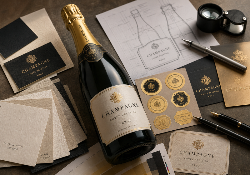
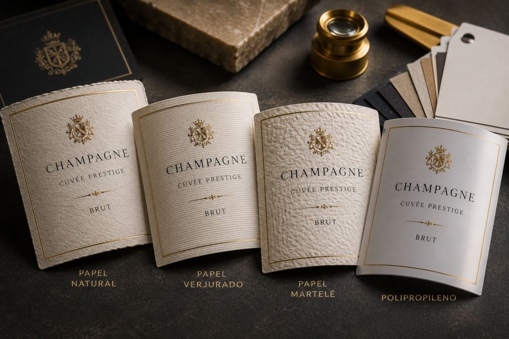
Materials: Choosing the Right Label Stock
One of the most underestimated aspects of label design is the choice of material.
The substrate influences not only the appearance of the label but also its durability and resistance to moisture — a particularly important factor for Champagne bottles, which are often stored in ice buckets.
Natural papers are a highly regarded option for elegant and traditional productions.
Laid and hammered papers offer a tactile texture that helps reinforce a sense of quality and craftsmanship.
For applications that require greater resistance to water and condensation, synthetic materials such as polypropylene may be a more suitable choice, maintaining the label’s appearance even after extended periods of refrigeration.
Those wishing to compare different options can explore the solutions available through Pixartprinting’s Champagne label printing service, evaluating materials, finishes and configurations according to the specific requirements of their project.
How to Design an Effective Champagne Label
One of the most widespread misconceptions in the world of packaging is that a premium label must necessarily be complex.
In reality, the opposite is often true.
Many of the most elegant labels on the market communicate a great deal while using relatively few graphic elements. Their strength lies not in the quantity of information or decoration, but in the way those elements are organised.
An effective Champagne label should be designed around a clear visual hierarchy.
Consumers should be able to identify immediately:
- the brand;
- the cuvée or product name;
- any distinctive features;
- secondary information.
When everything is given equal importance, nothing truly stands out.
The Importance of White Space
One of the most powerful tools available to a designer is unused space.
Many first-time producers feel compelled to use every millimetre of available label space. They add logos, crests, decorative elements, descriptive text, medals and certifications until the surface becomes completely saturated.
The most prestigious Champagne houses often take the opposite approach.
White space is not wasted space. On the contrary, it allows key elements to breathe and helps convey a sense of elegance and confidence.
In terms of perceived value, white space functions much like silence in a conversation: when used correctly, it increases the impact of the message.
How to Choose Typography
Typography is one of the most overlooked aspects of label design.
A typeface can make a bottle appear instantly sophisticated or surprisingly inexpensive.
In general, Champagne labels tend to use:
- classic serif typefaces to emphasise tradition and prestige;
- refined sans serif typefaces to convey modernity;
- combinations of both to create contrast and hierarchy.
The most common mistake is using too many different fonts.
In most cases, two carefully selected type families are more than sufficient to build a strong and coherent visual identity.
Colours and the Perception of Luxury
In wine and Champagne packaging, colour serves more than a purely aesthetic function.
It directly influences how consumers interpret the product.
Black communicates authority and prestige.
Gold evokes exclusivity and celebration.
Silver suggests contemporary elegance.
White conveys purity and refinement.
Navy blue is often associated with premium and institutional brands.
This does not mean that all labels should use the same colour palettes. It simply means that every colour choice should be consistent with the positioning the brand wishes to communicate.
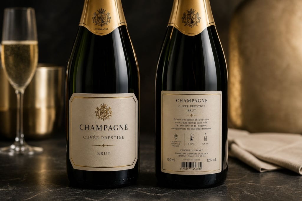
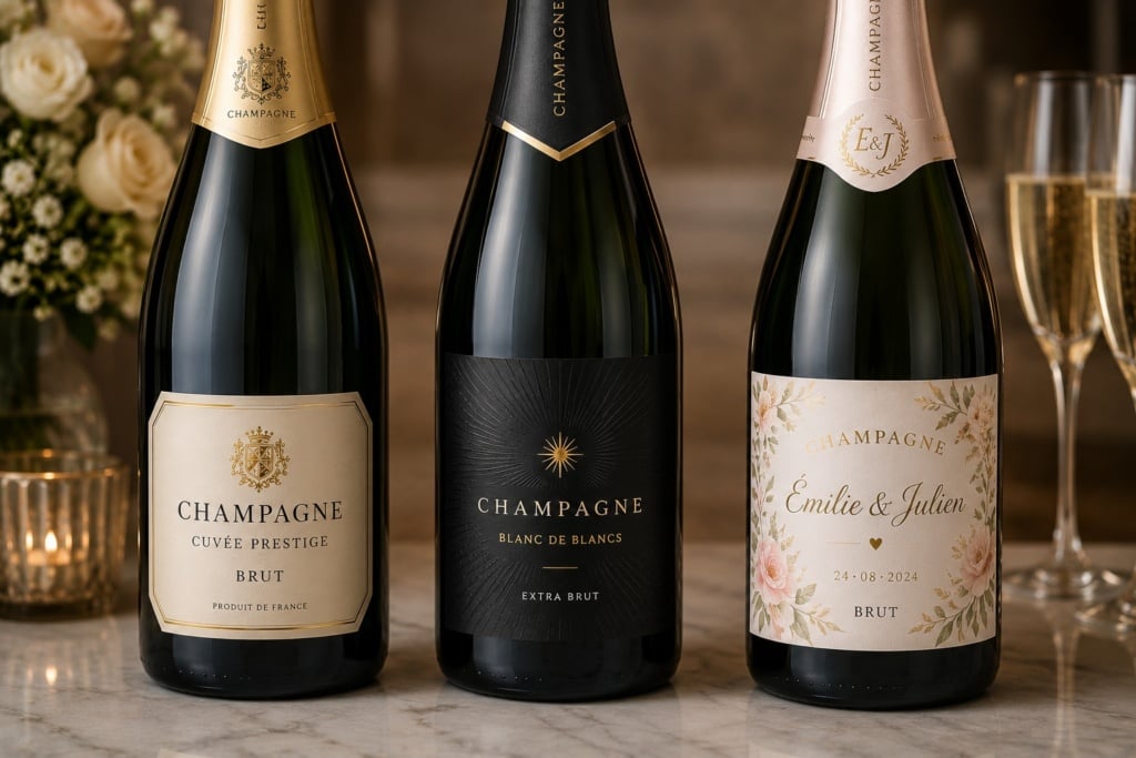
Champagne Label Sizes and Formats
There is no universal format suitable for every bottle.
Label dimensions depend on several factors:
- bottle shape;
- available surface area;
- the amount of information to be included;
- graphic style;
- the presence of both a front label and a back label.
In most cases, the most common configuration includes:
Front Label
This is the primary communication tool.
It typically contains:
- the brand name;
- the product name;
- the vintage;
- distinctive product features.
Back Label
The back label allows more detailed information to be included without compromising the visual cleanliness of the front of the bottle.
It may contain:
- product descriptions;
- tasting notes;
- technical information;
- QR codes;
- regulatory information.
Neck Label
Many Champagne bottles also feature a neck label applied around the neck of the bottle.
This is a particularly effective element for highlighting:
- limited editions;
- awards received;
- anniversaries;
- promotional campaigns.
When designed consistently with the rest of the packaging, it can significantly contribute to brand recognition.
Choosing the Right Material for Champagne Labels
The choice of substrate influences several factors simultaneously:
- aesthetics;
- perceived value;
- durability;
- long-term performance.
It is therefore a decision that should be made during the earliest stages of the project.
Natural Papers
Natural papers are among the most appreciated options in the premium segment.
Their slightly irregular surface creates an authentic, handcrafted feel that many consumers immediately associate with quality.
They are particularly suitable for:
- limited production runs;
- artisan Champagne houses;
- commemorative bottles;
- traditional packaging concepts.
Laid Papers
The presence of subtle embossed lines creates a texture that is both elegant and recognisable.
This solution is often chosen to reinforce ideas of tradition and production savoir-faire.
Hammered Papers
Hammered papers feature a more pronounced and three-dimensional texture.
They offer a particularly engaging tactile experience and are frequently selected for premium products.
Synthetic Materials
Champagne bottles spend a significant amount of time immersed in ice or exposed to condensation.
In these situations, synthetic materials can provide an especially effective solution.
Polypropylene, for example, offers:
- excellent water resistance;
- outstanding dimensional stability;
- high print quality;
- long-lasting durability.
Businesses wishing to compare different options can explore the solutions available for personalised Champagne labels, assessing different materials according to the intended application and the desired product positioning.
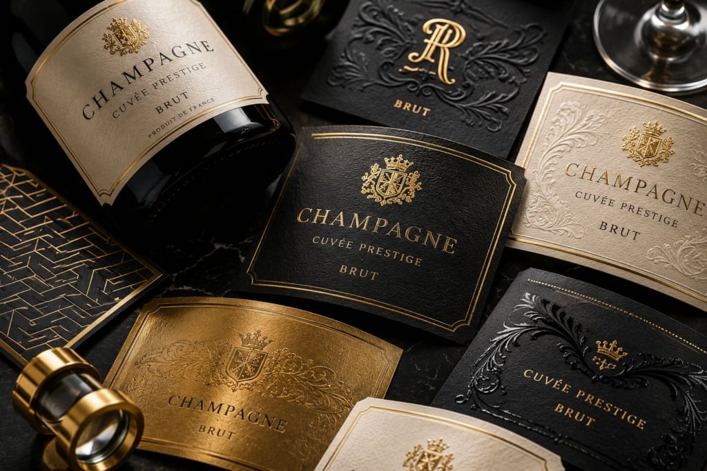
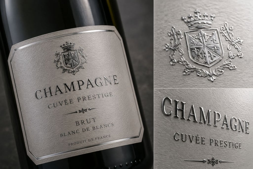
Finishes That Truly Make a Difference
In the world of Champagne, the right finishing touch can radically transform the perception of a label.
This is not simply a matter of adding a decorative effect.
Premium embellishments help guide the eye, highlight important details and strengthen perceived value.
Gold Foiling
Probably the most iconic finishing option.
When used with restraint, it immediately conveys a sense of exclusivity.
The secret lies in avoiding excess.
A small area enhanced with carefully applied gold foil often creates a more elegant result than a surface that is entirely covered.
Silver Foiling
More understated and contemporary than gold.
It is particularly well suited to minimalist and modern design projects.
Spot UV Varnish
Spot UV varnish allows highly refined visual and tactile contrasts to be created.
It can be used to highlight:
- logos;
- decorative details;
- patterns;
- specific graphic elements.
Embossing
Embossing and debossing add a physical dimension to the label.
The result is not only seen but also felt.
This characteristic contributes significantly to the overall perception of quality.
Mistakes That Make a Premium Bottle Look Cheap
Interestingly, many projects fail not because of a lack of budget, but because of poor design decisions.
Among the most common mistakes are:
Too Many Graphic Elements
Excess rarely communicates luxury.
More often, it communicates uncertainty.
Too Many Colours
A restrained colour palette generally appears more elegant and controlled.
Special Effects Used Without Purpose
Gold foil, embossing and varnishes can dramatically improve a design.
Or completely undermine it.
Everything depends on how they are used.
Inconsistent Typography
Mixing too many different font styles creates confusion and reduces brand recognition.
Lack of Consistency
The label should work harmoniously with every other element of the bottle:
- capsule;
- glass;
- neck label;
- packaging;
- promotional materials.
When all these elements speak the same visual language, the result immediately appears more professional and credible.
In many cases, different materials and finishing options can already be evaluated during the print configuration stage, making it easier to identify the combination that best suits the project, as is possible through dedicated Champagne label configuration tools.
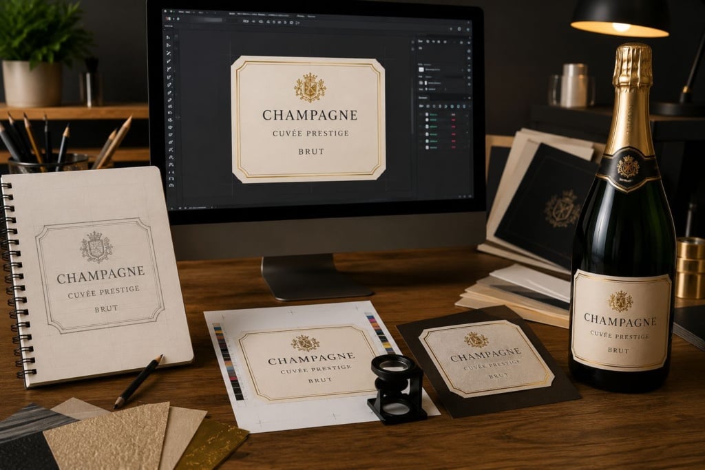
How to Prepare Artwork Correctly for Print
Even the most refined label design can lose much of its impact if the print file is not prepared correctly.
In the label industry, where designs often involve small formats and intricate details, technical precision becomes even more important.
Proper artwork preparation helps ensure more accurate colours, perfectly legible text and an overall quality level that matches the value of the product.
Use High-Resolution Images
Any images included in the design should be prepared at a resolution suitable for professional printing.
Low-resolution files can result in:
- blurred images;
- loss of detail;
- poorly defined edges;
- results that fall short of expectations.
When working on premium labels, every detail contributes to the perception of quality.
Pay Attention to Safety Margins
Text and logos should not be positioned too close to the edge of the label.
During the cutting process, slight tolerances may occur that could compromise the final result.
Maintaining adequate safety margins helps prevent issues and ensures a professional finish.
Manage Colour Correctly
One of the most common mistakes concerns colour management.
A label viewed on a screen will not necessarily appear identical once printed.
For this reason, it is important to prepare artwork according to the technical specifications provided by the print supplier and to use the appropriate colour profiles.
Check Fonts and Vector Elements
Before exporting the final file, it is good practice to verify:
- that fonts are properly embedded;
- that linked images are present and correctly connected;
- that vector elements are intact;
- that any transparencies or special effects have been handled correctly.
A thorough pre-flight check helps prevent problems that might otherwise only emerge during production.
From Concept to Bottle: How to Print Champagne Labels Online
In recent years, online printing has made professional production processes far more accessible than they once were.
What was previously reserved mainly for large companies and high-volume productions is now available to businesses of all sizes.
Today, it is possible to configure a project, select materials and finishes, upload artwork and manage the entire order online.
This approach offers several advantages:
- faster turnaround times;
- instant quotations;
- a wide range of configuration options;
- the ability to compare different solutions;
- centralised project management.
For businesses looking to create carefully crafted packaging, Pixartprinting’s personalised Champagne labels offer a wide selection of materials, formats and finishing options, allowing every project to be tailored to the specific characteristics of the bottle and the positioning of the brand.
How to Choose the Most Suitable Configuration
There is no universally perfect configuration.
The right choice always depends on the objectives of the project.
A bottle intended for a wedding or private celebration may prioritise emotional impact and personalisation.
A Champagne house or winery operating in the premium segment may instead focus on specialist materials, textures and luxury finishes.
A business using personalised bottles as a marketing tool may have different priorities, placing greater emphasis on consistency with its visual identity and ease of brand recognition.
For this reason, the choice of materials and finishing techniques should always reflect the message the product is intended to communicate.
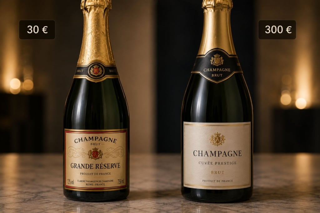
How Much Does It Cost to Print Champagne Labels?
This is one of the most frequently asked questions and, at the same time, one of the most difficult to answer definitively.
The final cost depends on a number of different factors.
Material
A standard paper stock and a premium paper stock do not require the same level of investment.
Special textures and more sophisticated substrates increase production costs, but they also contribute significantly to the perceived value of the finished product.
Finishes
Metallic foils, embossing, spot varnishes and other specialist finishing techniques represent an additional investment that can dramatically transform the final appearance of a label.
Quantity
As with many printed products, the number of copies affects the unit cost.
Carefully assessing print quantities helps optimise the available budget.
Format and Complexity
Unusual dimensions, custom die-cut shapes or advanced finishing processes may increase the final cost, but they also make it possible to create a more distinctive product.
Rather than focusing solely on cost, it is often more useful to consider the return on investment in terms of brand image, recognition and perceived value.
Frequently Asked Questions About Champagne Labels
What is the best material for a bottle stored in ice?
Synthetic materials such as polypropylene are generally among the most effective solutions for resisting moisture, water and condensation without altering the appearance of the label.
What is the standard size of a Champagne label?
There is no single size suitable for every bottle. However, for a standard 75cl Champagne bottle, the most common front label format typically falls between 120 × 70 mm and 120 × 90 mm, depending on the bottle shape and the chosen design style.
More compact formats can enhance a minimalist design, while larger labels provide additional space for information and decorative details.
The final choice should always take into account the curvature of the bottle, content legibility and the overall balance of the packaging.
Is it possible to personalise a small number of bottles?
Yes. Modern digital printing technology makes short print runs economically viable, making personalisation accessible for events, weddings, corporate gifts and limited editions.
Which finishes create the most elegant look?
Among the most popular options are gold foiling, silver foiling, spot UV varnish and embossing.
Their effectiveness, however, depends largely on how they are integrated into the overall design.
Is a rich design better than a minimalist one?
In the premium segment, minimalist designs often create a stronger perception of elegance.
That said, there is no universal rule. Everything depends on the brand identity and the target audience.
How do I choose the right label format?
The format should be determined according to the bottle shape, the amount of information to be included and the desired visual style.
A balanced design enhances the product without overcrowding the available surface area.
Where can personalised Champagne labels be printed?
The choice of supplier should be based on the range of available materials, customisation options and the quality of finishing techniques offered.
For this reason, many businesses and professionals choose dedicated Champagne label printing solutions such as those offered by Pixartprinting, which allow products to be configured with an exceptionally high level of detail.
It’s a Matter of Label Etiquette
In the world of Champagne, the label is far more than a simple information carrier. It is an integral part of the product experience.
It helps define perceptions of quality, strengthens brand identity and influences consumer expectations long before the first glass is poured.
For this reason, label design deserves the same level of attention as the contents of the bottle itself.
Materials, colours, typography, finishes and print quality are not secondary details. They are tools capable of telling a story, communicating a market position and distinguishing a product from its competitors.
Whether it is for a professional production, a commemorative range or a bespoke project created for a special occasion, investing time in label design ultimately means investing in the perceived value of the Champagne itself.