
Table of Contents
Sergio Toppi was one of the grand masters of comics, renowned the world over for his singular style. He re-wrote the rules of the genre with a visual architecture that frequently blended sequential art with illustration.
With huge figures that fill the page, condensing several panels’ worth of action into one, Toppi’s work often prompts the question: is this comics or illustration? But in the end, you always arrive at the same answer: Sergio Toppi is a comics artist.
The Italian used black and white contrast as a potent expressive tool, yet mastered the use of colour, too. And his refusal to be constrained by the classic panel grid allowed for more fluid storytelling.
Toppi was also admired in graphic design and printing for his knack of making materials look realistic through his unique inking technique. It allowed him to create worlds that hovered somewhere between the realistic and magical in his adaptations of Eastern legends and explorations of colonial conflicts.
Childhood, education and influences
Sergio Toppi was born in Milan, in 1932. His childhood was overshadowed by the death of his musician father, in 1936, from tuberculosis contracted while serving as an army truck driver in the First World War. As a result, he was raised in a female-dominated household by his mother and grandmother. Toppi’s mother worked for art publishing house De Giuli Gaddoni Grassoccolo, which meant he was exposed to illustrated books from an early age.
Another profound influence on the young Sergio was the Second World War. After the Allies began bombing Milan in 1943, he and his family were evacuated to Bannio Anzino, a small town in the Italian Alps. But the war was never far away, and this mountainous region would soon see fierce clashes between partisans and Axis forces. Though he hated conflict, Toppi became fascinated with military gear, from weapons to insignia, as well as with how men were depicted in hostile environments.
At the end of the war, he returned to Milan and continued his secondary education, picking up a solid grounding in the arts and humanities. He then went to Castello Sforzesco Art School, but dropped out a year later, having found the curriculum outdated and boring. Next, he enrolled in medical school, where he met his future wife and lifelong companion, Aldina Monesi, but eventually quit so he could fully devote himself to drawing.
Toppi was to all intents and purposes an autodidact: he taught himself to draw by observing the world around him, and then refracting it through the lens of his imagination. He began reading comics around the age of 14, becoming a regular customer of Milan’s second-hand book stalls. It was there that he came across Asso di Picche magazine and was immediately entranced by the dark and atmospheric work of Dino Battaglia. Little did he know at the time, but he would later become great friends with Battaglia, as well as another hero of his, Hugo Pratt.
Besides these iconic Italian comics artists, Toppi was also influenced by 18th and 19th century European art. From Gustav Klimt he learnt how to use geometric patterns, while from Egon Schiele he borrowed the dramatic tension of the human body and its angular anatomy, elevating the visual language of comics to new heights.
The 1950s and 1960s: illustration, animation and the Corriere dei Piccoli
Toppi started out doing illustrations for the Enciclopedia dei Ragazzi, published by UTET. It was work that required meticulous research at the library to ensure objects like weapons, clothes and buildings were accurately depicted.
From 1956 to 1961, Toppi worked for Pagot Film, a cutting-edge Italian animation house that did a lot of work for TV adverts. There he created backdrops for animations, as well as writing and producing ads. This taught him how to edit and frame shots, skills that he would later draw upon in his comics. In parallel to his day job at Pagot Film, Toppi also drew satirical political cartoons for the weekly magazine Candido.
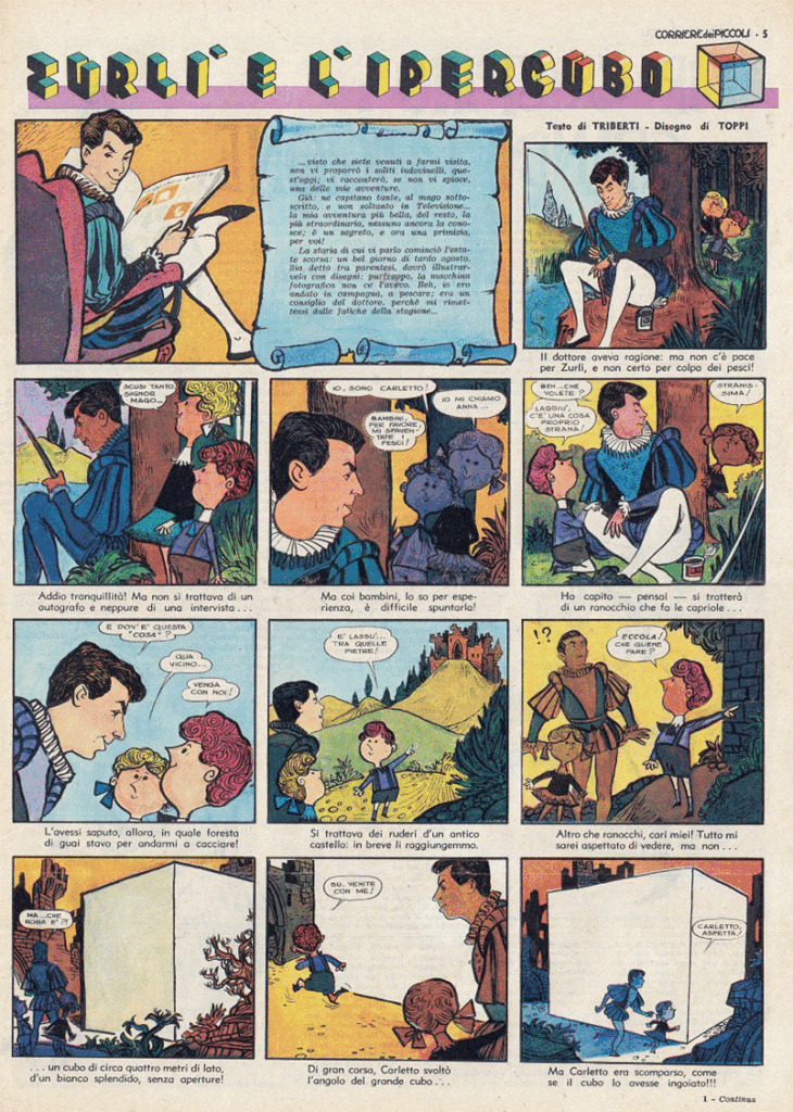
Toppi’s first gig as a comics artist came in 1961 in the pages of Corriere dei Piccoli, where he produced comic book adaptations of kids television programmes, like Mago Zurlì (Zurlì e l’Ipercubo). He also pitched less conventional projects to Corriere dei Piccoli: a fan of model building, he devised a series of paper models for kids to cut out and build. They included medieval knights and modern soldiers, as well as a space station with astronauts and even the Vatican Council, complete with bishops and Swiss Guards. Another imaginative idea was his 3D postcards of Italy’s most famous squares.
The 1970s: deconstructing the panel
In 1972, Corriere dei Piccoli became Il Corriere dei Ragazzi. Toppi stayed on at the magazine, continuing his partnership with writer Mino Milan, drawing the series Dal nostro inviato nel tempo Mino Milani, in which Milani played the role of narrator, as well as Fumetti-Verità, Uomini Contro and I Grandi nel Giallo.
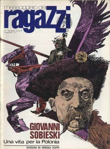
The decade marked a turning point in Toppi’s career as he began to break free from the conventions of classic comics. From 1974, in his work for Messaggero dei Ragazzi (edited by Father Giovanni Colasanti), he was given the creative freedom to abandon the rigid division of pages into panels, which he found stifling. Colasanti wanted to modernise the publication, and at the suggestion of literary critic Gianni Brunoro, hired Sergio Toppi, promising him carte blanche.
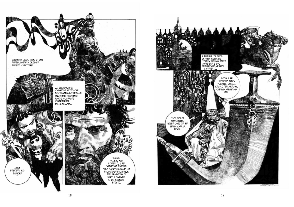
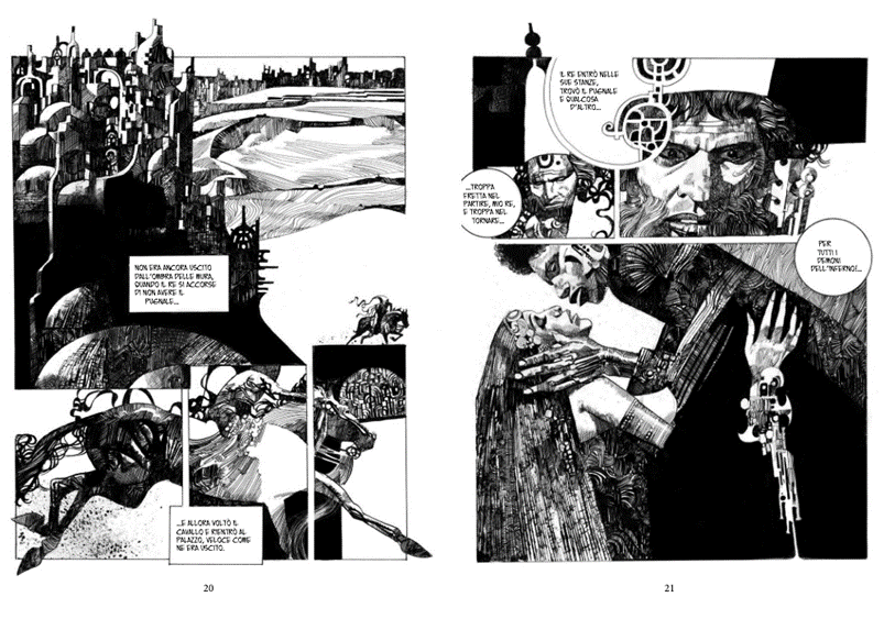
Toppi deployed what critics call “diagonal verticality”. The borders around panels dissolve on the page, while the outlines of characters, the drapery of clothes, or elements in the landscape serve as natural dividers that guide the reader’s eye through the story. Toppi places large elements – a face, a weapon – in the foreground, with crowd scenes behind. Figures occupy the full height of the page, taking on a monumental stature.
The result is an utterly personal style: besides unconventional page layouts without the customary television screen-like framing, Toppi uses a novel hatching technique to create light, shade and depth. And he uses colours, white above all, to add an extra dimension to his drawings.
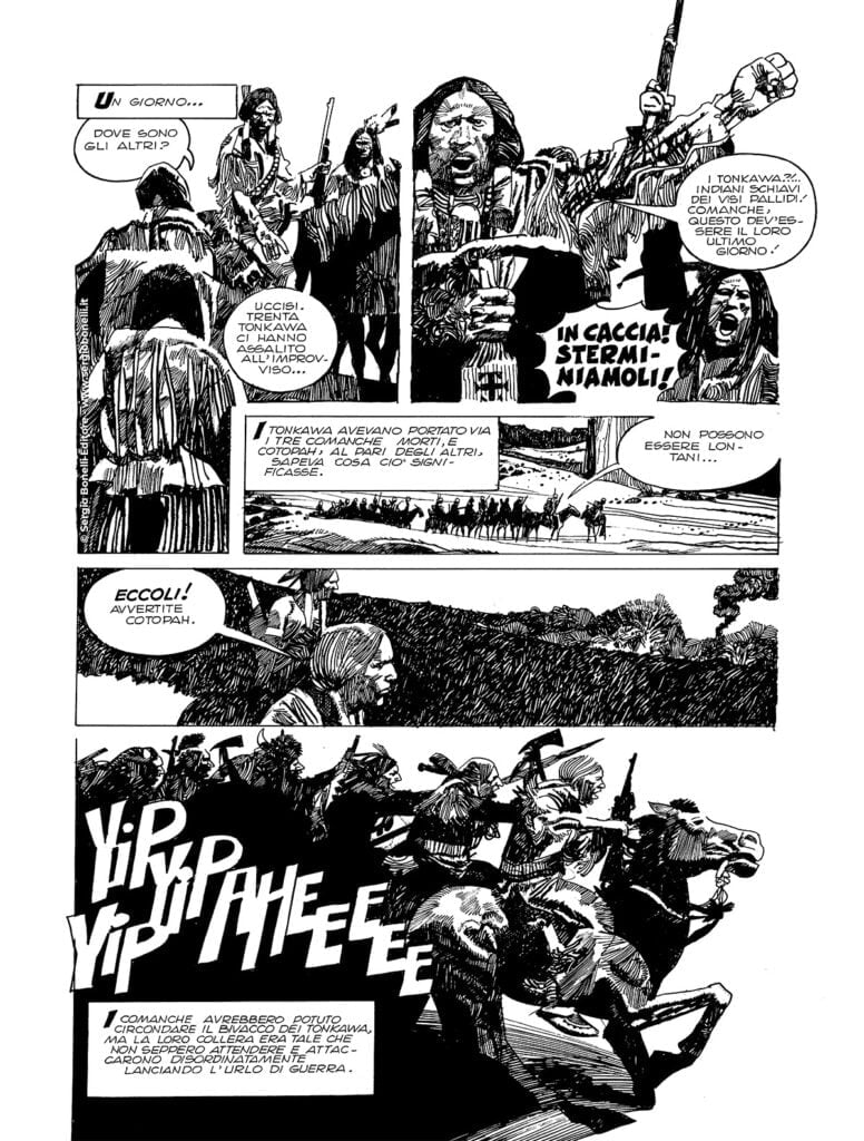
But Toppi was not just an auteur cartoonist. He also made forays into mainstream comics throughout his career, like in 1975, when Sergio Bonelli at Daim Press asked him to complete Herman Lehmann, l’indiano bianco, left unfinished by the late Rino Albertarelli. Then, from 1976 to 1978, Toppi was a contributor to the prestigious Un uomo un’avventura series (Cepim), debuting with L’Uomo del Nilo and following up with L’Uomo del Messico. And with L’uomo delle paludi, he both wrote and drew for the first time in this format.
Artistic maturity: Sharaz-de and The Collector
At a dinner arranged by Bonelli at the Lucca Comics festival, Toppi met Oreste Del Buono, writer, journalist and editor of Linus, the storied comics magazine that is today edited by Igort.
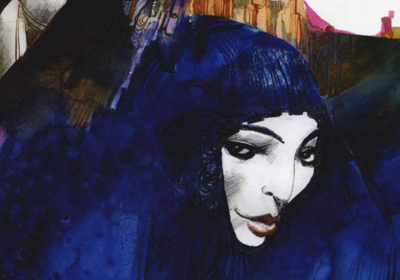
Del Buono got Toppi to publish in Alter Alter, the auteur comics magazine, the first chapter of his best-known and most acclaimed work, Sharaz-de, a visual retelling of One Thousand and One Nights. Regarded by critics as the peak of his experimentalism, the piece completely abandoned the traditional comics grid: instead, the princess’s face often served as the unifying element on the page, with characters and settings springing out from it in a heady mix of Klimtian references and geometric abstractions. The cover of Sharaz-de – © Edizioni NPE – Fonte
Made up of nine episodes (brought together into an album in 1984 by Milano Libri), Sharaz-de eschews the conventional language of comics. There are no panels or balloons – the artist’s drawings just emerge and run into a continuous narrative flow. Toppi gives us his trademark towering figures, which often take up half the page, alongside meticulously detailed abstract decorations. And he uses framing like a film director would to add a sense of movement and depth to static, 2D images.
This powerful graphic style makes skilful use of black and white, and spurns the wide, flat fills typical of American comics. Toppi fleshes out materials in his drawings through dense cross-hatching with India ink, using a pen, rag and sponge (like Battaglia) to convey three-dimensionality sublimely.
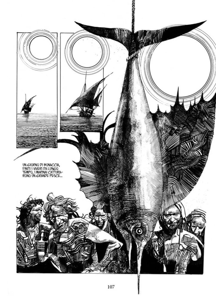
Dense blacks are balanced out by the strategic use of negative space: the white of the page is used to isolate a face, give a busy composition breathing space or suggest the vastness of a landscape. The result is an aesthetic contrast of real expressive power.
Following this success, Toppi’s comics were widely published in other magazines. In 1982, for the I protagonisti di Orient Express series, he created his first and only recurring character in The Collector. The eponymous protagonist is a cynical dandy who obsessively scours the planet for tribal artefacts and rare objects to loot. Through this anti-hero, Toppi gives us a scathing anthropological critique that contrasts ancient animistic cultures with the brutal progress of Western modernity.
International work and tarot cards
By now a world-renowned comics artist, Toppi began a collaboration with French publishing giant Larousse for whom, together with Battaglia, he created drawings for a volume of L’Histoire de France en bandes dessinées that was dedicated to the Great War.
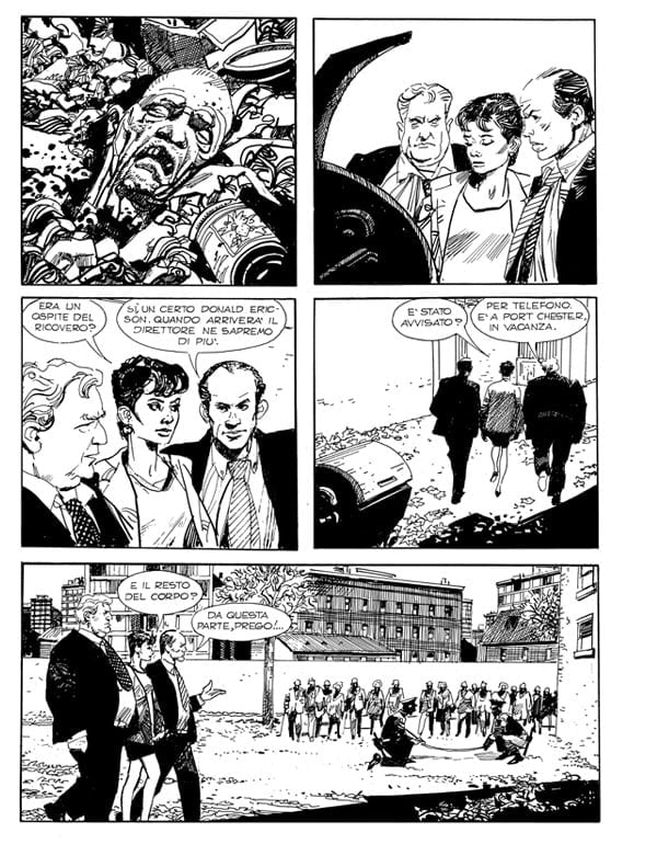
In Italy, he kept on working with Sergio Bonelli Editore as a sort of guest star, illustrating memorable episodes of Nick Raider (Senza Respiro, 1997) and Julia (L’eterno riposo, 1999), where he tried his hand at an atmospheric urban thriller. At the same time, he continued his collaboration with Edizioni Paoline for Il Giornalino, producing historical biographies (Un uomo chiamato Gesù, 1992), tales of adventure and sci-fi stories (like La Città, 1994).
En Italia siguió colaborando con Sergio Bonelli Editore como «estrella invitada», ilustrando algunos memorables episodios de Nick Raider (Senza Respiro, 1997) y Julia (L’eterno riposo, 1999), donde exploró el thriller urbano. Al mismo tiempo, mantuvo una colaboración estable con Edizione Paoline en Il Giornalino, dibujando biografías históricas (Un uomo chiamato Gesù, 1992), así como historias de aventuras y ciencia ficción (como La Città, 1994).
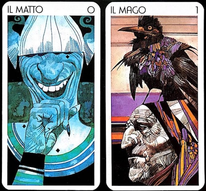
There was also an intriguing collaboration with Lo Scarabeo publishers, for whom Toppi produced two decks of tarot cards, the narrow, vertical format providing a perfect fit for his compositional style. Later, there were covers for Marvel and collaborations with national and international newspapers, including Il Messaggero, Il Manifesto, Il Giorno, Le Figaro and The Times.
Sergio Toppi’s legacy
Sergio Toppi always saw himself as a comic book artisan: for him, comics and illustration were crafts that must be honed. He left a legacy that reached beyond European shores, profoundly influencing the American comic scene, too. None other than Frank Miller heaped praise on him, calling him: “a Maestro, a Master of the Art … [who] … makes the impossible look easy.”
Toppi also inspired the likes of Bill Sienkiewicz (Daredevil, New Mutants), while Dave McKean (Sandman) has marvelled at how the spatial poise of Toppi’s compositions remains recognisable even when every figure is reduced to pure abstract form.
Toppi’s impact on global comics culture is nicely illustrated by the following anecdote told by Sergio Bonelli. Whenever Bonelli spoke at international events to audiences unfamiliar and seemingly uninterested in the Italian comics market, all he had to do to get people’s attention was utter the words: “I am Sergio Toppi’s publisher”. Today, the artist’s comics continue to be studied and republished in glossy new editions, which is testament to a body of work that still has much to give the world of comics and illustration.