
Table of Contents
Even today, leaflets remain an extremely useful communication tool. They can be used to inform the public about gigs, concerts or exhibitions, to advertise special promotions in shops or to gather support for a social or political cause.
Creating leaflets, however, is a real challenge! The design must be appealing, clear and direct: it has to immediately grab people’s attention and pass on your message in an instant.
Luckily, there are plenty of tools (many of them free!) for creating flyers online, making the job easier and more intuitive – we’ll go through them in the second half of this tutorial. In the first section, meanwhile, we have five pieces of advice for you on how to design your flyers: from choosing the images and title to positioning the various sections in a lay-out and printing your handiwork.
Creating a leaflet online: your message

As with many other graphic design projects, when putting together a leaflet you need to have one thing clear in your mind: the message you want to get across.
For this reason, before starting work with any online leaflet-design tool, you need to focus on the content. Here are some suggestions:
- Identify a single, key message: do you want to invite people to a concert or exhibition? Are you informing people about a special offer or promoting a cause? Focus on one main aspect.
- Organise your content into three levels: a title, subtitle and description. This will help to clarify the hierarchy of the information when you come to designing your flyer. For example, if you want to create a leaflet for an exhibition, the title will be the title of the exhibition and the artist, the subtitle could be useful information such as the location and dates, while the description will provide more detail on the type of exhibition you are advertising.
Once you’ve put together a draft of the content, you can start working on the graphic design for your flyer.
Creating the graphic design for your flyer
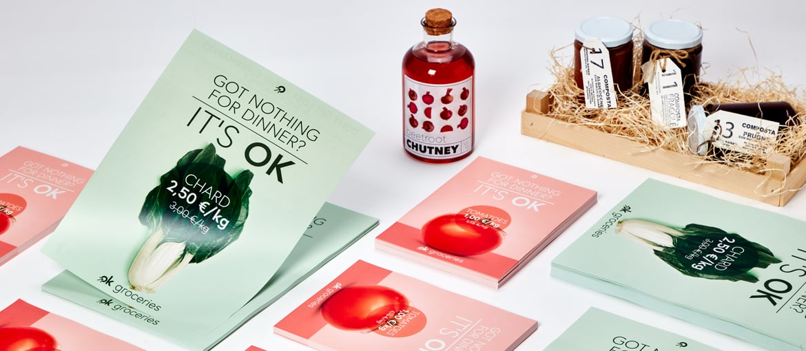
You’ve reached a crucial stage in the online creation of a leaflet: the graphic design. You can use a photograph, an illustration or a pattern for this – whichever you choose, keep three things in mind: the audience, the context and the message.
A flyer’s graphic design is the aspect that, in just a handful of seconds, needs to grab people’s attention and convince them to read the leaflet they’re holding, and not throw it away!

With this in mind, here is some advice:
- A single, large image will grab people’s attention much more than lots of small images. The image should be clearly legible.
- A background image or pattern, meanwhile, could help guide the flyer’s recipients towards another element: the title. In this case you can make use of colours and contrasts to direct people’s focus towards the relevant area of the leaflet.
- Make sure you use high-resolution and high-quality images. To find a suitable image online for your leaflet, have a look at our advice on the best free photo sites on the web.
- Try to avoid photos that are clearly stock images: remember, the design of your flyer has to be original, so as to be immediately noticeable.
The title of your leaflet
The next step in making a leaflet is dealing with the title. You should already have chosen it during the first step, when you honed your message. Now you need to position it on the flyer and find a suitable font and colour. Here are our suggestions:
- Before thinking about designing your flyer, we recommend you do plenty of work on the content. Make sure the message is clear, sexy and concise. The fewer words you use, the bigger you can make the title, so it stands out even more.
- The font you use for the leaflet’s title is also very important: along with the artwork you choose, this aspect will speak to the audience’s emotions. It must be clearly legible, so avoid overly ornate fonts. It should also go well with other elements, such as the image or illustration. Graphic designers recommend not using more than two different fonts on the same flyer. If you’re looking for fonts that are free to use, take a peek at our advice on the best websites for downloading free fonts.
- The title of the leaflet has to be legible, so use a colour that contrasts with the background or image you’ve chosen. Go for colours that match your brand identity, and don’t use too many on the same flyer: a rainbow of colours will distract readers, rather than focusing their attention.
- There are various options when it comes to positioning the title on your leaflet. If you have a pattern border, you could place the title at the centre of the flyer, where it is certain to be the first thing people notice. If, however, you would prefer people’s attention to be grabbed by the image you are using, you could put the title directly underneath it, so that once people’s eyes have been drawn to the image, they then fall on the title when searching for further information.

Creating a flyer: other things to consider
So far, producing your flyer has involved you working on the graphic design, image and title. Now you need to look at other aspects: the subtitle, any additional text, the website address, social media contact details and logos.
- For the subtitle, as before, work hard on the descriptive text. Use as few words as possible and answer the questions when, where and why.
- If your leaflet needs to contain lots of information (for example an advertising flyer or one raising awareness about a particular cause), divide the text up into paragraphs. You could use icons or bullet points to highlight various concepts. If you’re looking for the former, read our advice on the most useful platforms for free icons.
- Flyers overflowing with content are distracting, so if you have a lot of text, it’s best to opt for a double-sided design. The front will attract people’s attention, and you can then put all the information on the back.
How to print your leaflet

Once you’ve created your leaflet, all that remains is to print it! The Pixartprinting catalogue contains various options: a range of sizes, from A6 to A3, and the choice of printing on the front only, the same design front and back or different designs front and back.
Here are some tips for creating a print-ready file:
- Once you’ve chosen the flyer size you wish to order, download the template. You can then automatically adapt the artwork you created, or build it yourself from scratch. Before sending your design for printing, delete all the guidelines except the bleed margin and save the file in PDF format without crop marks.
- Ensure the page orientation matches the option you chose when ordering.
- If you opt for double-sided printing, the sheet will be rotated around its vertical axis, like turning the pages of a book; bear this in mind when positioning the text on the back, as shown in the image below.
To be sure the file you’re uploading is ready for printing, we recommend you choose the Professional File Check option when ordering your printed flyers with Pixartprinting.
We can’t wait to see your leaflets! If you need any advice on which free software to use for the layout of your flyers, read the second part of this tutorial.